High-Contrast Display Serif

Highland Bundle + Orvelia
Pairs sculptural editorial warmth with Highland Bundle's clean modern geometry.
Inspect Orvelia specimenDisclosure: MakerFileHub may earn a commission from qualifying purchases via paid links on this page. How our links work.
Rounded block capitals in clean, distressed and outline treatments
Highland Bundle is a rounded block capital alphabet delivered in three treatments — clean, distressed and outline — so one artwork can be printed heavy, worn or hollow without redrawing.
Paid link
Get this fontProject & layout blueprintsAt-a-glance maker compatibility
Fine grain and micro-texture excel in 300 DPI print, sublimation, and screen print rather than small vinyl weeding.
Visual anatomy & craft review
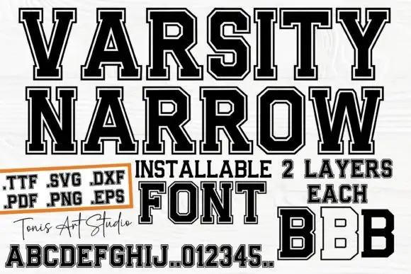
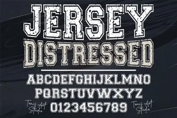
The base letterforms are fat rounded capitals: the H holds two square stems, the G closes with a straight bar, the L keeps one arm and the D a wide bowl, all with soft corners and no contrast. The distressed treatment breaks those shapes with a speckled mask, which is what gives the sample its printed-on-canvas look, while the outline treatment traces the same contour in a heavy hairline so the letter can print hollow. Because all three share one skeleton, a designer can register the clean and outline versions to build a two-colour badge. Weight is maximal in the solid cuts and the counters stay open at 40 pt. The cream ground, the black inks, the bull illustration, the orange label and the two rules are presentation; the typeface is the word.
Rounded · Distressed · Layered
Two-font hierarchy recipes
Tested contrast partners — pairing Highland Bundle with grounded secondary typography.
Highland Bundle + Orvelia
Pairs sculptural editorial warmth with Highland Bundle's clean modern geometry.
Inspect Orvelia specimen
Highland Bundle + Handmade Calligraphy
Introduces organic movement on pull-quotes, signatures and gift tags.
Inspect Handmade Calligraphy specimenPractical applications
Concrete hierarchy, scale and production guidance tailored to Highland Bundle’s stroke geometry.
The distressed cut prints like a worn stamp on a bottle label while the outline carries the sub-line, which is what small-batch packaging wants at 12 pt.
Hierarchy & layout recipe
Print on a 65 by 95 mm label: set the brand in the distressed cut at 12 pt, set the product in the outline cut at 9 pt beneath, and keep 6 mm of margin so the speckle does not break the letter edge at the trim.
Pre-production check
A distressed mask can eat the whole letter at 12 pt; check a printed label and use the clean cut for anything under 9 pt.
The worn cut gives a cover a printed-on-wood quality while the outline cut carries the standfirst hierarchy beneath it at 72 pt and 26 pt.
Hierarchy & layout recipe
Print an A4 cover: set the title in the distressed cut at 72 pt across the upper half, set the standfirst in the outline cut at 26 pt beneath, and keep 18 mm of margin so the outline has room to read as a contour.
Pre-production check
An outline over a photographic background loses its edge; check the cover proof and lay a plain panel behind the outlined line rather than thickening it.
The bundle suits a barn or highland wedding where a printed wooden sign needs a heavy face that still looks hand-finished at 8 cm.
Hierarchy & layout recipe
Print a 600 by 400 mm board: set the greeting in the distressed cut at 8 cm, set the names in the clean cut at 5 cm beneath, and leave 8 cm of margin so both treatments sit inside the board edge.
Pre-production check
Distressed capitals printed on plywood read as damage rather than texture; check a sample on the actual panel and switch to the clean cut if the grain fights the mask.
Technical & licence verification
Confirm included OTF/TTF/WOFF formats, full glyph tables and licence coverage on the live store page before batch production.
Closest visual alternatives
Matched across letterform anatomy, stroke behaviour and craft applications.
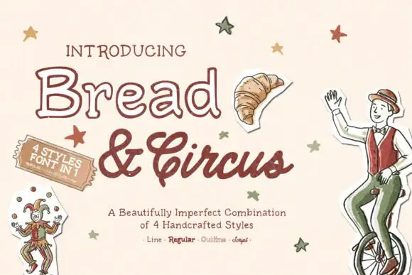
Outline lettering with a textured script and matching line, regular and sketch cuts
Bread and Circus is a bundle in which one hand-lettered drawing is supplied as an outline, a solid, a textured script and a sketch, so a single word can be printed hollow, filled or worn from one artwork.
Ideas for this font

Coral collection of five weights and cuts
Merida Coast is a collection of five styles in one coral ink: a fat solid capital face, an outlined capital face, a bold italic brush, a tracked small-caps line and a script.
Ideas for this font
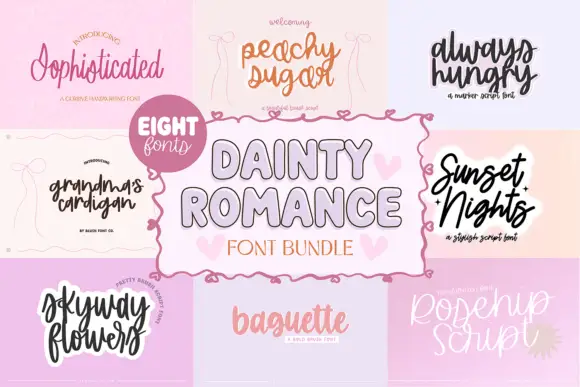
Eight contrasting romantic scripts from a fine flourish to a loose brush hand
Dainty Romance Script Bundle collects eight romantic treatments in one set, from a fine flourishes script to a loose brush hand, so a project can layer several voices from one purchase.
Ideas for this font
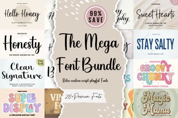
Twenty-plus scripts, serifs and displays
The Mega Font Bundle is a set of more than twenty faces: modern handwriting scripts, a clean signature, a wide comic serif, a chunky pastel display, a vintage label serif and a swashed script, presented as a grid of torn-paper tiles around a central card.
Ideas for this font
Same independent foundry
Allow optional Google Analytics to measure visits and catalogue actions. Your search words and notes are not included. Privacy & storage