High-Contrast Display Serif

Bread and Circus + The Lumina Awesome
Pairs sculptural editorial warmth with Bread and Circus's clean modern geometry.
Inspect The Lumina Awesome specimenDisclosure: MakerFileHub may earn a commission from qualifying purchases via paid links on this page. How our links work.
Outline lettering with a textured script and matching line, regular and sketch cuts
Bread and Circus is a bundle in which one hand-lettered drawing is supplied as an outline, a solid, a textured script and a sketch, so a single word can be printed hollow, filled or worn from one artwork.
Paid link
Get this fontProject & layout blueprintsAt-a-glance maker compatibility
Weld or Unite overlapping script joins into one continuous vector path before sending to the blade.
Visual anatomy & craft review
The upper word is drawn as a soft serif with an open face and a darker contour, which is how the sample gets its illustrated look without a second typeface. The lower word is the script cut: a heavy connected hand with a swollen middle stroke, a tight loop on the C and a tail that flicks up at the end, printed in the same ink as the outline above. Because all four cuts share proportions, a designer can stack the outline and the solid to build a shadow, or use the sketch for a stamped look on kraft. The texture in the printed cut is what keeps the bundle from reading as a clean vector set. The cream ground, the croissant, the jester, the stars and the small caption are presentation; the bundle is the lettering.
Sketchy · Outlined · Layered
Two-font hierarchy recipes
Tested contrast partners — pairing Bread and Circus with grounded secondary typography.
Bread and Circus + The Lumina Awesome
Pairs sculptural editorial warmth with Bread and Circus's clean modern geometry.
Inspect The Lumina Awesome specimen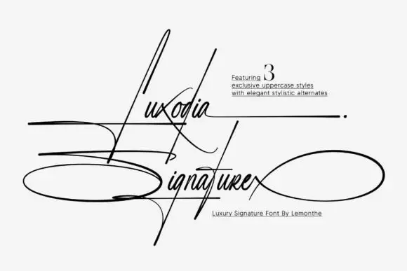
Bread and Circus + Luxodia Signature
Introduces organic movement on pull-quotes, signatures and gift tags.
Inspect Luxodia Signature specimenPractical applications
Concrete hierarchy, scale and production guidance tailored to Bread and Circus’s stroke geometry.
The outline and the script together carry a magazine cover as a drawn illustration, and the two cuts register so the feature reads as commissioned rather than pulled from a font menu.
Hierarchy & layout recipe
Print an A4 cover: set the outline word at 64 pt across the upper half, register the script cut at 46 pt across the middle, and keep 20 mm of margin so the sketch contour is not trimmed by the bleed.
Pre-production check
Two registered cuts drift by a hair on a digital press; check the imposed cover and keep 0.5 mm of trap between the outline and the fill.
The sketch cut gives a welcome sign a hand-drawn warmth, and the matching outline lets a short line read at 10 cm without any other ornament.
Hierarchy & layout recipe
Print a 700 by 500 mm board: set the greeting in the sketch cut at 10 cm, set the names in the outline cut at 6 cm beneath, and leave 10 cm of border so both cuts sit clear of the wooden frame.
Pre-production check
A sketch contour can look like a printing fault at a distance; check the board from three metres and switch to the solid cut if the drawing reads as damage.
The outline holds at 12 pt on a jar label while the script signs the producer, so one label carries illustration and signature together.
Hierarchy & layout recipe
Print a 55 by 70 mm label: set the product in the outline cut at 12 pt, set the maker in the script cut at 11 pt beneath, and keep 5 mm of margin so the contour does not touch the label edge on the curve of the jar.
Pre-production check
An outline under 0.4 mm fills in on a small label; check a printed label on the actual jar and use the solid cut below 12 pt.
Technical & licence verification
Confirm included OTF/TTF/WOFF formats, full glyph tables and licence coverage on the live store page before batch production.
Closest visual alternatives
Matched across letterform anatomy, stroke behaviour and craft applications.

Coral collection of five weights and cuts
Merida Coast is a collection of five styles in one coral ink: a fat solid capital face, an outlined capital face, a bold italic brush, a tracked small-caps line and a script.
Ideas for this font
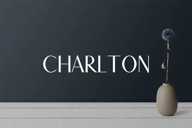
A restrained uppercase specimen with thin arms and modest curved-stroke contrast
Charlton 7 Font Family Pack shows one pale capital title on a dark wall beside a vase: slim horizontal arms meet stronger upright and curved strokes, the O closes as a rounded oval and the R keeps a short bowl above an angled leg.
Ideas for this font
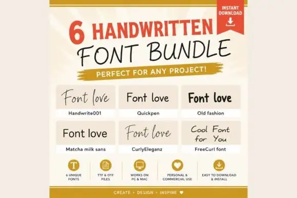
Six contrasting handwritten treatments in one set, from a loose script to a rounded sans
Handwritten Bundle collects six handwritten treatments in one set, ranging from a loose pen script to a rounded marker sans, so a project can carry several handwritten voices without mixing sources.
Ideas for this font
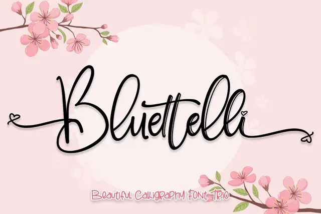
Thin decorated script with a drawable floral companion
Bluettelli is a thin script with a tall looped capital, sold as a duo with a drawn floral companion, and the sample pairs the word with cherry blossom so the script reads as part of an illustration.
Ideas for this font
Same independent foundry
Allow optional Google Analytics to measure visits and catalogue actions. Your search words and notes are not included. Privacy & storage