Modern Grotesque Body

Geliga + Monure
Creates crisp high-hierarchy contrast beneath Geliga headlines across menus, websites and labels.
Inspect Monure specimenDisclosure: MakerFileHub may earn a commission from qualifying purchases via paid links on this page. How our links work.
Heavy contrasting mixed case with an i-dot stroke enclosing the ending
Geliga shows gold mixed case on a dark portrait: thick curved sides meet fine joins, the g closes a low enclosed bowl and a long thin curve grows from the i-dot area to wrap around the right end of the word.
Paid link
Get this fontProject & layout blueprintsAt-a-glance maker compatibility
Sturdy stroke walls and open counters weed cleanly on adhesive vinyl, HTV apparel film, and cut cardstock.
Visual anatomy & craft review
The stems stay heavy and curved, the joins thin to hairlines, the g hangs a closed lower bowl and the enclosing stroke sweeps out of the upper line to finish past the last letter. The enclosing curve is the character: the word is closed by a single drawn arc, which is why the sample sets one name over a portrait. Because the arc and the low bowl both travel, keep 24 mm beneath and 22 mm at the right from 28 pt; the star above the opening letters and the metallic finish are effects, not verified glyphs.
Contrast · Enclosing stroke · Enclosed bowl
Two-font hierarchy recipes
Tested contrast partners — pairing Geliga with grounded secondary typography.
Geliga + Monure
Creates crisp high-hierarchy contrast beneath Geliga headlines across menus, websites and labels.
Inspect Monure specimen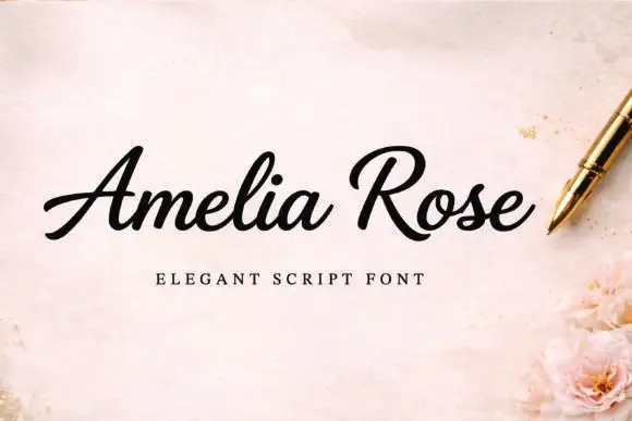
Geliga + Amelia Rose
Adds a warm human signature touch for 1-to-3-word callouts without competing against structured serif capitals.
Inspect Amelia Rose specimenPractical applications
Concrete hierarchy, scale and production guidance tailored to Geliga’s stroke geometry.
The enclosing arc gives a cover its close, and the heavy contrast holds a one-word title at 62 pt on a coated cover. The enclosing arc also keeps a cover from needing a rule.
Hierarchy & layout recipe
Print an A4 cover: set the title at 62 pt, keep 24 mm of clear ground beneath the arc, and set the cover lines at 9 pt in a small caps along the foot with 16 mm of space. Keep the foot band plain.
Pre-production check
An arc printed over a metallic ground loses its thin end; check the cover and keep the title on a matte area. Ask for a proof on matte stock.
The enclosed bowl gives a label a jewelled look, and the heavy stems stay solid at 22 pt on a 50 mm panel. The enclosed bowl also gives a small label its one curve.
Hierarchy & layout recipe
Print a 50 by 40 mm label: set the name at 22 pt, keep 8 mm beneath for the low g bowl, and set the city in a 6 pt caps at the foot with 4 mm of clear ground. Keep the label square.
Pre-production check
A hairline arc printed at 16 pt breaks; check the plate proof and keep the name at 20 pt or above. Ask for a plate proof first.
The enclosing stroke finishes a pair of names elegantly, and the heavy letters keep the row readable at 24 pt on heavy card stock. The arc also frames a pair of names without ornament.
Hierarchy & layout recipe
Print a 130 by 180 mm card: set the names at 24 pt, keep 22 mm of clear card at the right end for the arc, and set the venue at 9 pt in a light serif with 14 mm of clear ground below.
Pre-production check
A metallic finish on fine hairlines looks uneven; check the proof and print the names in one flat ink. Keep the venue line short.
Technical & licence verification
Confirm included OTF/TTF/WOFF formats, full glyph tables and licence coverage on the live store page before batch production.
Closest visual alternatives
Matched across letterform anatomy, stroke behaviour and craft applications.
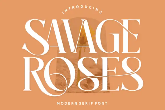
Tall contrasting serif with loops
Savage Roses is a tall contrasting serif in white on a warm tan ground: heavy stems with hairlines, wide serifs, and loops that leave the capitals and extend across the words in long horizontal sweeps, with a small tracked line above in a curved rule and a caption beneath.
Ideas for this font
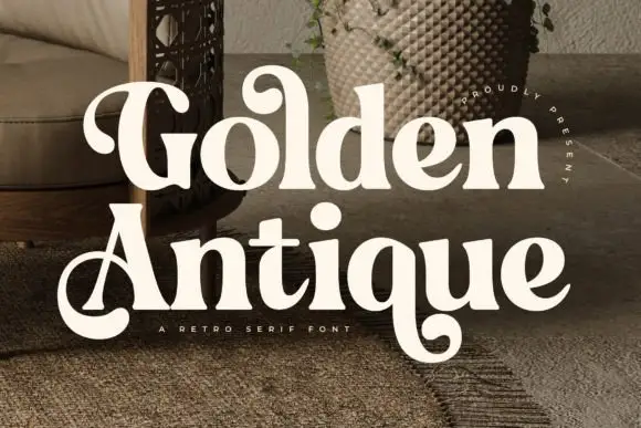
Retro serif with bulbous ball terminals and a swash tail
Golden Antique is a retro serif in which the stems swell, the terminals turn into balls and the final letter drops a swash, so a two-word title reads as a 1970s record sleeve rather than as a classical serif.
Ideas for this font
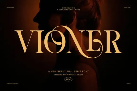
High-contrast display serif
Vioner is a high-contrast display serif in gold over a dark portrait: massive stems with hairlines as thin as rules, a looping N diagonal that crosses the following letter and long flared serifs, set as one wide word with tracked notes at the top and a credit below.
Ideas for this font
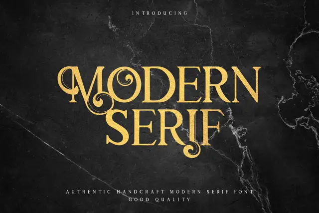
Display serif with ornate curled details
Modern Serif is a display serif in gold on dark marble: heavy letters with curled hairlines growing out of the stems, small flourishes at the feet and a moderate contrast, set as two stacked words with a tracked line beneath.
Ideas for this font
Same independent foundry
Allow optional Google Analytics to measure visits and catalogue actions. Your search words and notes are not included. Privacy & storage