Modern Grotesque Body

Vioner + Prime Nordic
Creates crisp high-hierarchy contrast beneath Vioner headlines across menus, websites and labels.
Inspect Prime Nordic specimenDisclosure: MakerFileHub may earn a commission from qualifying purchases via paid links on this page. How our links work.
High-contrast display serif
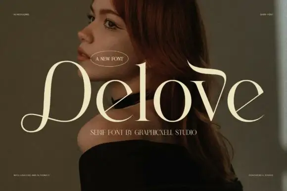
Vioner is a high-contrast display serif in gold over a dark portrait: massive stems with hairlines as thin as rules, a looping N diagonal that crosses the following letter and long flared serifs, set as one wide word with tracked notes at the top and a credit below.
Paid link
Get this fontProject & layout blueprintsAt-a-glance maker compatibility
Sturdy stroke walls and open counters weed cleanly on adhesive vinyl, HTV apparel film, and cut cardstock.
Visual anatomy & craft review
The word fills the plate and the drawing is a display serif at the top of the contrast scale: the verticals are very heavy, the joins are hairlines, and the N is drawn with a diagonal that loops out of the letter and overlaps its neighbour, which is what makes the word read as one drawn object. That kind of construction is a display decision, so the face belongs at large sizes on a smooth ground, and the sample sets it over a silhouette where the gold holds against the darkest area. The corner notes and the credit beneath are tiny tracked caps, which keeps the sheet reading like a foundry specimen. Because the hairlines are so fine, the face needs coating or a screen at high resolution, and the plate is honest about it by keeping the background dark and smooth.
Serif, display, contrast, dramatic
Two-font hierarchy recipes
Tested contrast partners — pairing Vioner with grounded secondary typography.
Vioner + Prime Nordic
Creates crisp high-hierarchy contrast beneath Vioner headlines across menus, websites and labels.
Inspect Prime Nordic specimen
Vioner + Easy Handwriting
Adds a warm human signature touch for 1-to-3-word callouts without competing against structured serif capitals.
Inspect Easy Handwriting specimenPractical applications
Concrete hierarchy, scale and production guidance tailored to Vioner’s stroke geometry.
A high-contrast serif gives a cover a masthead that reads as couture, and the looping diagonal lets a short title fill the width with one gesture.
Hierarchy & layout recipe
Set the masthead at 110 mm cap height across 210 mm, the cover lines in an 8 pt sans, and the issue at 7 pt. Print one ink on a coated stock and keep the masthead off the model's face.
Pre-production check
Check the masthead at 110 mm, where a hairline join can break; keep the joins above 0.25 mm. Confirm the 7 pt issue survives lamination and that the loop stays inside the trim.
A display serif with a drawn diagonal gives a luxury mark a signature, and the family range lets the same voice carry a box and a card.
Hierarchy & layout recipe
Set the mark at 20 pt on a card, 90 mm on a box and 12 pt in a footer, keeping the loop only above 26 pt. Keep one colour and hold clear space equal to the loop height.
Pre-production check
Check the 12 pt footer, where the loop can collide with the line above; drop it at that size. Confirm the box mark reads at four metres and that the hairlines survive a matte varnish.
A high-contrast serif gives an evening wedding a formal voice, and the flared serifs hold in foil where a thin script would break up.
Hierarchy & layout recipe
A5 invitation: the names at 28 pt, the request in a 9.5 pt serif, and the date at 8.5 pt caps. Keep 26 mm margins so the loop has room and foil one colour on a deep card.
Pre-production check
Check the 28 pt names in foil, where a hairline can break the edge; keep it above 0.3 mm. Confirm the 9.5 pt request reads at arm's length and that the loop clears the trim by 10 mm.
Technical & licence verification
Confirm included OTF/TTF/WOFF formats, full glyph tables and licence coverage on the live store page before batch production.
Closest visual alternatives
Matched across letterform anatomy, stroke behaviour and craft applications.
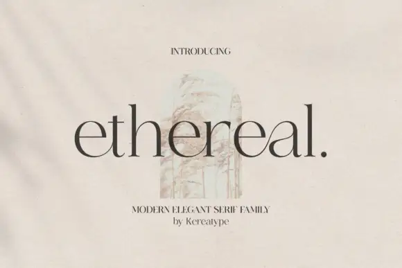
Fine lowercase serif with broad open bowls and tall ascenders
Ethereal shows dark lowercase letters with high contrast, thin joins and broad circular bowls, where tall h and l stems rise well above the rounded e forms and a small full stop ends the title.
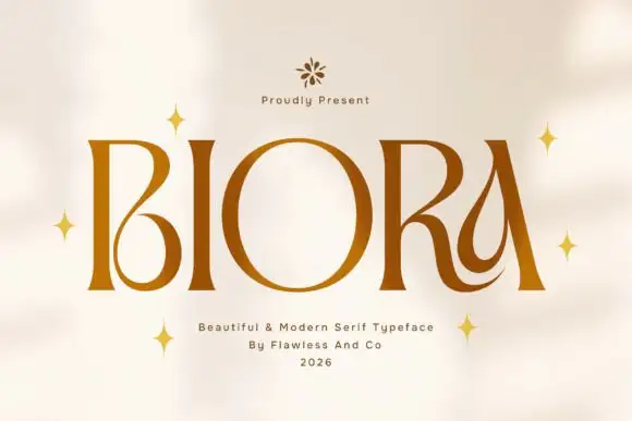
Tall contrasting capitals with inward curls and a broad circular O
Biora shows ochre serif capitals with long upright stems and a very broad O: the B lower bowl turns inward, and the R leg and final A form low curved hooks beside fine diagonal joins, with small gold stars around the title.
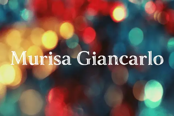
Classic text serif
Murisa Giancarlo is a classic serif in white over a bokeh photograph: moderate contrast, bracketed serifs, a wide oval O and an even rhythm, set as a single line with no ornament and no caption, so the plate reads as a name in lights rather than a specimen.
Ideas for this font
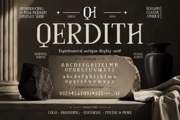
Experimental antique display serif
Qerdith is an experimental antique display serif in cream on a museum-style still life: narrow upright capitals with angular bowl joints, small ornamental serifs, a monogram at the top between dated notes, and sample rows of uppercase, lowercase, numerals and punctuation set on a stone tablet.
Ideas for this font
Same independent foundry
Allow optional Google Analytics to measure visits and catalogue actions. Your search words and notes are not included. Privacy & storage