Modern Grotesque Body

Dancing in the Rain + Kohilo
Creates crisp high-hierarchy contrast beneath Dancing in the Rain headlines across menus, websites and labels.
Inspect Kohilo specimenDisclosure: MakerFileHub may earn a commission from qualifying purchases via paid links on this page. How our links work.
Fine uppercase title paired with a strongly slanted lowercase phrase
Dancing in the Rain pairs a high-contrast serif capital line with the same face slanted hard into an italic, so a two-part title reads as one loud statement and one quieter afterthought.
Paid link
Get this fontProject & layout blueprintsAt-a-glance maker compatibility
Crisp hairline serifs shine on stationery, foil stamping, and packaging; add slight offset for small decals.
Visual anatomy & craft review
DANCING stands upright in wide white capitals with sharp bracketed serifs, thin hairlines and fine hairlines that hold only because the size is generous, while in the RAIN drops into a steep italic with a slanted e and a fast angled t. The contrast between the two halves is entirely structural, not decorative: no swash, no shadow, just roman against oblique. The sample runs it over a moody hillside photograph, with small captions in the same italic underneath. Hairlines are the fragility of this face, so it needs coated stock or a generous size, and heavy photography behind it needs a dark scrim to stop the fine strokes from breaking into the picture.
Fine uppercase title paired with a strongly slanted lowercase phrase
Two-font hierarchy recipes
Tested contrast partners — pairing Dancing in the Rain with grounded secondary typography.
Dancing in the Rain + Kohilo
Creates crisp high-hierarchy contrast beneath Dancing in the Rain headlines across menus, websites and labels.
Inspect Kohilo specimen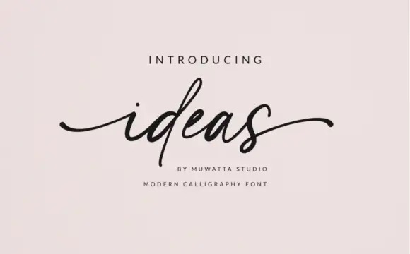
Dancing in the Rain + Ideas
Adds a warm human signature touch for 1-to-3-word callouts without competing against structured serif capitals.
Inspect Ideas specimenPractical applications
Concrete hierarchy, scale and production guidance tailored to Dancing in the Rain’s stroke geometry.
The roman against italic split gives an opener two voices at once, and the fine serifs hold at a magazine's large title size where hairlines can survive.
Hierarchy & layout recipe
Print a 210 by 280 mm page: set the upright half at 84 pt and the italic at 72 pt on the line beneath, keep 20 mm of clear ground under it before the standfirst at 10 pt, and keep 18 mm of margin from the text block.
Pre-production check
Hairlines break on uncoated paper; check the proof on the chosen stock before the print run.
A roman line with an italic second line is the classic wedding hierarchy, and the high contrast keeps a plain cream card from looking empty.
Hierarchy & layout recipe
Print a 130 by 180 mm invitation: set the upright names at 32 pt and the italic date at 22 pt below, keep 18 mm of clear ground beneath before the venue at 9 pt, and keep 16 mm of margin on each side.
Pre-production check
Fine serifs may need foil or letterpress; check a printed test before committing the whole suite.
The upright-plus-italic pairing gives a studio a mark that reads as editorial rather than corporate, and the fine serifs reproduce well on a printed card.
Hierarchy & layout recipe
Print a 55 by 90 mm business card: set the studio name at 16 pt on one row, keep 8 mm of clear ground beneath before the contact line at 6 pt, and keep 6 mm of margin so the serifs are not clipped.
Pre-production check
Small sizes thin the hairlines to nothing; check the card proof before printing a full box.
Technical & licence verification
Confirm included OTF/TTF/WOFF formats, full glyph tables and licence coverage on the live store page before batch production.
Closest visual alternatives
Matched across letterform anatomy, stroke behaviour and craft applications.

Tall light capitals with long overlapping crossbars
Beach Dates is a tall light capital face in which the C and D open broad curves, the serifs taper finely and the H crossbar reaches left into the C while the T bar stretches across the row below, so two stacked words lock into one form.
Ideas for this font
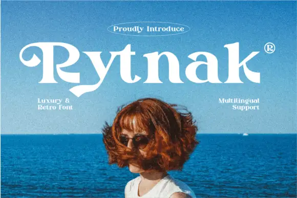
Heavy retro serif
Rytnak is a heavy retro serif in white over a photograph of a figure against a blue sea: fat stems, a hooked R, a pointed y tail and wide bowls, set as one word with a tracked line above in an oval rule and two small notes at the sides.
Ideas for this font
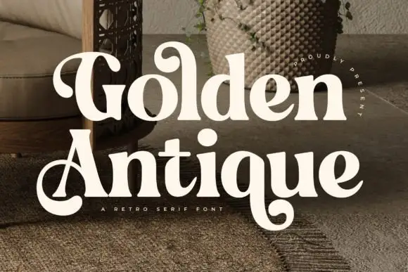
Retro serif with bulbous ball terminals and a swash tail
Golden Antique is a retro serif in which the stems swell, the terminals turn into balls and the final letter drops a swash, so a two-word title reads as a 1970s record sleeve rather than as a classical serif.
Ideas for this font
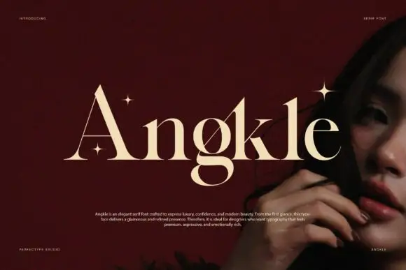
Broad mixed-case serif forms with fine diagonal cuts and a low g loop
Angkle shows pale lettering across a deep red field beside a portrait, where the capital A has a very fine left diagonal and a low crossbar while the lowercase n and g keep substantial rounded sides and narrow internal joins.
Same independent foundry
Allow optional Google Analytics to measure visits and catalogue actions. Your search words and notes are not included. Privacy & storage