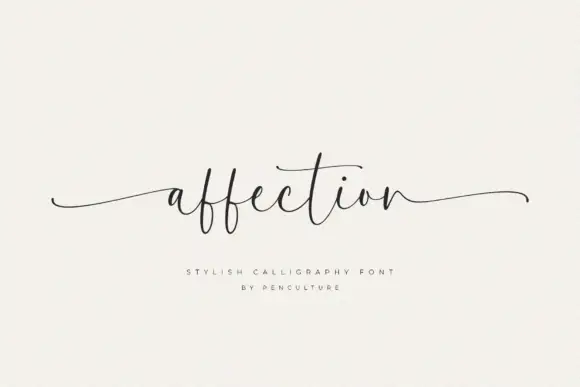
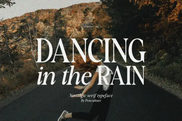
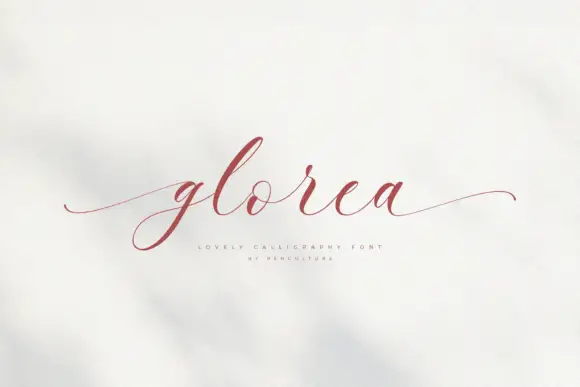
Editorial Serif Anchor

Harmony + Cronelo
Anchors Harmony's fluid strokes with crisp Roman proportions on wedding suites, headers and packaging.
Inspect Cronelo specimenDisclosure: MakerFileHub may earn a commission from qualifying purchases via paid links on this page. How our links work.
Speckled looping monoline script with a hand-textured stroke
Harmony is a looping monoline script whose strokes carry a fine speckled texture, so a word reads as if it had been drawn with a textured pen on rough paper rather than filled solidly.
Paid link
Get this fontProject & layout blueprintsAt-a-glance maker compatibility
Weld or Unite overlapping script joins into one continuous vector path before sending to the blade.
Visual anatomy & craft review
The capital H opens as a tall loop that closes against its stem, and the letters after it stay round and connected: the a closes a small bowl, the r keeps a short arm, the m holds three even arches and the y drops a loop that returns under the following letter. The weight is a true monoline, but the inside of every stroke is speckled with tiny gaps, which is what gives the face its vintage printed look and keeps a white word from reading flat on a dark ground. The loops stay open, the baseline is level and the ends finish in a long flat exit rather than a taper. The dark ground, the white ink and the three small caption blocks around the word are presentation; the script is the word.
Speckled · Looped · Monoline
Two-font hierarchy recipes
Tested contrast partners — pairing Harmony with grounded secondary typography.
Harmony + Cronelo
Anchors Harmony's fluid strokes with crisp Roman proportions on wedding suites, headers and packaging.
Inspect Cronelo specimen
Harmony + Kohilo
Keeps small-scale dates, URLs, nutrition facts and care instructions crisp and legible below script titles.
Inspect Kohilo specimenPractical applications
Concrete hierarchy, scale and production guidance tailored to Harmony’s stroke geometry.
The speckled texture gives a header the feel of old letterpress, and the monoline weight keeps the word readable at 44 pt over a dark spread.
Hierarchy & layout recipe
Set the header at 44 pt across the opening spread, keep the body in a 10 pt serif at 13 pt leading, and hold 16 mm below the header so the exit stroke has room.
Pre-production check
Speckles under 0.1 mm disappear in offset; check the page proof and keep the texture coarse enough to survive the screen ruling.
The textured monoline suits a period venue, and the round loops read across a room at 12 cm even when the paint is slightly uneven.
Hierarchy & layout recipe
Set the greeting at 12 cm on a 600 by 500 mm board, set both names at 7 cm beneath it, and leave 12 cm of margin so the exit stroke stays on the board.
Pre-production check
A speckled stroke painted by hand loses its texture at distance; check the sign from three metres and keep the stroke solid rather than stippled.
The vintage texture gives a small label character without illustration, and the monoline stroke holds at 12 pt where a contrasted script would break.
Hierarchy & layout recipe
Set the brand at 12 pt on a 50 by 75 mm label, keep the weight or contents in a 6 pt sans, and leave 6 mm of margin so the looped letters stay inside the edge.
Pre-production check
A textured stroke printed on kraft can break along the speckles; print one label on the actual board and smooth the texture before the run.
Technical & licence verification
Confirm included OTF/TTF/WOFF formats, full glyph tables and licence coverage on the live store page before batch production.
Closest visual alternatives
Matched across letterform anatomy, stroke behaviour and craft applications.
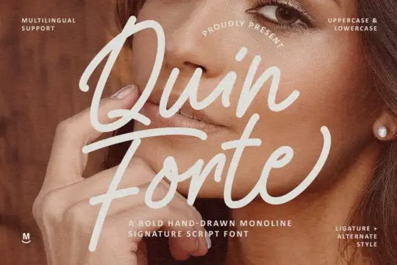
Broad monoline signature loops
Quin Forte is a broad monoline signature in cream over a portrait: wide even strokes, a capital Q that loops high above the word and a long horizontal return that runs under both lines.
Ideas for this font
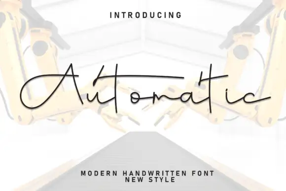
Angular extended monoline signature with flat joins
Automatic is an extended monoline signature built from straight segments and shallow angles, with flat-entry joins and a bar carried across the whole word, so it reads as a technical drawing of handwriting rather than as calligraphy.
Ideas for this font
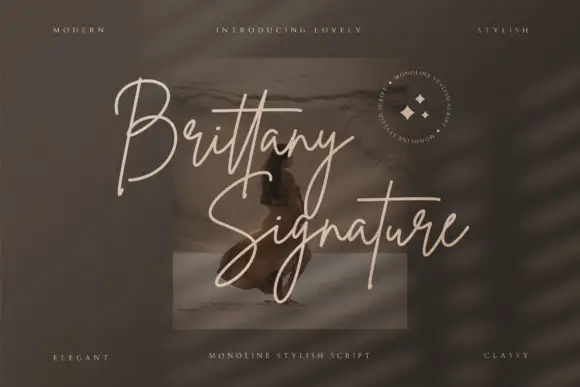
Monoline signature script with tall slender loops
Brittany Signature is a monoline signature script in which the capitals rise into slender loops, the body stays narrow and the joins stay even, so a name reads as a quick signature made with a fine marker.
Ideas for this font
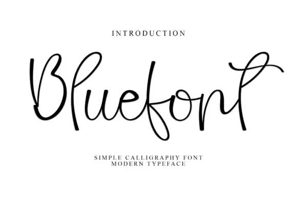
Open looping monoline script with exaggerated ascenders
Blue is an open monoline script whose ascenders and descenders run two or three times the x-height, with wide untouching loops and thin joins that make the word read as a loose ribbon rather than a solid line of text.
Ideas for this font
Same independent foundry
Allow optional Google Analytics to measure visits and catalogue actions. Your search words and notes are not included. Privacy & storage