Modern Grotesque Body

Conso + Borsen
Creates crisp high-hierarchy contrast beneath Conso headlines across menus, websites and labels.
Inspect Borsen specimenDisclosure: MakerFileHub may earn a commission from qualifying purchases via paid links on this page. How our links work.
Broad thin capitals with near-circular bowls and short fine serifs
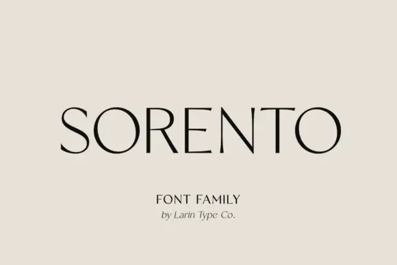
Conso Serif is a broad thin capital face in which the bowls close near circles, the stems stay light and the serifs finish short and fine, so a single name reads as a modern fashion masthead across an otherwise empty field.
Paid link
Get this fontProject & layout blueprintsAt-a-glance maker compatibility
Crisp hairline serifs shine on stationery, foil stamping, and packaging; add slight offset for small decals.
Visual anatomy & craft review
The O and Q turn wide circular bowls, the N runs a long thin diagonal between two light stems, the C opens a broad crescent and every straight stem ends in a short fine serif that barely leaves the letter. The near-circular geometry is the character: it holds a name wide and quiet, which is why the sample centres one word with generous blank space and a small serif subtitle. The family runs seven weights upright and italic, so a title can move from thin to bold without a second licence, and the thin cut wants coated stock from 16 pt. The pale field, the small subtitle and the slanted attribution are presentation.
Modern serif · Thin · Wide bowls
Two-font hierarchy recipes
Tested contrast partners — pairing Conso with grounded secondary typography.
Conso + Borsen
Creates crisp high-hierarchy contrast beneath Conso headlines across menus, websites and labels.
Inspect Borsen specimen
Conso + Farmhouse
Adds a warm human signature touch for 1-to-3-word callouts without competing against structured serif capitals.
Inspect Farmhouse specimenPractical applications
Concrete hierarchy, scale and production guidance tailored to Conso’s stroke geometry.
The circular bowls give a masthead symmetry, and the seven-weight family lets the title sit thin while the standfirst uses a bold cut at 12 pt.
Hierarchy & layout recipe
Print an A4 cover: set the masthead at 84 pt across the upper third, set the standfirst at 12 pt in a mid weight 24 mm beneath, and keep 26 mm of clear margin at both sides.
Pre-production check
A thin circular bowl printed at 84 pt on newsprint breaks its hairlines; check the stock and print the masthead coated or one weight heavier.
The wide bowls space a long studio name without ornament, and the light stems hold at 30 pt on a card with plenty of white.
Hierarchy & layout recipe
Print an 85 by 55 mm card: set the studio name at 30 pt with wide tracking, set the address at 7 pt in the italic cut beneath, and keep 14 mm of clear space below the wordmark.
Pre-production check
Wide tracking over a fine serif looks loose rather than airy; check the card and hold the tracking under 80 units.
The thin capitals suit a contemporary invitation, and the circular bowls keep a pair of names balanced at 24 pt on heavy card.
Hierarchy & layout recipe
Print a 130 by 180 mm card: set the names at 24 pt on one line, set the date and venue at 9 pt in a light serif beneath, and keep 20 mm of margin on all four sides.
Pre-production check
Two names set in a light cut at 18 pt lose their serifs on a textured stock; check the proof and keep the line at 22 pt or above.
Technical & licence verification
Confirm included OTF/TTF/WOFF formats, full glyph tables and licence coverage on the live store page before batch production.
Closest visual alternatives
Matched across letterform anatomy, stroke behaviour and craft applications.
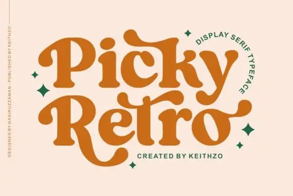
Curved retro serifs with extended terminals
Picky Retro is a chunky retro display serif in burnt orange: fat bracketed strokes, curved serifs that drop below the baseline, and long ball terminals that turn the P and the R into flourishes.
Ideas for this font
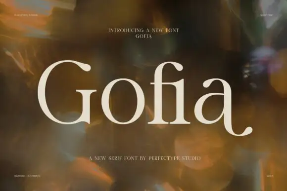
Light serif with ball-ended hooks and a low outward curl on the a
Gofia is a light modern serif in which the hairline joins stay delicate, the bowls run broad and round, the G and f finish in ball-ended hooks and the final a throws a low curl outward, so a short name reads as warm editorial lettering.
Ideas for this font
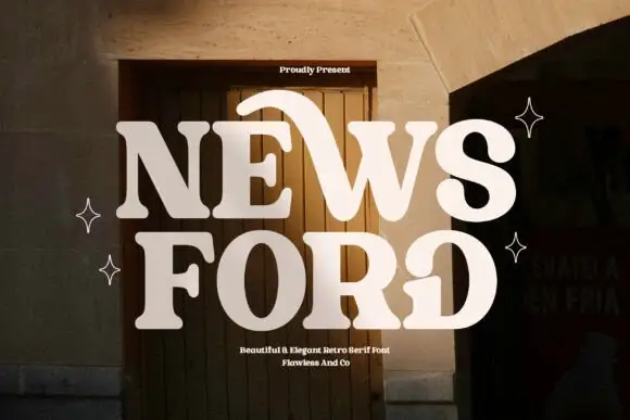
Retro serif with sweeping curved details
News Ford is a retro serif in cream over a warm doorway photograph: fat letters with a moderate contrast, curved details that sweep out of the W and the O, and rounded serifs, with small capital lines above and below.
Ideas for this font
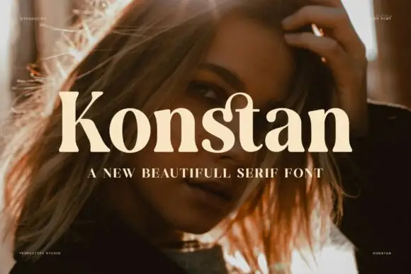
Heavy soft serif with rounded transitions and a warm weight
Konstan is a heavy serif in which the stems swell, the transitions round off and the serifs soften, so a single name reads as a warm printed label rather than as a sharp headline.
Ideas for this font
Same independent foundry
Allow optional Google Analytics to measure visits and catalogue actions. Your search words and notes are not included. Privacy & storage