Modern Grotesque Body

Christmas Melody + Limited Coffee
Creates crisp high-hierarchy contrast beneath Christmas Melody headlines across menus, websites and labels.
Inspect Limited Coffee specimenDisclosure: MakerFileHub may earn a commission from qualifying purchases via paid links on this page. How our links work.
Heavy condensed serif with small rounded feet and tight fitting
Christmas Melody is a heavy condensed serif in which the stems are fat, the feet round off into small pads and the fit stays tight, so a two-word greeting builds a solid block on a card.
Paid link
Get this fontProject & layout blueprintsAt-a-glance maker compatibility
Sturdy stroke walls and open counters weed cleanly on adhesive vinyl, HTV apparel film, and cut cardstock.
Visual anatomy & craft review
The C closes a narrow crescent with a rounded foot, the H keeps two heavy stems and a low bar, the M splays from a narrow vertex and the Y forks with rounded ends, all at a maximal weight with a moderate contrast and small rounded serifs. That combination is what gives the face its seasonal retail register rather than the look of a Victorian slab: the feet are pads rather than plates, which softens the block at 40 pt. The condensed width is what lets two long words stack in a portrait format with tight leading. Counters are narrow, so the face wants 24 pt minimum and belongs on greetings rather than on lists. The pale paper ground, the red and green inks, the fir, the lantern and the two caption lines are presentation; the serif is the two words.
Condensed · Heavy · Festive
Two-font hierarchy recipes
Tested contrast partners — pairing Christmas Melody with grounded secondary typography.
Christmas Melody + Limited Coffee
Creates crisp high-hierarchy contrast beneath Christmas Melody headlines across menus, websites and labels.
Inspect Limited Coffee specimen
Christmas Melody + Honey
Adds a warm human signature touch for 1-to-3-word callouts without competing against structured serif capitals.
Inspect Honey specimenPractical applications
Concrete hierarchy, scale and production guidance tailored to Christmas Melody’s stroke geometry.
The condensed heavy serif stacks two words tightly on a portrait card, and the rounded feet keep the block warm at 34 pt rather than severe.
Hierarchy & layout recipe
Print a 105 by 180 mm portrait card: set the greeting at 34 pt in two lines with 8 mm leading, set the family name in an 8 pt caps serif at the foot, and keep 15 mm of margin so the rounded feet stay inside the trim.
Pre-production check
Two condensed lines at 8 mm leading can merge their feet; check the proof and open the leading by 2 mm rather than reducing the point size.
The heavy weight reads on a kraft hamper label at 13 pt, and the condensed fit keeps a long product name on a single line.
Hierarchy & layout recipe
Print a 70 by 50 mm kraft label: set the product at 13 pt, set the contents in a 5.5 pt caps serif beneath, and keep 5 mm of margin so the rounded feet are not cut by the label corner.
Pre-production check
Kraft closes the narrow counters of a condensed face; check a printed label on the actual stock and open the tightest counter before the run.
The block weight reads at 12 cm through a doorway, and the rounded feet keep a seasonal sign from looking like a hardware notice.
Hierarchy & layout recipe
Print a 600 by 400 mm panel: set the greeting at 12 cm across the upper half, set the dates in a 4 cm caps serif below, and leave 8 cm of border so the feet sit clear of the frame and the fixings.
Pre-production check
A heavy condensed face printed on a narrow panel can look squeezed; check the sign at full size and keep the letters inside the panel width rather than tracking them out.
Technical & licence verification
Confirm included OTF/TTF/WOFF formats, full glyph tables and licence coverage on the live store page before batch production.
Closest visual alternatives
Matched across letterform anatomy, stroke behaviour and craft applications.
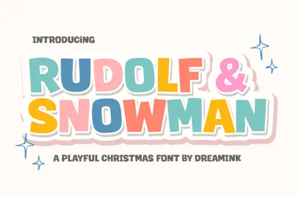
Playful multicolour sticker display
Rudolf and Snowman is a playful display in pastel colours on white: rounded caps of uneven height, a heavy white outline with a soft drop shadow, a large ampersand, and sparkle stars around the lockup, so the pair reads as a layered sticker set for a children's Christmas.
Ideas for this font
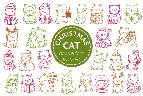
Festive cat outline dingbats with hats, gifts and winter costumes
Christmas Cat is a dingbat set of about twenty line-drawn cats in festive poses: a cat in a Santa hat, a cat inside a stocking, a cat with antlers, a cat under a tree and a cat curled in a bauble.
Ideas for this font
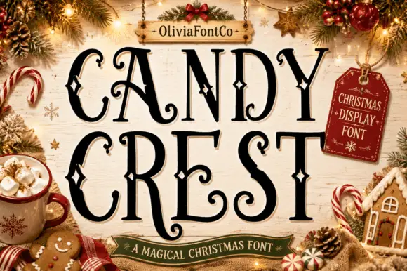
Fine Christmas capitals with curled terminals and outlined diamond accents
Candy Crest is a fine festive display in which the tall narrow capitals carry a strong thick-thin contrast, the terminals curl and small outlined diamonds sit inside selected stems and curves, so a greeting reads as decorated holiday lettering.
Ideas for this font
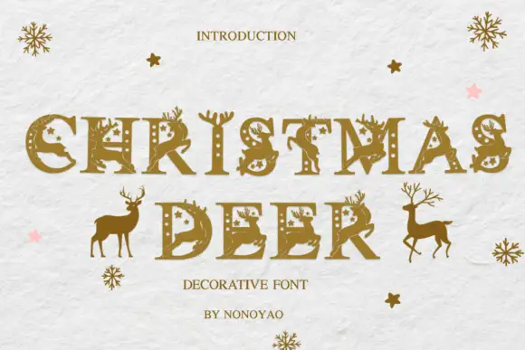
Slab capitals decorated with antlers, deer silhouettes, stars and dotted openings
Christmas Deer sets gold-toned capitals on pale textured paper. Antlers rise from several upper stems, deer silhouettes cross parts of the broad strokes, small star and dot openings puncture the bodies, and separate standing deer flank the second row as decoration distinct from the letters.
Ideas for this font
Same independent foundry
Allow optional Google Analytics to measure visits and catalogue actions. Your search words and notes are not included. Privacy & storage