Neutral Sans Workhorse

Christmas Deer + Corven
Lets Christmas Deer own the focal silhouette while handling secondary copy, sizing and subheads cleanly.
Inspect Corven specimenDisclosure: MakerFileHub may earn a commission from qualifying purchases via paid links on this page. How our links work.
Slab capitals decorated with antlers, deer silhouettes, stars and dotted openings
Christmas Deer sets gold-toned capitals on pale textured paper. Antlers rise from several upper stems, deer silhouettes cross parts of the broad strokes, small star and dot openings puncture the bodies, and separate standing deer flank the second row as decoration distinct from the letters.
Paid link
Get this fontProject & layout blueprintsAt-a-glance maker compatibility
Sturdy stroke walls and open counters weed cleanly on adhesive vinyl, HTV apparel film, and cut cardstock.
Visual anatomy & craft review
The strokes stay broad and slab-ended, the antlers climb off the stems, the silhouettes sit inside the letters and the counters open as stars and dots. That layered interior is the character: the word carries a whole winter scene without illustration, which is why the sample pairs two rows and flanks them with standing deer. The cover cannot establish whether the standalone deer or the gold effect are included, so confirm the motif mapping, inspect the fine antler branches at output size and give the decorated row extra spacing.
Slab capitals decorated with antlers, deer silhouettes, stars and dotted openings
Two-font hierarchy recipes
Tested contrast partners — pairing Christmas Deer with grounded secondary typography.
Christmas Deer + Corven
Lets Christmas Deer own the focal silhouette while handling secondary copy, sizing and subheads cleanly.
Inspect Corven specimen
Christmas Deer + Marquis - Elegant Modern Serif
Grounds bold display lettering with classic typographic authority on posters, badges and apparel.
Inspect Marquis - Elegant Modern Serif specimenPractical applications
Concrete hierarchy, scale and production guidance tailored to Christmas Deer’s stroke geometry.
The antlered capitals suit a tag, and the decorated bodies hold a short name at 26 pt on a 55 by 90 mm tag, where the star openings stay sharp in a die cut.
Hierarchy & layout recipe
Print a 55 by 90 mm tag: set the name at 26 pt on one row, keep 12 mm of clear ground beneath for the antler tips, keep 8 mm to the hole punch, and keep the gold effect off the fine branches.
Pre-production check
Antler tips thinner than 1 mm tear on a punched tag; check the die proof and hold the name at 24 pt or above.
The deer silhouettes give a jar a seasonal note, and the broad slabs hold a two-word name at 22 pt on a 50 mm round label, where the dotted counters stay readable on glass.
Hierarchy & layout recipe
Print a 50 mm round label: set the name at 22 pt across the middle, keep 10 mm of clear ground beneath before the weight at 6 pt, and keep the deer motif facing inward so it is not cut by the circle.
Pre-production check
A motif on the round edge gets trimmed; check the artwork and pull the motif inside a 40 mm safe circle.
The carved capitals read across a yard, and the heavy strokes hold a short sign at 60 mm on a painted board, where the antlers supply the seasonal cue without a second image.
Hierarchy & layout recipe
Paint a 700 by 350 mm board: set the sign at 60 mm on one row, keep 26 mm of clear ground above for the antlers, keep 24 mm of border, and seal the panel for wet weather.
Pre-production check
Painted antler branches blur under a brush; check the mask and keep the sign at 54 mm or above.
Technical & licence verification
Confirm included OTF/TTF/WOFF formats, full glyph tables and licence coverage on the live store page before batch production.
Closest visual alternatives
Matched across letterform anatomy, stroke behaviour and craft applications.
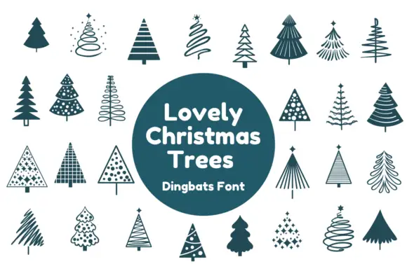
Christmas tree dingbats
Lovely Christmas Trees is a dingbat set on a cream ground: many small tree silhouettes drawn in a single teal, some solid, some spiral, some striped, some dotted and some made of fine radiating lines, arranged in rows around a solid teal circle that names the set and the format.
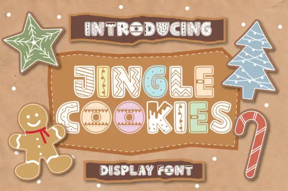
Rounded outlined capitals with varied icing-like stripes, dots and zigzag fills
Jingle Cookies draws fat hand-cut capitals and fills each one with a different piped icing pattern, so a seasonal word reads as a tray of decorated biscuits rather than as lettering.
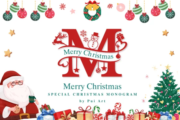
Ornate Christmas monogram with inset figures
Merry Christmas Monogram is a red ornamental initial in which a deer, a snowman and a pair of skates are drawn inside the letterforms: a heavy didone-style M with fine hairline accents, a green banner of serif capitals crossing it, and a page full of baubles, a wreath, a Santa and a tree.
Ideas for this font
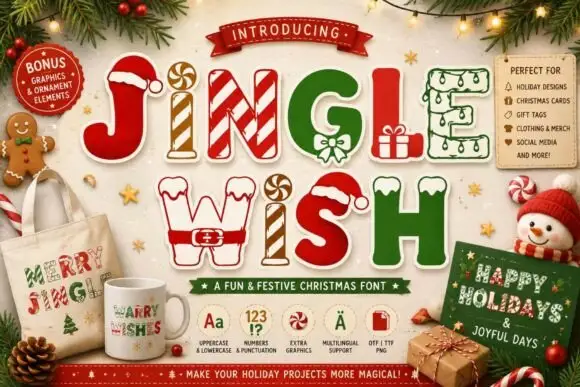
Christmas capitals dressed as festive objects
Jingle Wish shows chunky capitals decorated with candy stripes, hats, gifts and winter-clothing details: some characters arrive as outlines while others are solid filled shapes, so one word mixes two finishes.
Ideas for this font
Same independent foundry
Allow optional Google Analytics to measure visits and catalogue actions. Your search words and notes are not included. Privacy & storage