Neutral Sans Workhorse

Halloween + Bareum
Lets Halloween own the focal silhouette while handling secondary copy, sizing and subheads cleanly.
Inspect Bareum specimenDisclosure: MakerFileHub may earn a commission from qualifying purchases via paid links on this page. How our links work.
Jagged irregular capitals combining webs, hats, skull-like faces and sharp branch-like edges
Halloween stretches an uneven dark word across an ivory field, where tall pointed stems lean at different angles, a witch hat sits on the left, webs span several openings and sharp branch-like edges break the outer contours of the letters.
Paid link
Get this fontProject & layout blueprintsAt-a-glance maker compatibility
Sturdy stroke walls and open counters weed cleanly on adhesive vinyl, HTV apparel film, and cut cardstock.
Visual anatomy & craft review
The stems lean unevenly, the edges break into branches, the webs fill the counters and the ornaments sit inside the word. That layered construction is the character: the letters carry the whole scene rather than sitting in front of it, which is why the sample needs an ivory ground. Confirm the decorated-letter mapping and the exact word, keep 44 pt so the webs stay open and check that the outer trees and spider are not promised as part of the file.
Jagged irregular capitals combining webs, hats, skull-like faces and sharp branch-like edges
Two-font hierarchy recipes
Tested contrast partners — pairing Halloween with grounded secondary typography.
Halloween + Bareum
Lets Halloween own the focal silhouette while handling secondary copy, sizing and subheads cleanly.
Inspect Bareum specimen
Halloween + Stanza
Grounds bold display lettering with classic typographic authority on posters, badges and apparel.
Inspect Stanza specimenPractical applications
Concrete hierarchy, scale and production guidance tailored to Halloween’s stroke geometry.
The jagged caps set a seasonal poster, and the uneven stems hold a two-word title at 56 pt on an A2 sheet, where the webs read at distance.
Hierarchy & layout recipe
Print an A2 poster: set the title at 56 pt on one row, keep 26 mm of clear ground beneath before the times at 15 pt, and keep the ivory ground so the dark letters separate.
Pre-production check
Web strands under 0.5 mm fill in at banner size; check the proof and keep the title at 48 pt or above.
The branch edges suit a fiction heading, and the leaning stems hold a two-word title at 48 pt on a page, where the webs supply the period tone.
Hierarchy & layout recipe
Print a 210 mm page: set the heading at 48 pt on one row, keep 22 mm of clear ground beneath before the standfirst at 10 pt, and keep the body in a plain roman so the decorated row stands alone.
Pre-production check
Two decorated rows on one page become visual noise; check the layout and keep the deck in a plain roman.
The jagged forms read on a dark ground, and the heavy stems hold a short name at 50 mm on a printed panel, where the branch edges stay visible from the door.
Hierarchy & layout recipe
Print a 600 by 300 mm panel: set the bar name at 50 mm on one row, keep 24 mm of clear ground beneath before the hours at 15 pt, and keep 26 mm of border so the branches are not cut.
Pre-production check
The ornaments may depend on specific letters; check the mapping before composing a word for the sign.
Technical & licence verification
Confirm included OTF/TTF/WOFF formats, full glyph tables and licence coverage on the live store page before batch production.
Closest visual alternatives
Matched across letterform anatomy, stroke behaviour and craft applications.
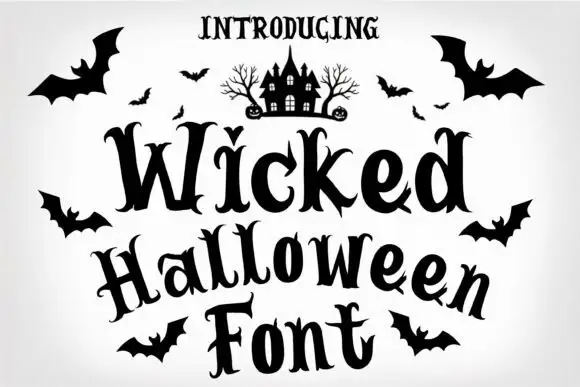
Forked curling Halloween serif
Wicked Halloween is a decorative display serif in black on white: tall letters with forked and curled terminals, a heavy vertical stress, small drawn bats around the block and a tiny haunted house illustration above it.
Ideas for this font
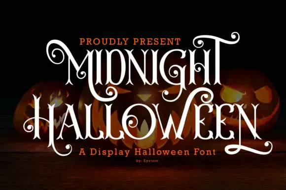
Ornate swirled Halloween display
Midnight Halloween is an ornate display in white on carved pumpkins: tall letters with hairline joins, curled finials that spiral into small commas, and a filigree treatment that turns the ascenders into hooks, so the word reads as a wrought-iron sign.
Ideas for this font
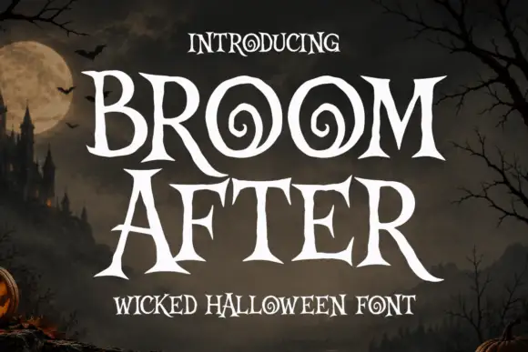
Sharp Halloween serifs with spiral counters and pointed terminals
Broom After is a sharp decorative face in which the serifs turn to points, the counters on the round letters coil into spirals and the terminals flick outward, so a word reads as a carved seasonal title.
Ideas for this font
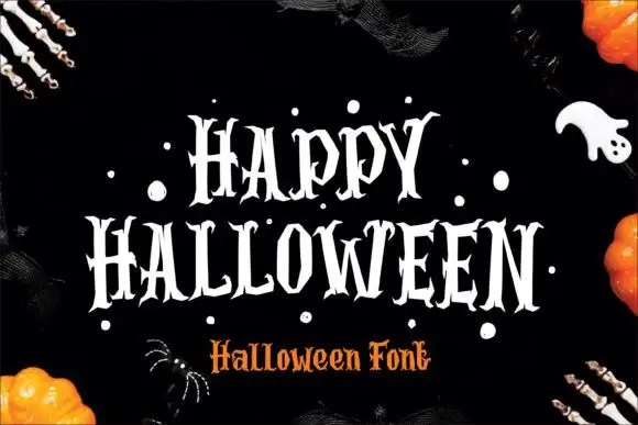
Narrow pointed Halloween capitals
Halloween shows narrow upright capitals with sharply split serifs and jagged pointed terminals, where the H carries a long thin cross-stroke and the O narrows into angular curves above deep pointed feet.
Same independent foundry
Allow optional Google Analytics to measure visits and catalogue actions. Your search words and notes are not included. Privacy & storage