Modern Grotesque Body

Camela + Inkora
Creates crisp high-hierarchy contrast beneath Camela headlines across menus, websites and labels.
Inspect Inkora specimenDisclosure: MakerFileHub may earn a commission from qualifying purchases via paid links on this page. How our links work.
Fine mixed case with opposing large loops above and below the name
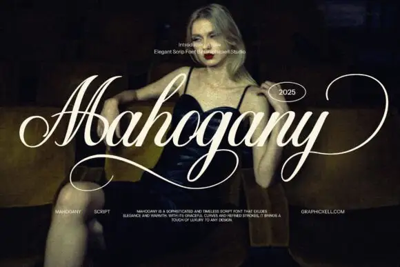
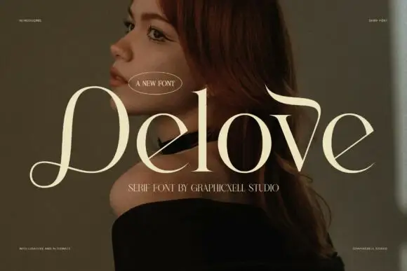
Camela shows pale cream lettering on a blurred brown field: the capital C opens broad, thin joins and rounded lowercase bowls give the ordinary letters a light horizontal rhythm, the first a drops into a large circular sweep below the middle and the l rises into an opposing curled stroke above it.
Paid link
Get this fontProject & layout blueprintsAt-a-glance maker compatibility
Crisp hairline serifs shine on stationery, foil stamping, and packaging; add slight offset for small decals.
Visual anatomy & craft review
The letter bodies stay light and wide, the joins thin to hairlines and the two oversized loops travel in opposite directions, one above and one below the word. The opposing loops are the character: the word is framed top and bottom by the same gesture, which is why the sample sets one name on a soft ground. Because both loops need room, keep 22 mm above and 24 mm below from 26 pt, and print on coated stock so the hairlines hold.
Fine · Opposing loops · Mixed case
Two-font hierarchy recipes
Tested contrast partners — pairing Camela with grounded secondary typography.
Camela + Inkora
Creates crisp high-hierarchy contrast beneath Camela headlines across menus, websites and labels.
Inspect Inkora specimen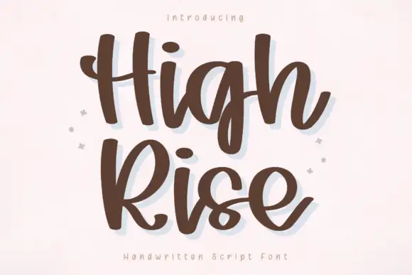
Camela + High Rise
Adds a warm human signature touch for 1-to-3-word callouts without competing against structured serif capitals.
Inspect High Rise specimenPractical applications
Concrete hierarchy, scale and production guidance tailored to Camela’s stroke geometry.
The opposing loops frame a pair of names, and the fine mixed case keeps the row light at 24 pt on heavy card stock in one ink. The loops also give a printed card its vertical frame.
Hierarchy & layout recipe
Print a 130 by 180 mm card: set the names at 24 pt, keep 20 mm above for the l curl and 22 mm below for the a sweep, and set the venue at 9 pt in a light serif beneath. Keep the card flat under the names.
Pre-production check
A loop printed at 20 pt thins into a broken line; check the proof and keep the names at 22 pt or above on coated stock.
The fine contrast sets an editorial title, and the two loops give a one-word heading its frame at 54 pt across a printed spread. The two sweeps keep a heading from needing ornament.
Hierarchy & layout recipe
Print a 210 mm spread: set the title at 54 pt, keep 26 mm beneath the lower sweep before the standfirst at 10 pt, and keep the block on the plain outer column. Keep the lower sweep clear of the rule line.
Pre-production check
A sweep printed over an image edge loses its end; check the page and keep the title on the unprinted margin. Ask for a proof at the final size.
The light lettering keeps a valentine gentle, and the opposing loops add movement without ornament at 28 pt on an A6 card. The light rhythm keeps a card from feeling heavy.
Hierarchy & layout recipe
Print an A6 card: set the line at 28 pt across the upper third, keep 18 mm of clear card at each end, and leave the lower half blank for a handwritten message. Keep the loops inside the card edge.
Pre-production check
A loop printed into the blank writing area is smudged; check the card and keep 12 mm of white beneath it. Keep the message short on the card.
Technical & licence verification
Confirm included OTF/TTF/WOFF formats, full glyph tables and licence coverage on the live store page before batch production.
Closest visual alternatives
Matched across letterform anatomy, stroke behaviour and craft applications.
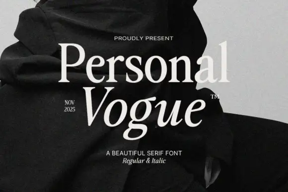
Elegant editorial serif with italic
Personal Vogue is a serif in cream on a monochrome fashion photograph: a moderate-contrast roman with fine serifs and a true italic with a strong slant, set on two lines with small tracked notes at the sides and an attribution beneath.
Modern serif with softened joins
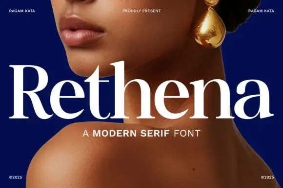
Rethena is a modern serif in white over a deep blue portrait: moderate contrast, softened joins, round bowls and short bracketed serifs, set as one large word with a capital line beneath and small credits in the corners.
Ideas for this font
High-contrast serif with an italic companion
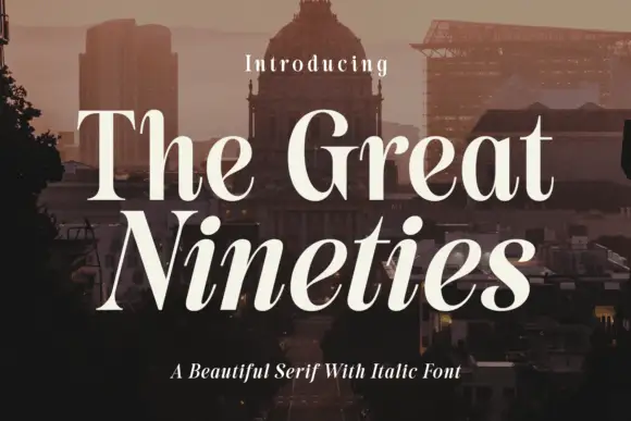
The Great Nineties is a serif family in cream over a city at dusk: a high-contrast roman with fine bracketed serifs for the first line and a matching italic for the second, sold together as a pair.

High-contrast italic editorial serif
The Simple Editorial is a high-contrast italic serif in near-black on white: very fine hairlines, sharp serifs, a strong forward slant and a tall waist, shown in a full specimen with weight and width labels in a small caps grid around the display line.
Ideas for this font
Same independent foundry
Allow optional Google Analytics to measure visits and catalogue actions. Your search words and notes are not included. Privacy & storage