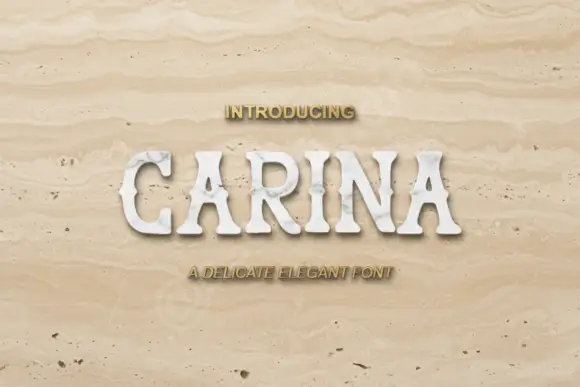
Editorial Serif Anchor

Cagu + Lumera Editorial
Anchors Cagu's fluid strokes with crisp Roman proportions on wedding suites, headers and packaging.
Inspect Lumera Editorial specimenDisclosure: MakerFileHub may earn a commission from qualifying purchases via paid links on this page. How our links work.
Thin irregular wide capitals with open round curves and flared stroke ends
Cagu is a set of thin wide capitals drawn slightly irregular, with open round curves and ends that flare where the pen lifted, so a word reads as hand-lettered roman rather than as a printed face.
Paid link
Get this fontProject & layout blueprintsAt-a-glance maker compatibility
Weld or Unite overlapping script joins into one continuous vector path before sending to the blade.
Visual anatomy & craft review
The C opens as a broad crescent and the A closes with a low bar and splayed stems, while the G keeps an open aperture and the U holds a shallow bowl, all at a light weight with paths that waver by a hair. That waver is the character: nothing is mechanically concentric, so the word looks drawn with a fine nib on a board rather than generated. The flared ends thicken slightly where each stroke finishes, which keeps the light weight from looking like a hairline sans. Because the letters are wide and open, four characters fill a generous format at 80 pt and read cleanly when reversed out of a dark ground. The leather portfolio, the ink pen, the seal and the small caption are presentation; the caps are the word.
Thin · Wide · Flared
Two-font hierarchy recipes
Tested contrast partners — pairing Cagu with grounded secondary typography.
Cagu + Lumera Editorial
Anchors Cagu's fluid strokes with crisp Roman proportions on wedding suites, headers and packaging.
Inspect Lumera Editorial specimen
Cagu + Sailors
Keeps small-scale dates, URLs, nutrition facts and care instructions crisp and legible below script titles.
Inspect Sailors specimenPractical applications
Concrete hierarchy, scale and production guidance tailored to Cagu’s stroke geometry.
The light wide caps give a maker's mark the look of a hand-painted sign, and the open curves still read at 20 pt on a small pressed label.
Hierarchy & layout recipe
Emboss on a 60 by 40 mm leather patch: set the name at 20 pt equivalent height, keep the sub-line in a 6 pt caps sans beneath, and leave 6 mm of margin so the flared ends are not pushed into the stitched edge.
Pre-production check
A flared end under 0.4 mm disappears in an emboss die; check a pressed sample and thicken the flare rather than the stems.
The wide irregular capitals fill a title page at 80 pt with the look of drawn lettering, which suits a book about making things by hand.
Hierarchy & layout recipe
Print a 210 by 280 mm title page: set the title at 80 pt across the upper half, set the imprint in a 9 pt caps sans at the foot, and keep 25 mm of margin so the wide letters have air on both sides.
Pre-production check
A light wide face printed blind on uncoated stock can look grey; check a press sheet and specify a solid ink rather than a tint.
The drawn caps read at 8 cm through a glass door and give a shared workshop a hand-lettered plate that a system sans cannot.
Hierarchy & layout recipe
Print a 300 by 120 mm plate: set the studio name at 8 cm, set the hours in a 2.5 cm caps sans beneath, and leave 3 cm of border so the flared ends sit clear of the mounting screws at the corners.
Pre-production check
Screw holes drilled after printing can land on a letter; check the layout against the fixing points and keep the type inside the inner two thirds of the plate.
Technical & licence verification
Confirm included OTF/TTF/WOFF formats, full glyph tables and licence coverage on the live store page before batch production.
Closest visual alternatives
Matched across letterform anatomy, stroke behaviour and craft applications.
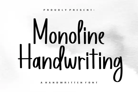
Tall narrow monoline hand
Monoline Handwriting is a tall narrow hand in black on white: fine even strokes, high ascenders, a small x-height and a quick forward rhythm that keeps an eleven-letter word inside a card.
Ideas for this font
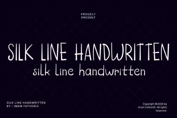
Very narrow light handwriting
Silk Line Handwritten is a very narrow light handwriting in white on near-black: tall compressed letters, thin even strokes and a high x-height, shown in two cuts, one all caps and one mixed case.
Ideas for this font
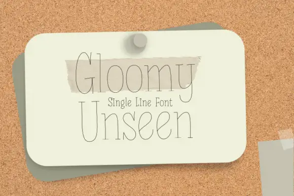
Single-line display serif drawn as one even hairline contour
Gloomy Unseen is a single-line display serif in which every letter is drawn as one even hairline, the serifs thin to points and the bowls stay wide open, so a two-word title reads as a pencil sketch rather than a printed line.
Ideas for this font
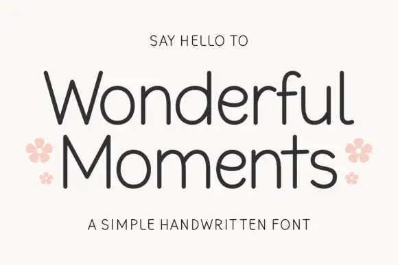
Thin rounded handwritten sans
Wonderful Moments is a thin rounded handwritten sans set in mixed caps: wide open letterforms, a light even stroke with rounded terminals and a small bounce that keeps the line from feeling ruled.
Ideas for this font
Same independent foundry
Allow optional Google Analytics to measure visits and catalogue actions. Your search words and notes are not included. Privacy & storage