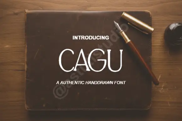
Modern Grotesque Body

Carina + Bareum
Creates crisp high-hierarchy contrast beneath Carina headlines across menus, websites and labels.
Inspect Bareum specimenDisclosure: MakerFileHub may earn a commission from qualifying purchases via paid links on this page. How our links work.
Substantial uppercase serif forms presented with a pale raised stone-like effect
Carina shows pale uppercase lettering against a beige stone-like background: broad stems, rounded bowls and short flared serifs form a compact title, with a narrow triangular A counter and a pointed diagonal R leg.
Paid link
Get this fontProject & layout blueprintsAt-a-glance maker compatibility
Sturdy stroke walls and open counters weed cleanly on adhesive vinyl, HTV apparel film, and cut cardstock.
Visual anatomy & craft review
The stems stay broad, the bowls round out, the serifs flare briefly and two letters carry a distinctive cut, the A with a triangle and the R with a pointed leg. The compact cap row is the character: the word reads as carved into a solid rather than printed, which is why the sample sits on a stone surface. Because the raised effect and mottling belong to the artwork, judge the outline first and keep 28 pt before the flared serifs blur.
Substantial caps · Flared serifs · Stone tone
Two-font hierarchy recipes
Tested contrast partners — pairing Carina with grounded secondary typography.
Carina + Bareum
Creates crisp high-hierarchy contrast beneath Carina headlines across menus, websites and labels.
Inspect Bareum specimen
Carina + Hello Honey
Adds a warm human signature touch for 1-to-3-word callouts without competing against structured serif capitals.
Inspect Hello Honey specimenPractical applications
Concrete hierarchy, scale and production guidance tailored to Carina’s stroke geometry.
The substantial caps suit a pottery label, and the flared serifs stay solid at 22 pt on a 60 mm panel, so a studio name reads as pressed into the surface rather than stuck on top of it.
Hierarchy & layout recipe
Print a 60 by 40 mm label: set the studio name at 22 pt in capitals, keep 5 mm of border so the flared serifs stay whole, and set the town in a 6 pt caps beneath with 5 mm of clear ground.
Pre-production check
The stone texture on the cover is artwork; check the actual outline on a proof before assuming a textured style ships with the files.
The compact caps set a feature title, and the wide bowls hold a two-word heading at 54 pt across a printed spread, where the short cap height lets the heading sit low without crowding the standfirst.
Hierarchy & layout recipe
Print a wide 210 mm spread: set the title at 54 pt capitals on a single row, keep 20 mm beneath before the standfirst at 10 pt, and hold the whole block to the upper third so the lower half of the page stays open.
Pre-production check
A raised shadow applied in the layout doubles the fine contours; check the page and keep one flat colour for body-level size.
The heavy letters read from a doorway, and the pointed R leg gives a short name at 55 mm on a painted panel, so the sign works from the street without needing a second line or an illustration.
Hierarchy & layout recipe
Paint a 500 by 250 mm panel: set the name at 55 mm in capitals, keep 20 mm of border so the flared serifs stay inside, and set the hours in a 13 mm caps on a plain band beneath.
Pre-production check
Two flat colours keep the carved impression without a shadow; check the mask and skip the extra offset entirely.
Technical & licence verification
Confirm included OTF/TTF/WOFF formats, full glyph tables and licence coverage on the live store page before batch production.
Closest visual alternatives
Matched across letterform anatomy, stroke behaviour and craft applications.

Elegant feminine serif
Olivia Serif is an elegant serif in black on warm cream: high contrast, bracketed serifs, a large x-height and round bowls, set in title case on one line with a smaller serif line beneath, two tracked caps lines under that, and a fine ornamental frame with fleurons at the corners.
Ideas for this font
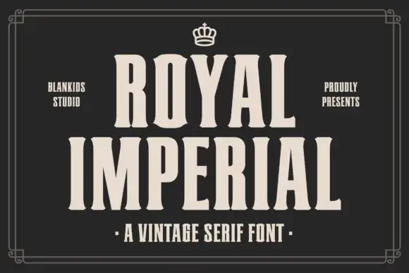
Compressed flared serif
Royal Imperial is a heavy compressed serif in cream on a near-black ground: flared ends on the stems, narrow counters, tall proportions and even spacing, set in two stacked words beneath a small crown ornament, with studio credits at the sides and a plain descriptor under a centred dot row.
Ideas for this font
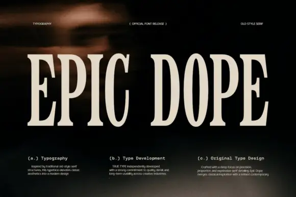
Condensed old-style serif with tall narrow letterspaced capitals
Epic Dope is a condensed old-style serif in which the capitals stretch tall, the serifs finish in small balls and the fit runs narrow, so a two-word title reads as a film credit card rather than as a headline.
Ideas for this font
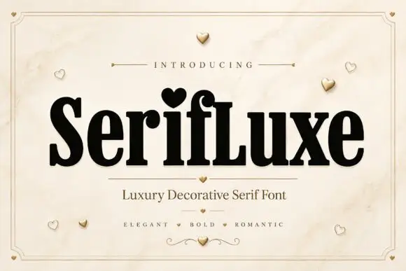
Heavy narrow serif with heart dot
Serifluxe is a heavy narrow serif in black on a marble panel: thick stems with fine joins, a heart-shaped dot over the i, tight counters and a small flourish at the foot, with a tracked line above and two lines of description beneath, framed by a thin double rule with gold hearts scattered across the sheet.
Ideas for this font
Same independent foundry
Allow optional Google Analytics to measure visits and catalogue actions. Your search words and notes are not included. Privacy & storage