Editorial Serif Anchor

Brooklyn + Bulgary
Anchors Brooklyn's fluid strokes with crisp Roman proportions on wedding suites, headers and packaging.
Inspect Bulgary specimenDisclosure: MakerFileHub may earn a commission from qualifying purchases via paid links on this page. How our links work.
Fine signature script with deep round loops and a tall leaning capital
Brooklyn is a fine signature script whose capital rises into a long diagonal loop and whose descenders drop into deep round loops, so a single word covers a tall, wide area of a page.
Paid link
Get this fontProject & layout blueprintsAt-a-glance maker compatibility
Weld or Unite overlapping script joins into one continuous vector path before sending to the blade.
Visual anatomy & craft review
The capital B starts with a heavy-ish diagonal that lifts from below the baseline into a tall narrow loop, then folds back into a stem that leans hard right, and the letters after it keep that forward lean without drifting. The r keeps a short shoulder, the o's are round and open, the k rises to ascender height with a single closed loop, and the l and the y both drop into deep descender loops that return close to their stems. The joins are thin, the stems are slightly heavier, and the difference is small enough that the word still reads as a single weight at a distance. Ends taper. The pale striped paper behind and the curved tracked caption at the top right are presentation; the script is the word.
Fine · Signature · Looped
Two-font hierarchy recipes
Tested contrast partners — pairing Brooklyn with grounded secondary typography.
Brooklyn + Bulgary
Anchors Brooklyn's fluid strokes with crisp Roman proportions on wedding suites, headers and packaging.
Inspect Bulgary specimen
Brooklyn + Headline
Keeps small-scale dates, URLs, nutrition facts and care instructions crisp and legible below script titles.
Inspect Headline specimenPractical applications
Concrete hierarchy, scale and production guidance tailored to Brooklyn’s stroke geometry.
A fine signature reads as a name rather than a logo, which is what a photographer selling a personal service wants, and the deep descender loops give the mark recognisable silhouette at small size.
Hierarchy & layout recipe
Set the name at 24 pt on the back of a 90 by 55 mm card, keep the contact details in a 6 pt sans, and hold 8 mm below so the y loop does not sit on the address line.
Pre-production check
Deep loops that fall close to the baseline can merge with small text below; check the proof at final size and raise the address block if the loop touches it.
A signature script on an envelope front reads as handwriting, which suits a wedding where the envelope is the first thing a guest sees, and the tall capital anchors the address block.
Hierarchy & layout recipe
Set the names at 20 pt at the centre of a 110 by 220 mm envelope, set the address in a 10 pt serif, and keep 15 mm above the names so the capital loop has air against the flap crease.
Pre-production check
Envelopes are machine-sorted and crease at the flap; check the artwork against the crease line and move the lettering down if a loop crosses it.
The signature quality suits a column built from readers' letters, and the fine weight keeps the byline quieter than the letters themselves.
Hierarchy & layout recipe
Set the byline at 14 pt after the letter body, keep the column heading in a bold serif at 18 pt, and leave 6 mm above the byline so the descender loops do not touch the last line.
Pre-production check
A fine script under dense body text at 14 pt can read as a printing artefact; check the page proof and raise it to 16 pt if it looks like dirt.
Technical & licence verification
Confirm included OTF/TTF/WOFF formats, full glyph tables and licence coverage on the live store page before batch production.
Closest visual alternatives
Matched across letterform anatomy, stroke behaviour and craft applications.
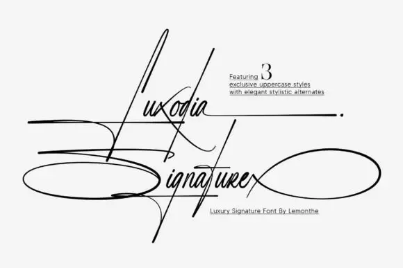
Needle-tall signature with wide horizontal loops
Luxodia Signature is a hairline signature script in black on off-white: needle-tall ascenders, a lowercase kept small, and loops that leave the word in wide ellipses to the left and right, with three uppercase styles offered as alternates.
Ideas for this font
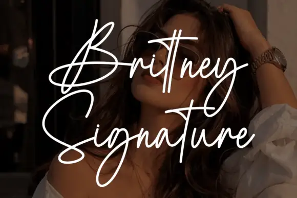
Tall signature script with long crossing crossbars and thin even strokes
Brittney Signature is a tall signature script with thin even strokes, very tall narrow ascenders and crossbars that extend across several letters before lifting away.
Ideas for this font
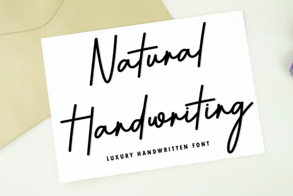
Fine tall signature handwriting
Natural Handwriting is a fine tall signature in black across a white card laid on a linen envelope: long hairline strokes, very tall ascenders and a final g that drops a deep loop below the line.
Ideas for this font
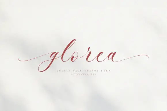
Fine sloping calligraphy with hairline entry and exit tails
Glorea is fine sloping calligraphy in which the first and last letters throw hairline tails far beyond the word, and the letters between them stay narrow, light and evenly sloped.
Ideas for this font
Same independent foundry
Allow optional Google Analytics to measure visits and catalogue actions. Your search words and notes are not included. Privacy & storage