Editorial Serif Anchor

Blush + Auretha
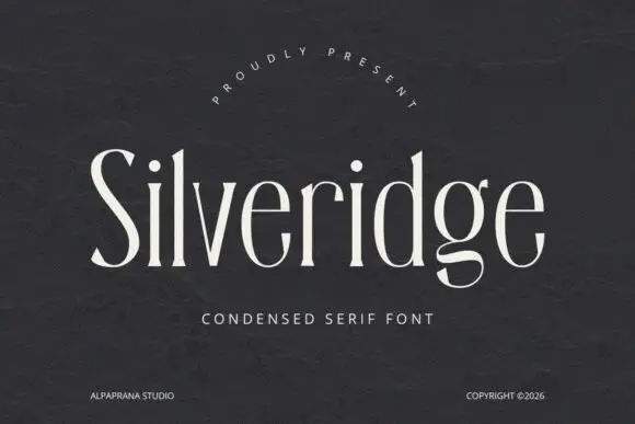
Anchors Blush's fluid strokes with crisp Roman proportions on wedding suites, headers and packaging.
Inspect Auretha specimenDisclosure: MakerFileHub may earn a commission from qualifying purchases via paid links on this page. How our links work.
Light rounded monoline script with tall capitals and generous spacing
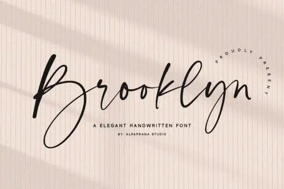
Blush is a light rounded monoline script whose capitals rise tall, whose joins cross at a consistent height and whose letter spacing stays generous enough for the line to read at a distance.
Paid link
Get this fontProject & layout blueprintsAt-a-glance maker compatibility
Weld or Unite overlapping script joins into one continuous vector path before sending to the blade.
Visual anatomy & craft review
The capital B opens as a tall loop that begins below the baseline and closes through its own stem, and the letters after it stay light and round: the l and the u hold plain stems, the s reverses through a thin join and the h keeps a wide shoulder without a closing loop. Weight is a true monoline with rounded ends: nothing swells and nothing tapers, which is what lets the word read evenly on a dark ground or in white ink on a coloured card. The spacing is the other half of the character; the letters stand apart enough that a phrase fills a wide measure without tracking and stays legible at 18 pt. The plum ground, the white ink and the two tracked captions are presentation; the script is the word.
Light · Rounded · Monoline
Two-font hierarchy recipes
Tested contrast partners — pairing Blush with grounded secondary typography.
Blush + Auretha
Anchors Blush's fluid strokes with crisp Roman proportions on wedding suites, headers and packaging.
Inspect Auretha specimen
Blush + Bareum
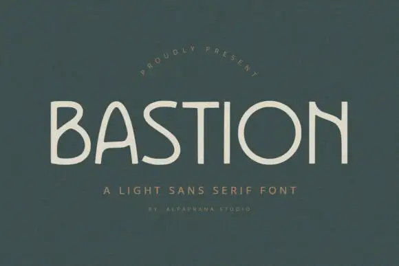
Keeps small-scale dates, URLs, nutrition facts and care instructions crisp and legible below script titles.
Inspect Bareum specimenPractical applications
Concrete hierarchy, scale and production guidance tailored to Blush’s stroke geometry.
The monoline weight reproduces cleanly in foil and on screen at once, and the generous spacing keeps the mark readable at 14 pt on a small label.
Hierarchy & layout recipe
Set the brand at 14 pt on a 45 by 75 mm label, keep the product type in a 6 pt caps sans, and leave 7 mm of clearance so the tall capital does not touch the label edge.
Pre-production check
Foil on a thin monoline can break at the joins; check a foil dummy at final size and thicken the line rather than reducing the spacing.
The light monoline reads at a distance because the spacing is generous, and a single name fills a board without any added ornament at 12 cm.
Hierarchy & layout recipe
Set the greeting at 12 cm on a 600 by 400 mm board, set both names at 6 cm beneath it, and leave 10 cm of margin so the tall capital loop stays inside the frame.
Pre-production check
White ink on a painted board can go chalky; check the sign in daylight and add a second coat rather than thickening the lettering.
The even light line keeps a minimal card quiet, and the tall capitals give a short pair of names presence at 24 pt without a second element.
Hierarchy & layout recipe
Set both names at 24 pt on a 148 by 105 mm card, set the date in a small caps serif at 8 pt, and leave 18 mm at each end so the loops finish inside the trim.
Pre-production check
A thin monoline printed in one pass can look grey; check the proof and darken the ink instead of adding weight to the letters.
Technical & licence verification
Confirm included OTF/TTF/WOFF formats, full glyph tables and licence coverage on the live store page before batch production.
Closest visual alternatives
Matched across letterform anatomy, stroke behaviour and craft applications.
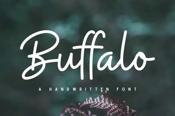
Broad monoline signature script with open capitals
Buffalo is a monoline signature script that holds one even stroke from the first capital to the last exit, with a wide-open capital B and a double f whose two ascenders stand straight up out of the x-height band.
Ideas for this font

Fine extended signature script
Lovely sets a fine signature script in a single dark weight over a pale city photograph, where a wide entry curve opens low at the left, the letters rise into tall slender loops through the middle and a large descending y plus an extended closing sweep make the lower right part of the footprint.
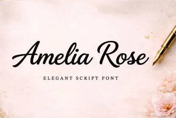
Slanted weighty script with a sweeping capital R and connected joins
Amelia Rose is a slanted script in which the strokes stay weighty through the joins, the capital R sweeps wide and the letters lean together, so a name reads as a confident handwritten signature.
Ideas for this font
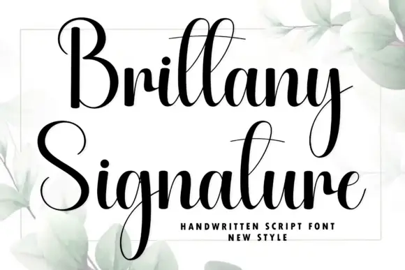
Heavy high-contrast script with very long descenders and narrow loops
Brittany Signature is a heavy high-contrast script in which the ascenders and descenders run far beyond the letter body, the loops stay narrow and the joins thin to hairline between thick stems.
Ideas for this font
Same independent foundry
Allow optional Google Analytics to measure visits and catalogue actions. Your search words and notes are not included. Privacy & storage