High-Contrast Display Serif

Bold Limited + Majestic Letters
Pairs sculptural editorial warmth with Bold Limited's clean modern geometry.
Inspect Majestic Letters specimenDisclosure: MakerFileHub may earn a commission from qualifying purchases via paid links on this page. How our links work.
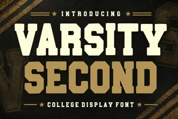
Upright narrow capitals with rounded corners, small oval counters and a deep M valley
Bold Limited stacks white capitals over a lake photograph, where the B, O and D contain narrow rounded openings, the L and E end in flat arms with softened corners and the M drops into a deep valley between its diagonal strokes.
Paid link
Get this fontProject & layout blueprintsAt-a-glance maker compatibility
Sturdy stroke walls and open counters weed cleanly on adhesive vinyl, HTV apparel film, and cut cardstock.
Visual anatomy & craft review
The stems stay upright and narrow, the counters turn oval, the arms flatten and one letter opens a deep V. That valley is the character: a neutral narrow cap set gains a single graphic feature, which is why the sample keeps a wide-tracked row over water. The generous spacing is a cover arrangement rather than a default, so set your own tracking, keep 30 pt and check the counters against a plain ground before placing the type over an image.
Upright narrow capitals with rounded corners, small oval counters and a deep M valley
Two-font hierarchy recipes
Tested contrast partners — pairing Bold Limited with grounded secondary typography.
Bold Limited + Majestic Letters
Pairs sculptural editorial warmth with Bold Limited's clean modern geometry.
Inspect Majestic Letters specimen
Bold Limited + Autography
Introduces organic movement on pull-quotes, signatures and gift tags.
Inspect Autography specimenPractical applications
Concrete hierarchy, scale and production guidance tailored to Bold Limited’s stroke geometry.
The narrow caps give a property restraint, and the oval counters hold a two-word name at 24 pt on a card, where the wide tracking reads as calm.
Hierarchy & layout recipe
Print an 85 by 55 mm card: set the wordmark at 24 pt on one row with 10 percent tracking, keep 16 mm of clear ground beneath before the address at 7 pt, and keep the card white so the counters stay crisp.
Pre-production check
Wide tracking on a short name looks loose; check the card, reduce it to 8 percent and keep the wordmark centred.
The narrow forms suit a running head, and the flat arms stay clear at 9 pt across a page, where the oval counters remain readable in a long title.
Hierarchy & layout recipe
Print a 210 mm page: set the running head at 9 pt on one line with 8 percent tracking, keep 6 mm of clear ground above the first column, and keep the head in one colour so it recedes.
Pre-production check
Oval counters close at 7 pt; check the printed page, keep the head at 9 pt or above and track it wider if the ovals fill.
The upright caps read on a door, and the deep M valley gives the row a marker at 40 pt on a printed plate, where the softened corners stay clean.
Hierarchy & layout recipe
Print a 320 by 130 mm plate: set the room label at 40 pt on one row, keep 15 mm of clear ground beneath before the capacity line at 12 pt, and keep 18 mm of margin for the corner fixings.
Pre-production check
A titled photograph behind the caps hides the counters; check the mounted version on plain colour.
Technical & licence verification
Confirm included OTF/TTF/WOFF formats, full glyph tables and licence coverage on the live store page before batch production.
Closest visual alternatives
Matched across letterform anatomy, stroke behaviour and craft applications.
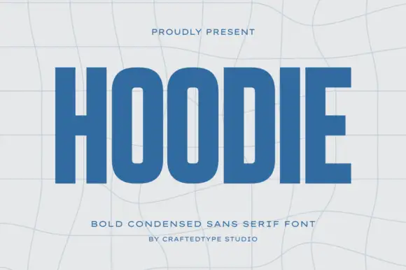
Condensed block capitals with rounded rectangular O counters
Hoodie shows a large blue uppercase word on a pale warped-grid field, where heavy straight uprights and flat horizontal endings form a dense block, the O and D hold rounded rectangular counters, the H crossbar sits near the middle and the E keeps three squared arms.
Ideas for this font
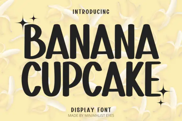
Tall playful display sans
Banana Cupcake stacks two large words in dark letters on a pale banana photograph, where tall narrow capitals fill the width, the counters squeeze into thin slots, the corners soften slightly and the letter widths shift row by row so the second word runs wider than the first.
Ideas for this font
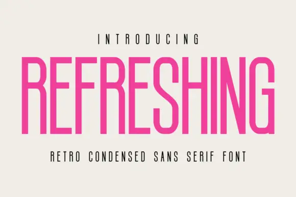
Light condensed retro sans
Refreshing is a light condensed sans in magenta on a warm off-white ground: capitals with long straight stems, a diagonal S middle, flat terminals and a narrow fit, set as one line between a tracked line above and a plain line beneath.
Ideas for this font
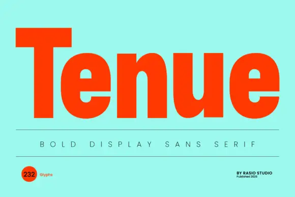
Very heavy upright display sans
Tenue is a very heavy upright sans in vermilion on a mint ground: wide mixed case with compact e counters, a broad u cup, thick even strokes and flat terminals, set as one large word above a rule, a tracked line and two small notes in the corners.
Same independent foundry
Allow optional Google Analytics to measure visits and catalogue actions. Your search words and notes are not included. Privacy & storage