High-Contrast Display Serif

Bleson Voozart + Rosemode
Pairs sculptural editorial warmth with Bleson Voozart's clean modern geometry.
Inspect Rosemode specimenDisclosure: MakerFileHub may earn a commission from qualifying purchases via paid links on this page. How our links work.
Thin contrast capitals with overlapping circular O forms and extended horizontal arms
Bleson Voozart is a modern serif family in seven weights with tall narrow capitals, a high contrast at the light end, and ligatures that let adjacent letters share a stroke.
Paid link
Get this fontProject & layout blueprintsAt-a-glance maker compatibility
Sturdy stroke walls and open counters weed cleanly on adhesive vinyl, HTV apparel film, and cut cardstock.
Visual anatomy & craft review
BLESON over VOOZART fills the upper two thirds of the card in a deep burgundy on a soft cream ground, the capitals set at a size where the proportions are visible: the B and the E are narrow, the O is a tall ellipse, and the Z is drawn with a flat top and a diagonal that ends in a hairline. In the second row the two O's overlap and share a single contour, which is the ligature the family is built around, and the A and the R are joined at the waist. A tracked line at the top names the studio with two small ornaments, and a line at the foot describes the family and the number of weights in a rounded label. The face is a display serif that can be pushed into text at the heavier weights, and it wants a wide measure and generous margins to look its best.
Thin contrast capitals with overlapping circular O forms and extended horizontal arms
Two-font hierarchy recipes
Tested contrast partners — pairing Bleson Voozart with grounded secondary typography.
Bleson Voozart + Rosemode
Pairs sculptural editorial warmth with Bleson Voozart's clean modern geometry.
Inspect Rosemode specimen
Bleson Voozart + Hello Honey
Introduces organic movement on pull-quotes, signatures and gift tags.
Inspect Hello Honey specimenPractical applications
Concrete hierarchy, scale and production guidance tailored to Bleson Voozart’s stroke geometry.
Seven weights let one family cover a hang tag, a lookbook and a website, and the narrow capitals give a long label name a distinctive vertical rhythm.
Hierarchy & layout recipe
Print an A5 hang tag: set the label name at 16 pt on one row, keep 6 mm of clear ground beneath before the size at 5 pt, and hold 5 mm from the widest letter to the tag edge.
Pre-production check
The shared-stroke ligature collapses on a small tag; print one tag at the finished size and check the joins before the order.
The narrow caps make a masthead that fits a wide page without shrinking, and the ligatures give the title a single distinctive join to remember it by.
Hierarchy & layout recipe
Print a 230 by 300 mm cover: set the masthead at 120 pt across one row, keep 30 mm of clear ground beneath before the year at 12 pt, and hold 22 mm from the last letter to the right trim.
Pre-production check
Overlapping contours need careful trapping; print one cover from the real files and check the shared stroke before the run.
The tall narrow capitals suit a long pair of names on a single line, and the restrained contrast keeps the card formal without a script underneath it.
Hierarchy & layout recipe
Print a 148 by 210 mm invitation: set the names at 28 pt on one row, keep 22 mm of clear ground beneath before the venue at 9 pt, and hold 16 mm of margin left and right of the widest letter.
Pre-production check
Names with an O next to an O trigger the ligature; print one invitation and check that the join reads as intended before the suite.
Technical & licence verification
Confirm included OTF/TTF/WOFF formats, full glyph tables and licence coverage on the live store page before batch production.
Closest visual alternatives
Matched across letterform anatomy, stroke behaviour and craft applications.
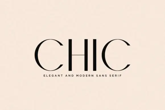
Sparse high-contrast capitals with circular C curves and a hairline H bar
Chic places four black capitals on a pale peach field, where the two C forms sweep from thick curved sides into very fine upper and lower arcs while the H and I use strong plain stems and the H crossbar thins to a hairline.
Ideas for this font

Contrasting mixed case with broad e bowl and plain tall B stem
Bareum shows muted terracotta title-case lettering on a pale flat field, where more substantial vertical and curved sides meet fine joins, the B carries a broad bowl, the u opens widely and the m keeps two narrow curved shoulders without projecting feet.
Ideas for this font
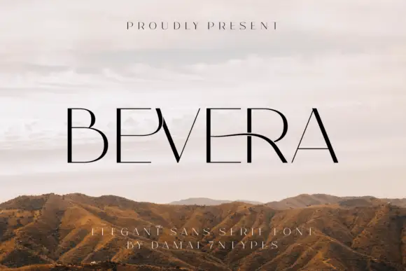
Fine high-contrast capitals with a sweeping E-R connection and a sharp narrow V
Bevera places thin black capitals over a pale landscape photograph, where fine horizontal arms meet stronger vertical strokes, the E near the middle extends into a long curved connection toward the R and the V narrows to a sharp point.
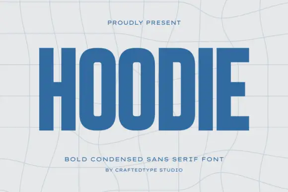
Condensed block capitals with rounded rectangular O counters
Hoodie shows a large blue uppercase word on a pale warped-grid field, where heavy straight uprights and flat horizontal endings form a dense block, the O and D hold rounded rectangular counters, the H crossbar sits near the middle and the E keeps three squared arms.
Ideas for this font
Same independent foundry
Allow optional Google Analytics to measure visits and catalogue actions. Your search words and notes are not included. Privacy & storage