High-Contrast Display Serif

Beautiful Caroline + Mewah
Pairs sculptural editorial warmth with Beautiful Caroline's clean modern geometry.
Inspect Mewah specimenDisclosure: MakerFileHub may earn a commission from qualifying purchases via paid links on this page. How our links work.
Even monoline script over a heavy geometric sans with a square counter
Beautiful Caroline is a pair of faces in which a light even monoline script sits above a very heavy geometric sans whose counters turn square, so one lockup carries a handwritten line and an architectural one.
Paid link
Get this fontProject & layout blueprintsAt-a-glance maker compatibility
Weld or Unite overlapping script joins into one continuous vector path before sending to the blade.
Visual anatomy & craft review
The script half is a rounded monoline with generous spacing: the b rises into a tall plain loop, the e and the a close loose bowls, the t is crossed with a short light bar and the f finishes with a lifted curve, all drawn at one weight so the line reads as a single pen stroke. The sans half is the opposite: fat rectangular letters with squared counters, a heavy stem on every letter and a flat bar on the t, so the second line reads as a stamped plate beneath the handwriting. The contrast between the two is the point of the pair, and because the script is so light, the sans has to carry the weight at small sizes. The green ink, the cream ground and the four small corner labels are presentation; the letters are the words.
Script · Geometric · Paired
Two-font hierarchy recipes
Tested contrast partners — pairing Beautiful Caroline with grounded secondary typography.
Beautiful Caroline + Mewah
Pairs sculptural editorial warmth with Beautiful Caroline's clean modern geometry.
Inspect Mewah specimen
Beautiful Caroline + Autography
Introduces organic movement on pull-quotes, signatures and gift tags.
Inspect Autography specimenPractical applications
Concrete hierarchy, scale and production guidance tailored to Beautiful Caroline’s stroke geometry.
The light script names the studio while the heavy sans carries the product line, and both halves read at 13 pt and 9 pt on a small curved label.
Hierarchy & layout recipe
Set the studio name in the script at 13 pt on a 60 by 80 mm label, set the flavour in the sans at 9 pt beneath, and leave 6 mm at the sides so the loops stay on the label.
Pre-production check
A rounded monoline under 0.2 mm fades on a curved label; print one on the real stock and thicken the script slightly rather than the sans.
The pairing lets a card carry a soft name and a bold number in one visual language, and the square countered sans reads at a child's height.
Hierarchy & layout recipe
Set the name in the script at 30 pt on a 148 by 105 mm card, set the age in the sans at 22 pt beneath it, and hold 12 mm of clear space between those two lines.
Pre-production check
A very heavy sans printed small closes its squared counters; check the proof at final size and open them slightly if the ink bridges.
The script supplies the hand-painted feel and the heavy sans gives the sign a firm base, which is what a shopfront needs at a distance.
Hierarchy & layout recipe
Set the shop name in the script at 14 cm on the glass, set the word bakery in the sans at 8 cm beneath, and hold 10 cm of clearance so the tails are not cut by the frame.
Pre-production check
Window vinyl of a light monoline is hard to weed; check the cut file and thicken the thinnest join before plotting.
Technical & licence verification
Confirm included OTF/TTF/WOFF formats, full glyph tables and licence coverage on the live store page before batch production.
Closest visual alternatives
Matched across letterform anatomy, stroke behaviour and craft applications.
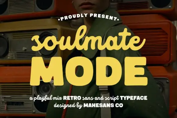
Retro sans with a fat rounded script
Soulmate Mode is a retro pair in pale yellow over a dark photograph of stacked boomboxes: a fat rounded sans in capitals for the main word and a thick rounded script for the word above it, sold together as two styles rather than one.
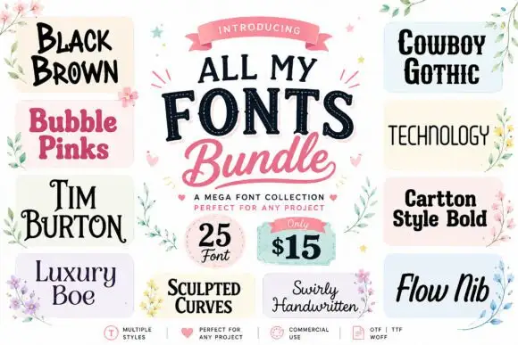
A collage of unrelated display and script directions
All My Fonts is presented as a central title between thirteen sample tiles, from Black Brown and Bubble Pinks through Tim Burton, Luxury Boe, Sculpted Curves and Swirly Handwritten to Cowboy Gothic, Technology, Cartoon Style Bold and Flow Nib, with a corner badge advertising a quantity and a price.
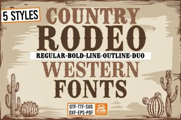
Five-cut country western bundle
Country Rodeo is a five-cut western bundle in brown on cream: a bracketed slab offered as regular, bold, line, outline and duo, each shown at the same size with a format strip at the foot, framed by cacti and a hairline border, so the sheet reads as a sign painter's kit.
Ideas for this font
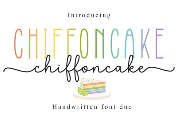
Tall narrow sans and fine looping script duo
Chiffoncake Duo pairs very tall narrow capitals, each in a different pastel tone, with a low connected script whose deep f loops drop below the baseline, and long tails extend from both sides of the lower word above a small cake illustration.
Ideas for this font
Same independent foundry
Allow optional Google Analytics to measure visits and catalogue actions. Your search words and notes are not included. Privacy & storage



