High-Contrast Display Serif

Beach Lemon + Medvilea Editorial
Pairs sculptural editorial warmth with Beach Lemon's clean modern geometry.
Inspect Medvilea Editorial specimenDisclosure: MakerFileHub may earn a commission from qualifying purchases via paid links on this page. How our links work.
Heavy condensed capitals with a small upright A opening and deep M diagonals
Beach Lemon stacks blue uppercase words on a pale grid, where thick narrow stems enclose small vertical openings in the B, A and O, the A rises into a rounded top rather than a pointed apex, the M makes a deep central diagonal and the C opens through a narrow right-hand gap.
Paid link
Get this fontProject & layout blueprintsAt-a-glance maker compatibility
Sturdy stroke walls and open counters weed cleanly on adhesive vinyl, HTV apparel film, and cut cardstock.
Visual anatomy & craft review
The stems stay thick, the counters squeeze into vertical slots, the apex rounds off and the tracking stays tight so each row reads as a block. That compressed density is the character: two long words fill a square poster without shrinking, which is why the sample sits on a grid it does not come from. Keep 48 pt so the slots stay open, test the rounded A in a short word and print a size proof before using it for anything small.
Heavy condensed capitals with a small upright A opening and deep M diagonals
Two-font hierarchy recipes
Tested contrast partners — pairing Beach Lemon with grounded secondary typography.
Beach Lemon + Medvilea Editorial
Pairs sculptural editorial warmth with Beach Lemon's clean modern geometry.
Inspect Medvilea Editorial specimen
Beach Lemon + Silken Luxe
Introduces organic movement on pull-quotes, signatures and gift tags.
Inspect Silken Luxe specimenPractical applications
Concrete hierarchy, scale and production guidance tailored to Beach Lemon’s stroke geometry.
The condensed caps fill a poster, and the narrow slots read from across a promenade where a lighter face would disappear.
Hierarchy & layout recipe
Print an A2 poster: set the bar name at 100 pt across two rows with 24 mm between baselines, keep 28 mm of clear ground beneath before the hours at 18 pt, and keep 24 mm of border.
Pre-production check
Slot counters close under 40 pt; check the poster proof and keep both rows at 60 pt or above.
The compressed caps fit a tall bottle label, and the thick stems keep a short drink name bold at only 45 mm wide on the shelf.
Hierarchy & layout recipe
Print a 45 by 80 mm bottle label: set the brand at 24 pt on one row, keep 10 mm of clear ground beneath before the volume at 7 pt, and keep 6 mm to the die edge.
Pre-production check
The rounded A may read as a printing fault; check the printed label before the bottle run.
The block caps read at distance, and the deep M diagonal keeps a two-word sports hall name from blurring on a painted panel.
Hierarchy & layout recipe
Paint a 700 by 300 mm panel: set the hall name at 60 mm across two rows, keep 24 mm of clear ground beneath before the times at 15 pt, and keep 28 mm of border all round.
Pre-production check
The grid on the cover is not a spacing template; check your own tracking before setting the rows.
Technical & licence verification
Confirm included OTF/TTF/WOFF formats, full glyph tables and licence coverage on the live store page before batch production.
Closest visual alternatives
Matched across letterform anatomy, stroke behaviour and craft applications.
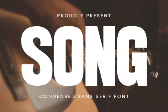
Heavy condensed sans
Song is a heavy condensed sans in white over a photograph of a guitar being played: tall capitals with rounded rectangular counters, a square G opening and an even heavy stroke, set as one large word with a small tracked line above and a plain line beneath.
Ideas for this font
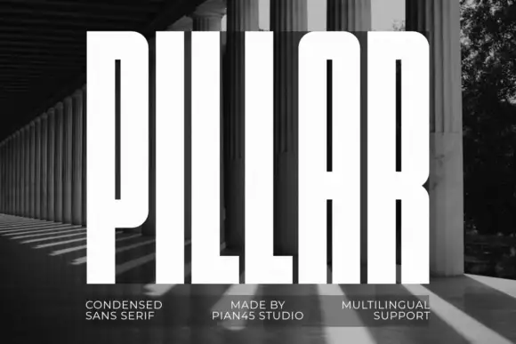
Extremely tall heavy capitals
Pillar is an extremely tall heavy sans in white over a black-and-white photograph of a colonnade: capitals with narrow vertical slots, flat tops, a rounded arch-top A and an even thick stroke, set as one word filling the frame with three small tracked notes along the foot.
Ideas for this font
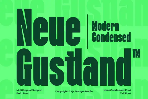
Very heavy condensed display sans
Neue Gustland is a very heavy condensed mixed case shown in dark green on a bright acid ground: tall narrow letters with tight bowls, a sharply cut N diagonal and thick even strokes, set in two large lines with a small tracked block beside the first line and three notes along the foot.
Ideas for this font
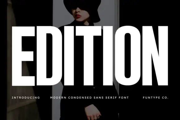
Very heavy condensed capitals with squared stems and narrow oval counters
Edition shows white capital lettering spanning most of a dark portrait cover: thick vertical strokes and broad flat arms build a rectangular title, the O keeps rounded outer sides around a small vertically elongated counter and the I stands as a plain bar.
Same independent foundry
Allow optional Google Analytics to measure visits and catalogue actions. Your search words and notes are not included. Privacy & storage