Editorial Serif Anchor

Beach Actually + Stanza
Anchors Beach Actually's fluid strokes with crisp Roman proportions on wedding suites, headers and packaging.
Inspect Stanza specimenDisclosure: MakerFileHub may earn a commission from qualifying purchases via paid links on this page. How our links work.
Tall open capitals with plain ascenders
Beach Actually pairs very tall open capitals with plain, almost unadorned ascenders, giving a relaxed coastal script with no flourish at all.
Paid link
Get this fontProject & layout blueprintsAt-a-glance maker compatibility
Weld or Unite overlapping script joins into one continuous vector path before sending to the blade.
Visual anatomy & craft review
The capitals rise to roughly twice the x-height and are drawn wide and open, with a simple diagonal A and a B whose bowl stays unfussy, while the lowercase ascenders are plain vertical stems with no loops. Joins are short and sit close to the baseline, weight stays even from 0.6 to full by the middle of the stroke, and the final y releases a low tail rather than a curl. The result reads as informal handwriting at poster scale. The sea and sky photograph behind the two lines is context, and the small tracked caption beneath belongs to a separate label face.
Tall · Open · Coastal
Two-font hierarchy recipes
Tested contrast partners — pairing Beach Actually with grounded secondary typography.
Beach Actually + Stanza
Anchors Beach Actually's fluid strokes with crisp Roman proportions on wedding suites, headers and packaging.
Inspect Stanza specimen
Beach Actually + Clyne Sans
Keeps small-scale dates, URLs, nutrition facts and care instructions crisp and legible below script titles.
Inspect Clyne Sans specimenPractical applications
Concrete hierarchy, scale and production guidance tailored to Beach Actually’s stroke geometry.
An open coastal script reads casually at large sizes, which is what a seasonal outdoor board needs in bright summer light.
Hierarchy & layout recipe
Set the header at 3-inch height on a 60 cm board, keep the drinks in a plain sans at 1 inch, and leave 8 cm of clear board between the header and the list below.
Pre-production check
Salt air and sun fade painted boards; use exterior paint and check the contrast from five metres.
A relaxed script sets the tone of a holiday property better than a formal serif, and the tall capitals carry the property name.
Hierarchy & layout recipe
Set the property name at 4-inch height on an A1 sheet, keep the wifi and check-out details in a plain sans at 1 inch, and leave 12 cm between the two blocks.
Pre-production check
Guests read the details from a doorway, so keep the practical block at least one inch high regardless of the decorative line.
Tall open capitals give a travel opener movement without a decorative flourish that would date the page within a few years.
Hierarchy & layout recipe
Run the headline at 60 pt across the column, keep the standfirst at 12 pt beneath it, and allow 15 mm between the two so the y descender sits well clear.
Pre-production check
The low tail on the y crosses the standfirst on tight leading; check the spacing at the real page size.
Technical & licence verification
Confirm included OTF/TTF/WOFF formats, full glyph tables and licence coverage on the live store page before batch production.
Closest visual alternatives
Matched across letterform anatomy, stroke behaviour and craft applications.

Tall connected script with a long y descender and open round bowls
Hello Honey is a tall connected script in which the ascenders rise high, the bowls stay round and the y drops a descender that runs far below the line before curling away.
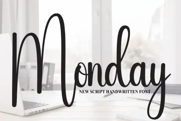
Tall script with an oversized narrow M
Monday is a tall script in black over a photograph of a desk: a very tall narrow capital M drawn as two long strokes with a shallow valley between, a compact connected body and a y whose descender curls below the word.
Ideas for this font
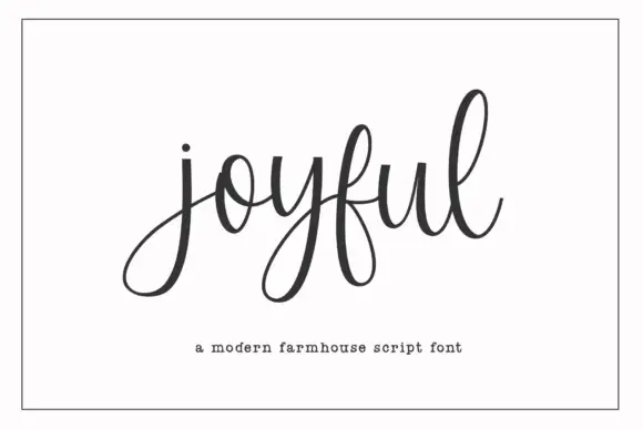
Modern farmhouse script with open descenders and long exit tails
Joyful Script is a modern farmhouse script with light even strokes, wide open descenders and long exit tails, drawn so a single word sits evenly across a wide card.
Ideas for this font
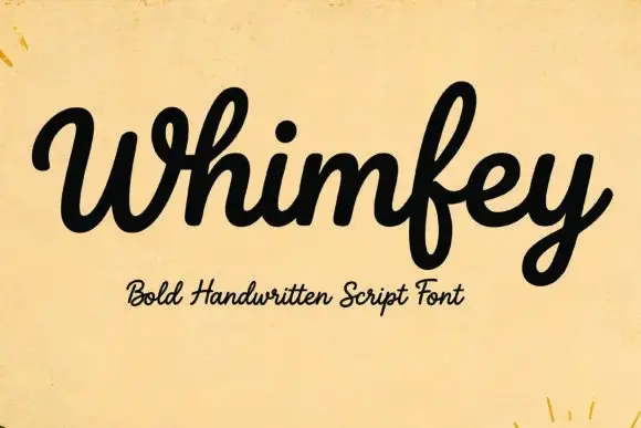
Bold handwritten script
Whimfey is a bold handwritten script in black on aged yellow paper: fat even strokes, a high x-height, short ascenders and a tight rhythm that reads as a confident everyday hand.
Ideas for this font
Allow optional Google Analytics to measure visits and catalogue actions. Your search words and notes are not included. Privacy & storage