Modern Grotesque Body

Anggun + Cultivo
Creates crisp high-hierarchy contrast beneath Anggun headlines across menus, websites and labels.
Inspect Cultivo specimenDisclosure: MakerFileHub may earn a commission from qualifying purchases via paid links on this page. How our links work.
Fine mixed-case lettering with paired g loops and a large upper curl
Anggun is a fine mixed-case serif in which the capital opens broad, the lowercase rounds, two g letters drop adjacent loops beneath the middle of the name and a large fine circular stroke rises above them, so a word reads as linked script lettering.
Paid link
Get this fontProject & layout blueprintsAt-a-glance maker compatibility
Crisp hairline serifs shine on stationery, foil stamping, and packaging; add slight offset for small decals.
Visual anatomy & craft review
The A opens a wide top, the bowls stay rounded on fine strokes, the paired g descenders create two low loops side by side and the upper curl rises in a wide arc over the middle. The paired loops are the character: they tie the word into one shape, which is why the sample sets a single name over a woodland portrait. Because the curl rises and the loops fall, the layout needs 22 mm above and 20 mm below from 26 pt, and the fine strokes want coated stock. Ligatures are listed in the source, so any linked pair is a deliberate access step.
Fine · Looped · Curled
Two-font hierarchy recipes
Tested contrast partners — pairing Anggun with grounded secondary typography.
Anggun + Cultivo
Creates crisp high-hierarchy contrast beneath Anggun headlines across menus, websites and labels.
Inspect Cultivo specimen
Anggun + Hello Honey
Adds a warm human signature touch for 1-to-3-word callouts without competing against structured serif capitals.
Inspect Hello Honey specimenPractical applications
Concrete hierarchy, scale and production guidance tailored to Anggun’s stroke geometry.
The paired loops give a nature suite its gesture, and the fine mixed case keeps a pair of names gentle at 24 pt on heavy card. Two loops are enough for one line.
Hierarchy & layout recipe
Print a 130 by 180 mm card: set the names at 24 pt, keep 20 mm beneath for the two loops, keep 20 mm above for the curl, and set the venue at 9 pt in a light serif below. Keep the venue to one short line.
Pre-production check
Loops printed under 1 mm close at 20 pt; check the proof and keep the names at 22 pt or above on coated stock.
The upper curl gives a feature title a single arch, and the fine strokes stay readable at 54 pt across a printed spread. The arch should not reach the column edge.
Hierarchy & layout recipe
Print a 210 mm spread: set the title at 54 pt across the opening page, keep 26 mm above for the curl and 22 mm beneath for the loops, and set the standfirst at 10 pt in a serif.
Pre-production check
An arch printed over a busy image loses its line; check the page and keep the title on the plain margin. Ask for a colour proof of the page.
The fine loops suit a botanical label, and the open bowls stay clear at 18 pt on a 50 mm panel in one ink. One ink keeps the hairlines from doubling on a small label.
Hierarchy & layout recipe
Print a 50 by 35 mm label: set the studio name at 18 pt, keep 6 mm beneath for the loops, and set the town in a 6 pt caps at the foot with 4 mm of clear ground. Centre the studio name on the panel.
Pre-production check
Two loops printed on a narrow panel touch the die edge; check the artwork and keep 5 mm of border. A round die makes this worse, so keep the panel square.
Technical & licence verification
Confirm included OTF/TTF/WOFF formats, full glyph tables and licence coverage on the live store page before batch production.
Closest visual alternatives
Matched across letterform anatomy, stroke behaviour and craft applications.

Curly ornamental serif
Sparky Dream sets two gold rows of curled serif lettering on a night sky, where large spirals rise above the words, a wide curl sits between the rows and a low figure-eight flourish drops beneath the second word so the outer silhouette fills most of the square field.
Elegant editorial serif with italic
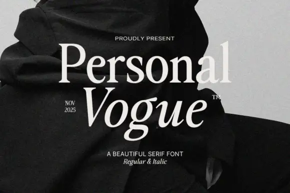
Personal Vogue is a serif in cream on a monochrome fashion photograph: a moderate-contrast roman with fine serifs and a true italic with a strong slant, set on two lines with small tracked notes at the sides and an attribution beneath.
Modern serif with softened joins
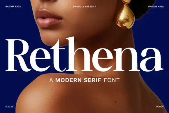
Rethena is a modern serif in white over a deep blue portrait: moderate contrast, softened joins, round bowls and short bracketed serifs, set as one large word with a capital line beneath and small credits in the corners.
Ideas for this font
High-contrast serif with an italic companion
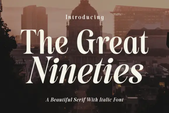
The Great Nineties is a serif family in cream over a city at dusk: a high-contrast roman with fine bracketed serifs for the first line and a matching italic for the second, sold together as a pair.
Same independent foundry
Allow optional Google Analytics to measure visits and catalogue actions. Your search words and notes are not included. Privacy & storage