Editorial Serif Anchor

Amsterdam + The Lumina Awesome
Anchors Amsterdam's fluid strokes with crisp Roman proportions on wedding suites, headers and packaging.
Inspect The Lumina Awesome specimenDisclosure: MakerFileHub may earn a commission from qualifying purchases via paid links on this page. How our links work.
Very thin signature script with a large open capital
Amsterdam is a very thin signature script whose capital opens into a wide oval before the rest of the word runs, and the whole name is set so lightly that it reads as a pen mark on the photograph behind it.
Paid link
Get this fontProject & layout blueprintsAt-a-glance maker compatibility
Weld or Unite overlapping script joins into one continuous vector path before sending to the blade.
Visual anatomy & craft review
The capital A is drawn as a large upright oval with a long tail that sweeps down and to the left, which gives the word a hinge at its start. The m, s, t, e, r, d, a and m that follow run at an even hairline weight with tall straight ascenders, short joins and a slight forward slant, so the word looks written quickly at a slant rather than drawn upright. The thinness is the point: on the dark photograph of hands adjusting a jacket, the white script holds only where the stroke crosses something dark, which is how the sample demonstrates the weight. The tracked subline under the word and the small studio credit at the foot belong to a plain face, and the photograph is the ground.
Thin · Signature · Wide
Two-font hierarchy recipes
Tested contrast partners — pairing Amsterdam with grounded secondary typography.
Amsterdam + The Lumina Awesome
Anchors Amsterdam's fluid strokes with crisp Roman proportions on wedding suites, headers and packaging.
Inspect The Lumina Awesome specimen
Amsterdam + Corven
Keeps small-scale dates, URLs, nutrition facts and care instructions crisp and legible below script titles.
Inspect Corven specimenPractical applications
Concrete hierarchy, scale and production guidance tailored to Amsterdam’s stroke geometry.
A hairline signature reads as a maker's mark rather than a logo, which suits a tailor whose value is in handwork, and the wide capital gives a long name a clear starting point on a narrow label.
Hierarchy & layout recipe
Keep the wordmark at 20 mm wide inside a 45 mm woven label, set the establishment year in a small serif at 4 pt beneath, and hold 3 mm from the tail of the capital to the label edge.
Pre-production check
Woven labels lose a hairline entirely; if the mark is to be woven, redraw the strokes at a millimetre minimum rather than shrinking the print artwork.
A thin signature over a photograph works as a caption device, because the eye reads it as annotation rather than as a headline competing with the image.
Hierarchy & layout recipe
Set the note at 22 pt in white over a dark area of the opening image, keep the caption in a sans at 8 pt below, and hold the words over shadow rather than over highlights where the hairlines disappear.
Pre-production check
Test the placement on the final image at full bleed: a hairline over a light sky is invisible, and the note would look like a printing fault.
A light signature suggests an invitation written by hand rather than a mass mailing, and the thin strokes suit the quieter tone of a winter event better than a bold display face.
Hierarchy & layout recipe
Set the studio name at 26 pt on an A6 card, keep the date and address in a light serif at 9 pt, and hold 10 mm under the lowest tail so the card still feels open at the bottom.
Pre-production check
Winter events are often printed on dark stock; check the hairline against a reversed proof, because white on black reads thinner than black on white.
Technical & licence verification
Confirm included OTF/TTF/WOFF formats, full glyph tables and licence coverage on the live store page before batch production.
Closest visual alternatives
Matched across letterform anatomy, stroke behaviour and craft applications.
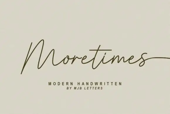
Light modern handwriting with long exits
Moretimes is a light modern handwriting script in olive brown on cream: hairline monoline strokes, an M built from open peaks, and a final s that runs out to the edge of the frame.
Ideas for this font
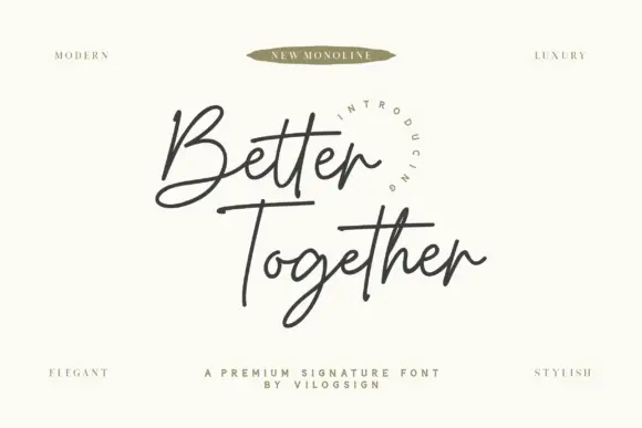
Fine crossed signature script
Better Together is a fine connected signature script with an open looped B, an even monoline weight and long horizontal strokes that cross beneath both words.
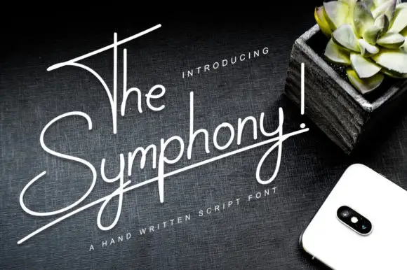
Very thin rising monoline script
The Symphony! is a very thin monoline script in white on a dark wood surface: tall narrow letters, a baseline that rises to the right, and a long horizontal stroke that underlines the whole phrase.
Ideas for this font
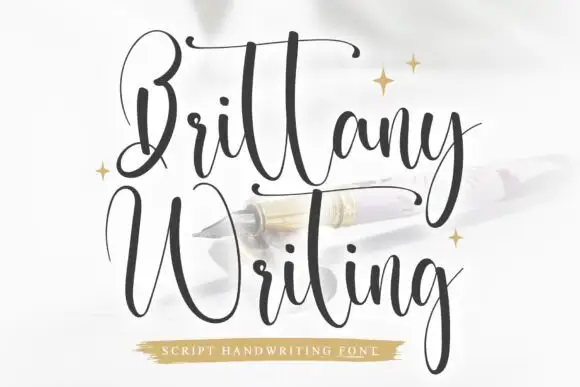
Very tall contrast handwriting with long horizontal swashes and fine joins
Brittany Writing is a very tall handwriting script in which the ascenders run far above the x-height, the joins stay fine and both capital letters carry long horizontal swashes that lift the word off the line.
Ideas for this font
Allow optional Google Analytics to measure visits and catalogue actions. Your search words and notes are not included. Privacy & storage