Editorial Serif Anchor

Athaya + The Bilstein Editorial
Anchors Athaya's fluid strokes with crisp Roman proportions on wedding suites, headers and packaging.
Inspect The Bilstein Editorial specimenDisclosure: MakerFileHub may earn a commission from qualifying purchases via paid links on this page. How our links work.
Handwritten script with a crossing baseline stroke
Athaya is a loose handwritten script whose capital sweeps a long flat horizontal stroke across the whole word, crossing beneath the lowercase to finish in a small curl.
Paid link
Get this fontProject & layout blueprintsAt-a-glance maker compatibility
Weld or Unite overlapping script joins into one continuous vector path before sending to the blade.
Visual anatomy & craft review
The crossing stroke is the whole device: it leaves the first capital, runs flat under the letters and finishes in a small curl on the far side, so the word sits on a drawn line rather than on an imaginary baseline. Lowercase letters stay small, rounded and evenly weighted, with short connections and single-storey forms, which keeps the middle of the word quiet and lets the stroke do the work. The capitals are taller and more angular than the lowercase, which is a deliberate proportion break. The marble ground is the photograph behind the card, the four small icons are listing marks, and the tracked caption above the script belongs to a separate label face.
Crossed · Modern · Loose
Two-font hierarchy recipes
Tested contrast partners — pairing Athaya with grounded secondary typography.
Athaya + The Bilstein Editorial
Anchors Athaya's fluid strokes with crisp Roman proportions on wedding suites, headers and packaging.
Inspect The Bilstein Editorial specimen
Athaya + Prime Nordic
Keeps small-scale dates, URLs, nutrition facts and care instructions crisp and legible below script titles.
Inspect Prime Nordic specimenPractical applications
Concrete hierarchy, scale and production guidance tailored to Athaya’s stroke geometry.
The crossing stroke turns a short brand name into a self-contained mark, so a plain box or bag needs no extra graphic element at all.
Hierarchy & layout recipe
Keep the mark at 30 mm wide, hold the crossing stroke exactly level, and leave 3 mm from the closing curl to the printing edge so the mark sits comfortably on a box lid.
Pre-production check
Rubber stamps distort long straight strokes first; check the line stays straight on a test impression before the final stamp is made.
A crossed lockup reads as a deliberate closing mark, which ends a section more quietly than a printed rule or a decorative ornament would.
Hierarchy & layout recipe
Set the sign-off at 18 pt at the end of the section, align the crossing stroke exactly with the text measure, and keep one clear line of space above it before the next heading.
Pre-production check
If the stroke is shorter than the measure it reads as an underline; match the measure or drop the stroke entirely.
The loose lowercase keeps a casual rehearsal-dinner menu readable while the crossing stroke gives the header a designed edge.
Hierarchy & layout recipe
Set the header at 26 pt on an A5 menu, let the crossing stroke run under the first two words only, and set the courses in a small serif at 9 pt beneath.
Pre-production check
The small caps are single-storey and close together; check the a and e at 26 pt before printing a long header.
Technical & licence verification
Confirm included OTF/TTF/WOFF formats, full glyph tables and licence coverage on the live store page before batch production.
Closest visual alternatives
Matched across letterform anatomy, stroke behaviour and craft applications.
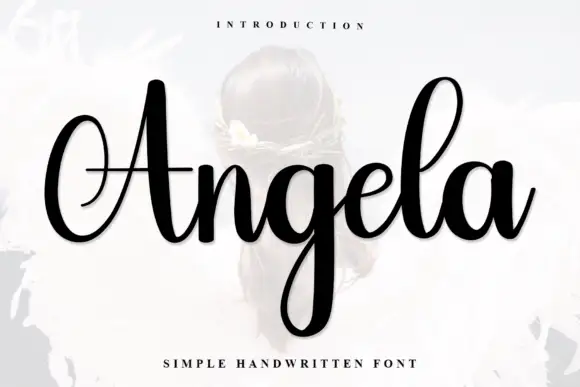
High-contrast handwritten script
Angela has a sweeping capital A, thin connecting strokes and a long looped g below the baseline, where the narrow l rises well above the rounded lowercase and the left curl of the A reaches into the margin.
Ideas for this font
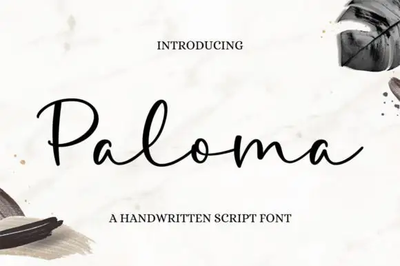
Open rounded low-body script
Paloma is an open rounded script in black on marble: thin monoline strokes, low round bodies with wide counters, a long entry loop on the P and a relaxed spacing that keeps a six-letter word airy.
Ideas for this font

Substantial handwriting script
Simple Handwriting is a substantial handwritten script in deep green on white: connected lowercase with open round bowls, a firm even stroke, tall ascenders and a long entry stroke on the H, set across two lines over a soft brush swipe, with a serif caption beneath and a studio credit at the foot.
Ideas for this font

Fine extended signature script
Lovely sets a fine signature script in a single dark weight over a pale city photograph, where a wide entry curve opens low at the left, the letters rise into tall slender loops through the middle and a large descending y plus an extended closing sweep make the lower right part of the footprint.
Allow optional Google Analytics to measure visits and catalogue actions. Your search words and notes are not included. Privacy & storage