Editorial Serif Anchor

Wedding Romantic + Auretha
Anchors Wedding Romantic's fluid strokes with crisp Roman proportions on wedding suites, headers and packaging.
Inspect Auretha specimenDisclosure: MakerFileHub may earn a commission from qualifying purchases via paid links on this page. How our links work.
Luxury dry-brush handwritten script
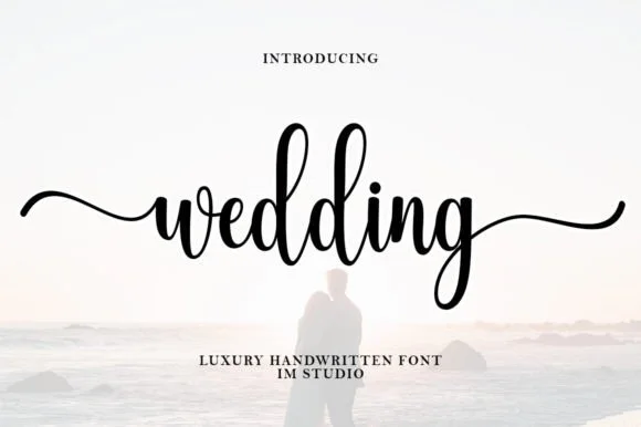
Wedding Romantic is a dry-brush script in black on pale pink: heavily textured strokes that break into bristle marks, sharp thick-to-thin transitions, tall looping capitals, and a baseline that rises across both words.
Paid link
Get this fontProject & layout blueprintsAt-a-glance maker compatibility
Weld or Unite overlapping script joins into one continuous vector path before sending to the blade.
Visual anatomy & craft review
The two words are set large and stacked, and the drawing is a loaded brush with very little ink: the downstrokes are broad and broken by the bristles, the upstrokes are thin and scratchy, and the terminals fray rather than taper, which gives the face its hand-painted credibility. The capitals W and R both rise into tall loops that lean forward, and the lowercase keeps a narrow rhythm that holds the word together despite the texture. Because the texture is in the stroke rather than overlaid, it survives at large sizes and reads as a painted sign, while at small sizes the breaks would read as damage, which is why the sample keeps everything at display scale. The ground is a soft pink field, and the caption at the foot is a small tracked cap line, so the script is the only textured element.
Brush, textured, luxurious, expressive
Two-font hierarchy recipes
Tested contrast partners — pairing Wedding Romantic with grounded secondary typography.
Wedding Romantic + Auretha
Anchors Wedding Romantic's fluid strokes with crisp Roman proportions on wedding suites, headers and packaging.
Inspect Auretha specimen
Wedding Romantic + Modern Heritage
Keeps small-scale dates, URLs, nutrition facts and care instructions crisp and legible below script titles.
Inspect Modern Heritage specimenPractical applications
Concrete hierarchy, scale and production guidance tailored to Wedding Romantic’s stroke geometry.
A dry-brush script gives a romantic suite a hand-painted look, and the texture reads as an intentional brush mark rather than as a distressed font effect.
Hierarchy & layout recipe
A5 portrait: the names at 34 pt, the details in a 9.5 pt serif, and a 0.4 pt rule at the head. Keep 22 mm margins and print in one ink on a textured stock so the bristle marks sit with the paper grain.
Pre-production check
Check the names at 34 pt on the textured stock, where the dry breaks can look like a worn plate; proof one sheet. Confirm the 9.5 pt details keep a 4.5:1 contrast and that the tall loops clear the trim by 8 mm.
A brush script gives a stationer a mark that looks written by hand, and the heavy downstrokes survive being printed at tag size where a fine script would break.
Hierarchy & layout recipe
Set the mark at 36 pt for the card and 18 pt for the tag, with the loops simplified for the tag version. Keep the mark one colour and leave clear space equal to the height of the capital on every side.
Pre-production check
Check the 18 pt tag version, where the dry texture becomes noise; use a cleaner cut for the tag. Confirm the 36 pt card mark reads at arm's length and that the mark holds on a dark ground reversed.
A brush script gives a wedding feature a title that feels painted rather than set, and the textured strokes read strongly over a photograph without a plate.
Hierarchy & layout recipe
Set the title at 90 pt across 170 mm over a photograph, the standfirst in a 10 pt serif beneath, and the folio in 8 pt. Keep the title on the darker band of the image so the thin upstrokes survive the contrast.
Pre-production check
Check the title at 90 pt over the image, where the thin upstrokes disappear first; move the type rather than lightening it. Confirm the 10 pt standfirst reads at arm's length and that the title does not overlap a face.
Technical & licence verification
Confirm included OTF/TTF/WOFF formats, full glyph tables and licence coverage on the live store page before batch production.
Closest visual alternatives
Matched across letterform anatomy, stroke behaviour and craft applications.
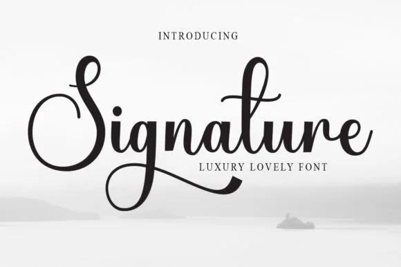
Luxury signature script with high contrast
Signature is a luxury script in black on a pale misty scene: high contrast between thick downstrokes and hairline joins, a capital S drawn as a large closed loop, and a descender on the g that sweeps back under the word in a long taper.
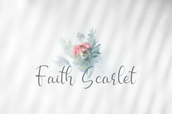
Airy upright fine-pen modern calligraphy script
Faith Scarlet is a delicate, upright fine-pen script with graceful looped capitals ('F', 'S') and light, natural handwritten bounce.
Ideas for this font
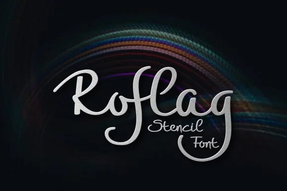
Brush script with stencil bridges
Roflag Stencil is a brush script in silver on a dark ground: a moderate stroke with visible modulation, tall looping ascenders, curled terminals and small bridges cut through several strokes, set as one word with a second line in the same hand and a subtle light trail behind.
Ideas for this font
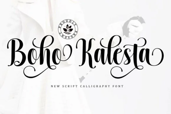
Ornate spiral-looped bohemian calligraphy script
Boho Kalesta is a lush handwritten calligraphy script (not a block display) crowned with dramatic coiled spiral loops on capitals and endings.
Ideas for this font
Same independent foundry
Allow optional Google Analytics to measure visits and catalogue actions. Your search words and notes are not included. Privacy & storage