Editorial Serif Anchor

Virnature + Worldstar
Anchors Virnature's fluid strokes with crisp Roman proportions on wedding suites, headers and packaging.
Inspect Worldstar specimenDisclosure: MakerFileHub may earn a commission from qualifying purchases via paid links on this page. How our links work.
Calligraphic script with leaf ornaments
Virnature is a wide, low-contrast calligraphy script with a deep blue ink and leaf ornaments drawn into the letters themselves, shown between branches of real foliage.
Paid link
Get this fontProject & layout blueprintsAt-a-glance maker compatibility
Weld or Unite overlapping script joins into one continuous vector path before sending to the blade.
Visual anatomy & craft review
Virnature runs across the card in a single generous line, and the letters are drawn rather than written: the stems swell and thin by hand, the capitals open into wide ribbons, and the entry and exit strokes stretch out to both margins like a signature that has been given room. A leaf is drawn inside the bowl of the capital V and another at the end of the final swash, so the ornament is part of the glyph rather than a separate artwork. The ground is a cream fabric with real eucalyptus and fern branches laid at the left and right corners, and four letter-spaced labels above read Natural, Alternates, Ligatures, Elegant, with the designer's credit at the foot. The script is built for one line at generous size: with alternates and ligatures it can be tuned, but it should not be set as body copy.
A wide calligraphic script with drawn leaf ornaments
Two-font hierarchy recipes
Tested contrast partners — pairing Virnature with grounded secondary typography.
Virnature + Worldstar
Anchors Virnature's fluid strokes with crisp Roman proportions on wedding suites, headers and packaging.
Inspect Worldstar specimen
Virnature + Taught
Keeps small-scale dates, URLs, nutrition facts and care instructions crisp and legible below script titles.
Inspect Taught specimenPractical applications
Concrete hierarchy, scale and production guidance tailored to Virnature’s stroke geometry.
The leaf ornaments carry the botanical theme without a separate illustration, and the wide swashes let a single line fill the width of an invitation.
Hierarchy & layout recipe
Print a 130 by 180 mm invitation: set the names at 30 pt on one row, keep 20 mm of clear ground beneath before the venue at 9 pt, and hold 15 mm from the outer swash to the card edge.
Pre-production check
The long swashes can be clipped by a border; print one invitation on the intended stock and check both ends before the suite.
The script reads as a hand-written apothecary label, and the drawn leaves give a small label its illustration without a second element.
Hierarchy & layout recipe
Print a 50 by 75 mm bottle label: set the product name at 15 pt on one row, keep 6 mm of clear ground beneath before the volume at 4.5 pt, and hold 4 mm from the lowest swash to the die line.
Pre-production check
At label size the leaf in the capital closes up; print one at the real size and check the ornament before the order.
One line of this script reads as a magazine masthead treatment, and the blue ink holds against the photography of a plant-filled spread.
Hierarchy & layout recipe
Print a 230 by 300 mm opener: set the feature word at 96 pt on one row, keep 28 mm of clear ground beneath before the standfirst at 11 pt, and hold 20 mm of margin so the swashes are not trimmed.
Pre-production check
Wide swashes at 96 pt can collide with a column rule; print one opener and check the line clears the gutter before the issue.
Technical & licence verification
Confirm included OTF/TTF/WOFF formats, full glyph tables and licence coverage on the live store page before batch production.
Closest visual alternatives
Matched across letterform anatomy, stroke behaviour and craft applications.
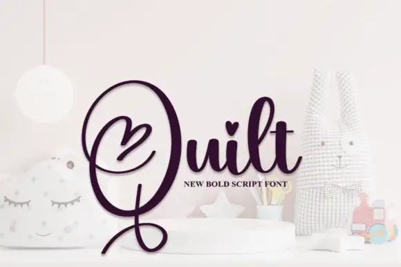
Bold heart-accented looping script
Quilt is a bold looping script in deep plum on a pale nursery set: fat even strokes, a huge open capital Q with a heart drawn inside its bowl, a heart on the t and a long descender that curls back under the word.
Ideas for this font

Fine lowercase script with a heart worked into the central connector
Hello Honey is fine lowercase script in which the two words are joined by a heart drawn into the connector, with long flat tails on both sides and a small even x-height.
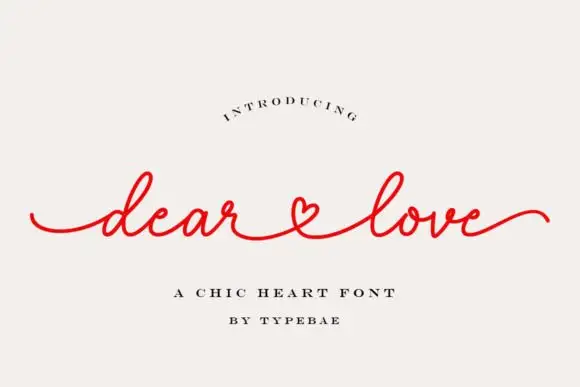
Fine lowercase script with long flat tails and a heart-shaped connector
Dear Love is a fine lowercase script in which the stroke stays light and even, the ends run out as flat tails and the words are joined by a connector drawn as a small heart.
Ideas for this font
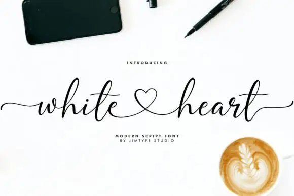
Modern signature script with a heart loop
White Heart is a modern signature script in black on white: a hairline hand with tall loops, long horizontal entry and exit strokes, and a heart drawn into the connection between the two words.
Ideas for this font
Same independent foundry
Allow optional Google Analytics to measure visits and catalogue actions. Your search words and notes are not included. Privacy & storage