High-Contrast Display Serif

Valerine + Raffined
Pairs sculptural editorial warmth with Valerine's clean modern geometry.
Inspect Raffined specimenDisclosure: MakerFileHub may earn a commission from qualifying purchases via paid links on this page. How our links work.
High-contrast serif with a flowing script
Valerine is a bundle of a high-contrast display serif and a flowing script, presented on a torn cream sheet over blue stripes: a red serif with fine hairlines and a green script that sits beneath it in a lighter hand.
Paid link
Get this fontProject & layout blueprintsAt-a-glance maker compatibility
Weld or Unite overlapping script joins into one continuous vector path before sending to the blade.
Visual anatomy & craft review
The pairing is the product: Valerine is set in a didone-style serif with extreme thick-to-thin, sharp serifs and a small x-height, so a short word reads as a printed title, while Lovely Typeface runs beneath it in a connected script with wide loops and a soft slant. The two share a period feel and nothing else, which is what makes them work as a pair: the serif holds the structure, the script supplies the movement, and both are shown in colours that separate them on one sheet. A torn paper edge, a striped border, a small oval stamp and a banner at the foot complete the presentation, which reads as a vintage packaging mock-up. The bundle is aimed at labels, covers and packaging with a retro voice, and it needs a large format where the serif hairlines can be seen.
A red display serif over a green script
Two-font hierarchy recipes
Tested contrast partners — pairing Valerine with grounded secondary typography.
Valerine + Raffined
Pairs sculptural editorial warmth with Valerine's clean modern geometry.
Inspect Raffined specimen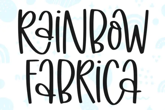
Valerine + Rainbow Fabrica
Introduces organic movement on pull-quotes, signatures and gift tags.
Inspect Rainbow Fabrica specimenPractical applications
Concrete hierarchy, scale and production guidance tailored to Valerine’s stroke geometry.
A didone title over a script subtitle gives a cover a period hierarchy in two moves, and the bundle means one purchase for both roles.
Hierarchy & layout recipe
Print a 230 by 300 mm cover: set the title at 90 pt in the serif, set the subtitle at 34 pt in the script with 24 mm of clear ground, and hold 22 mm of margin on all four sides.
Pre-production check
Fine hairlines break on uncoated cover stock; print one cover on the intended paper and check the thinnest stroke before the run.
A high-contrast serif gives a wedding card the look of a printed announcement, and the script keeps the names from feeling like a formal notice.
Hierarchy & layout recipe
Print a 130 by 180 mm invitation: set the family name at 30 pt in the serif, set the names at 22 pt in the script with 16 mm of clear ground, and hold 18 mm of margin on all four sides.
Pre-production check
Two faces with very different contrast can fight on one card; print one invitation at the finished size and check the balance before the suite.
The pair suits a product with a heritage story, and the serif carries the product name while the script carries the age line on one small label.
Hierarchy & layout recipe
Print a 55 by 90 mm label: set the product at 15 pt in the serif, set the age at 8 pt in the script with 5 mm of clear ground, and hold 4 mm of margin on all four sides.
Pre-production check
Hairlines on a matte label fill in; print one on the real stock and check the serif edges before the order.
Technical & licence verification
Confirm included OTF/TTF/WOFF formats, full glyph tables and licence coverage on the live store page before batch production.
Closest visual alternatives
Matched across letterform anatomy, stroke behaviour and craft applications.
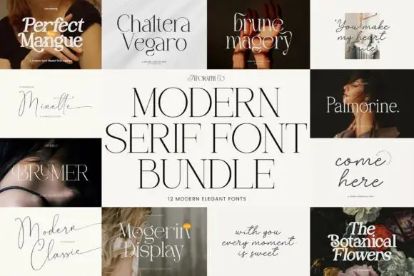
Twelve-cut modern serif bundle
Modern Bundle is a twelve-font serif bundle laid out as a grid of titled tiles: each of the twelve faces is shown in its own cover with its name set in itself, and the bundle name sits across a central cream panel in a high-contrast serif.
Ideas for this font
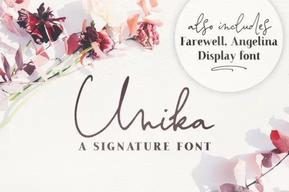
Fine signature with a serif companion
Unika is a fine signature script in cocoa brown on white, sold with a companion display serif: long flat entry strokes, narrow loops, and a lower case that barely leaves the baseline.
Ideas for this font
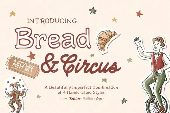
Outline lettering with a textured script and matching line, regular and sketch cuts
Bread and Circus is a bundle in which one hand-lettered drawing is supplied as an outline, a solid, a textured script and a sketch, so a single word can be printed hollow, filled or worn from one artwork.
Ideas for this font
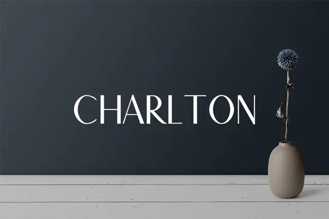
A restrained uppercase specimen with thin arms and modest curved-stroke contrast
Charlton 7 Font Family Pack shows one pale capital title on a dark wall beside a vase: slim horizontal arms meet stronger upright and curved strokes, the O closes as a rounded oval and the R keeps a short bowl above an angled leg.
Ideas for this font
Same independent foundry
Allow optional Google Analytics to measure visits and catalogue actions. Your search words and notes are not included. Privacy & storage