High-Contrast Display Serif

Thanksgiving + Alerigue
Pairs sculptural editorial warmth with Thanksgiving's clean modern geometry.
Inspect Alerigue specimenDisclosure: MakerFileHub may earn a commission from qualifying purchases via paid links on this page. How our links work.
Rounded marker sans with an informal stem
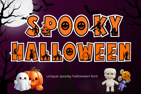
Thanksgiving is a rounded marker sans in warm orange on a dark panel: capital letters with soft terminals, a slightly informal stem and a hand-drawn feel, framed by autumn produce on a wooden table.
Paid link
Get this fontProject & layout blueprintsAt-a-glance maker compatibility
Sturdy stroke walls and open counters weed cleanly on adhesive vinyl, HTV apparel film, and cut cardstock.
Visual anatomy & craft review
The two words are stacked in large capitals on a dark navy panel, and the face is a rounded marker sans: the stroke is even with a slight swell on the curves, the terminals are cut round rather than square, the H and the A have softened corners, the S is drawn with generous bowls and the G carries a short spur instead of a bar. Nothing joins and nothing slants, so the face reads as a friendly upright letter, closer to a sign written with a felt marker than to a geometric sans, and the counters stay open enough to keep the letters apart at a distance. In the sample the type sits on a dark panel that floats over a wooden surface crowded with apples, peppers, cherries, corn and autumn leaves, and a tracked capital line names the product at the foot. Thanksgiving is a casual sans for menus, labels, cards and seasonal signage, and it works best in capitals at a large size on a dark ground.
Rounded, casual, warm
Two-font hierarchy recipes
Tested contrast partners — pairing Thanksgiving with grounded secondary typography.
Thanksgiving + Alerigue
Pairs sculptural editorial warmth with Thanksgiving's clean modern geometry.
Inspect Alerigue specimen
Thanksgiving + Hello Honey
Introduces organic movement on pull-quotes, signatures and gift tags.
Inspect Hello Honey specimenPractical applications
Concrete hierarchy, scale and production guidance tailored to Thanksgiving’s stroke geometry.
A rounded marker sans reads at a distance in a hall and looks written for the evening rather than printed from a template.
Hierarchy & layout recipe
Print a 700 by 500 mm board: set the heading at 90 pt over two lines, keep 30 mm of clear ground beneath before the courses at 20 pt, and hold 26 mm of margin on all four sides.
Pre-production check
Warm orange on a dark ground loses contrast in dim light; proof one board under the room lighting before the print.
A soft rounded face carries gratitude without the formality of a serif, and the capitals stay legible at the size of a small tag.
Hierarchy & layout recipe
Print a 90 by 50 mm card: set the message at 14 pt over two lines, keep 6 mm of clear ground beneath before the signature at 9 pt, and hold 5 mm of margin on all four sides.
Pre-production check
Two short lines of capitals can look like a label rather than a note; print one card and check the balance of the lines.
A warm marker sans suits a seasonal product, and the even stroke reproduces cleanly on a small label where a brush face would blot.
Hierarchy & layout recipe
Print a 55 by 70 mm label: set the product at 14 pt on one line, keep 6 mm of clear ground beneath before the weight at 5 pt, and hold 4 mm of margin on all four sides.
Pre-production check
An orange ink on kraft board turns muddy; print one label on the intended stock and judge the colour before the order.
Technical & licence verification
Confirm included OTF/TTF/WOFF formats, full glyph tables and licence coverage on the live store page before batch production.
Closest visual alternatives
Matched across letterform anatomy, stroke behaviour and craft applications.
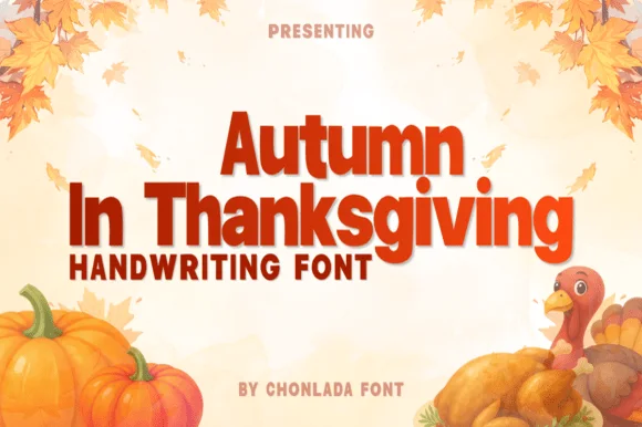
Warm thick marker print with upright letters and even stroke weight
Autumn in Thanksgiving is a warm thick marker print in which the letters stand upright, the stroke stays heavy and even and the counters remain open, so a word reads as something written large with a marker on a card.
Ideas for this font
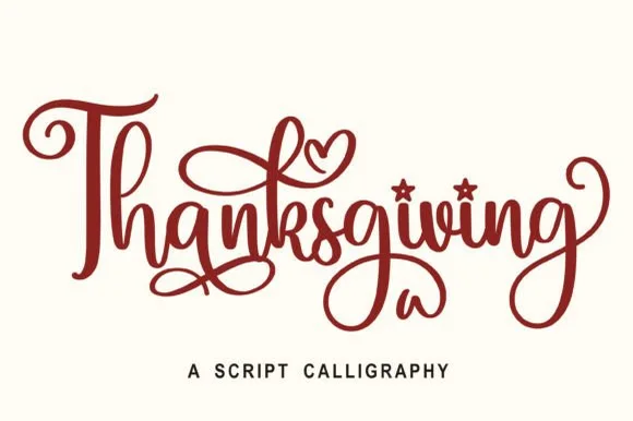
Calligraphic brush script
Thanksgiving is a calligraphic script in dark red on white: a heavy brush stroke with thick-to-thin modulation, tall looping ascenders, generous flourishes on the first and last letters, and heart-shaped details inside two bowls, so the word reads as a hand-lettered greeting.
Ideas for this font
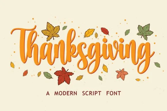
Bouncy upright harvest brush script
Thanksgiving is a bouncy upright harvest brush script in orange on cream: soft strokes with a slight taper, a large x-height, tall round loops and a baseline that rises and falls with drawn leaves around it.
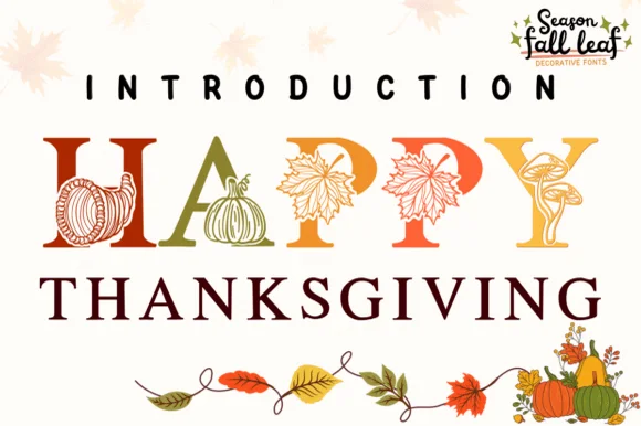
Botanical harvest serif illustrated with pumpkins, cornucopias & leaves
Happy Thanksgiving (by PraewDesigns / Season Fall Leaf) is an illustrated harvest display serif (NOT a script) wrapping pumpkins, maple leaves, mushrooms, and cornucopias around Roman capitals!
Ideas for this font
Same independent foundry
Allow optional Google Analytics to measure visits and catalogue actions. Your search words and notes are not included. Privacy & storage