Editorial Serif Anchor

Tattoo Studio + Stanza
Anchors Tattoo Studio's fluid strokes with crisp Roman proportions on wedding suites, headers and packaging.
Inspect Stanza specimenDisclosure: MakerFileHub may earn a commission from qualifying purchases via paid links on this page. How our links work.
Slanted calligraphy with fine loops and oversized sweeping capitals
Tattoo Studio is an ornate connected script in neon green on black, its letters linked by wide loops and its capitals throwing swashes far past the word on both sides.
Paid link
Get this fontProject & layout blueprintsAt-a-glance maker compatibility
Fine grain and micro-texture excel in 300 DPI print, sublimation, and screen print rather than small vinyl weeding.
Visual anatomy & craft review
Tattoo over Studio fills the frame, the T built from a long horizontal flourish and the S curling into a loop that crosses the baseline. The joins stay thick and continuous, the ascenders end in fine curls, and the flourishes reach so far that the words overlap each other's space. Nothing here is a text face: the sample is a lettering piece, and the script reads as one continuous drawing rather than a sequence of glyphs. On a dark ground the neon edge is what makes it legible, and printed light-on-dark or as a foil it behaves the same way, so the artwork needs space around it on every side.
Slanted calligraphy with fine loops and oversized sweeping capitals
Two-font hierarchy recipes
Tested contrast partners — pairing Tattoo Studio with grounded secondary typography.
Tattoo Studio + Stanza
Anchors Tattoo Studio's fluid strokes with crisp Roman proportions on wedding suites, headers and packaging.
Inspect Stanza specimen
Tattoo Studio + Borsen
Keeps small-scale dates, URLs, nutrition facts and care instructions crisp and legible below script titles.
Inspect Borsen specimenPractical applications
Concrete hierarchy, scale and production guidance tailored to Tattoo Studio’s stroke geometry.
The script reads as hand-lettered signage rather than a shop font, and the long flourishes give a window a piece of artwork with one word in it.
Hierarchy & layout recipe
Print a 600 by 400 mm window decal: set the shop name at 70 mm across two rows, keep 26 mm of clear ground beneath before the street line at 14 pt, and keep 34 mm of border so the swashes stay inside.
Pre-production check
Fine curls break when weeded from cut vinyl; check a weeding test before the decal run. Have the printer send a physical sample first.
The neon script on black suits a dark-season night out, and the heavy joins keep a short event name readable from across a street.
Hierarchy & layout recipe
Print an A2 poster: set the event name at 110 pt across one row, keep 30 mm of clear ground beneath before the date at 18 pt, and keep 28 mm of border so the overlapping flourishes have room.
Pre-production check
Neon colour is a treatment on the artwork; check the flat file before planning a two-colour print.
The lettering style is the subject of the book, and one phrase fills a cover without a photograph or a second graphic element behind it.
Hierarchy & layout recipe
Print a 200 by 250 mm cover: set the title at 80 pt across two rows, keep 24 mm of clear ground beneath before the author at 12 pt, and keep 20 mm of margin from the trim edge on every side.
Pre-production check
Thin overlapping lines fill in at small sizes; check the printed cover before the run. Request a proof on the actual stock before signing off.
Technical & licence verification
Confirm included OTF/TTF/WOFF formats, full glyph tables and licence coverage on the live store page before batch production.
Closest visual alternatives
Matched across letterform anatomy, stroke behaviour and craft applications.
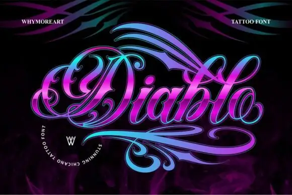
Ornamental script with ribbon flourishes and heavy shaded stems
Diablo is an ornamental script in which the letters grow ribbon-like flourishes, the stems carry a shaded double line and the word is wrapped in swashes above and below.
Ideas for this font
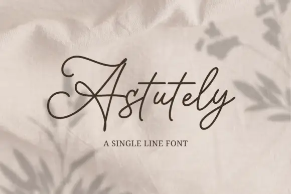
Single-line monoline script with connected ribbon strokes
Astutely is a single-line script: one unvarying stroke loops through every letter without swelling, thinning or overlapping, so the word reads as a piece of bent wire rather than written ink.
Ideas for this font
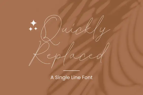
Hairline loosely joined script
Quickly Replaced is a single-line signature script drawn as a hairline: the letters are loosely joined, the ascenders are tall and narrow, and the whole signature is the width of a stroke rather than a shape.
Ideas for this font
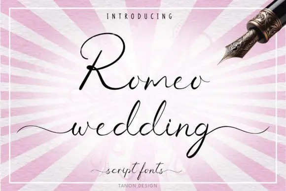
Fine connected wedding script
Romeo Wedding is a fine connected script in black on a striped pink ground: tall loops, long horizontal swashes, a fine consistent connector and a light weight, set in two lines with a small introducing line above, a script descriptor beneath and a credit at the foot, inside a fine rule.
Ideas for this font
Allow optional Google Analytics to measure visits and catalogue actions. Your search words and notes are not included. Privacy & storage