Neutral Sans Workhorse

Super Mama + Nyxar
Lets Super Mama own the focal silhouette while handling secondary copy, sizing and subheads cleanly.
Inspect Nyxar specimenDisclosure: MakerFileHub may earn a commission from qualifying purchases via paid links on this page. How our links work.
Playful multicolour rounded display
Super Mama is a playful display in fat rounded capitals: each letter takes its own bright colour, every shape carries a white outline and a pale halo, and small glossy highlights sit at the top left of each stroke so the word looks like inflated icing.
Paid link
Get this fontProject & layout blueprintsAt-a-glance maker compatibility
Sturdy stroke walls and open counters weed cleanly on adhesive vinyl, HTV apparel film, and cut cardstock.
Visual anatomy & craft review
Both words are stacked and fill the frame, and the drawing is deliberately soft: the stems are thick, the terminals are round, the counters are wide ovals, and the letters bounce a little off the baseline, so the pair reads as a children's party graphic rather than as a typeface. Each letter is enclosed in a white keyline with a wider pale halo behind it, which is what separates two adjacent bright colours without a plate, and the highlights are drawn as small slivers rather than gradients. The spacing is close, so the word reads as a garland of shapes, and the counters stay generous enough that the letters are still distinguishable. The ground is a soft watercolour wash, and the two captions are set in a playful rounded sans, so the page holds together as a product shot.
Playful, rounded, colourful, glossy
Two-font hierarchy recipes
Tested contrast partners — pairing Super Mama with grounded secondary typography.
Super Mama + Nyxar
Lets Super Mama own the focal silhouette while handling secondary copy, sizing and subheads cleanly.
Inspect Nyxar specimen
Super Mama + Evoire
Grounds bold display lettering with classic typographic authority on posters, badges and apparel.
Inspect Evoire specimenPractical applications
Concrete hierarchy, scale and production guidance tailored to Super Mama’s stroke geometry.
A multicolour rounded display reads as celebration before the words are parsed, and the white keyline keeps the colours legible when they are printed at card size.
Hierarchy & layout recipe
A6 card: the name at 34 pt, the details in a 10 pt rounded sans, and the halo at 1.5 mm. Keep the palette to four colours on a white ground so a home printer can reproduce the keylines cleanly.
Pre-production check
Check the 34 pt name on a home printer, where a 1.5 mm halo can fill and merge two letters; increase the gap between letters. Confirm the 10 pt details keep a 4.5:1 contrast and that the keyline does not disappear on the palest colours.
A bright rounded display attracts children at a distance, and the individual letter colours make a sign look hand-decorated without any illustration.
Hierarchy & layout recipe
A2 print: the name at 150 mm cap height, the times in a 24 mm rounded sans, and a 5 mm halo. Keep 25 mm margins so the haloes never bleed off the sheet, and print on a coated board so the colours stay saturated outdoors.
Pre-production check
Check the sign at five metres, where adjacent bright colours can vibrate; separate them with the white keyline at full width. Confirm the 24 mm times read at three metres and that the haloes stay even around every letter.
A rounded multicolour face gives a snack label a playful identity, and the keyline construction lets several colours print on a small label without a second plate.
Hierarchy & layout recipe
Print a 60 by 80 mm label: the brand at 20 pt in two colours, the flavour in a 7 pt sans, and a 1 mm keyline. Keep the palette to three colours plus white so the label stays legible on a busy shelf.
Pre-production check
Check the 20 pt brand on the label, where a bright colour on a pale ground can lose contrast; add the keyline at full width. Confirm the 7 pt flavour reads at arm's length and that the label survives a chilled display cabinet.
Technical & licence verification
Confirm included OTF/TTF/WOFF formats, full glyph tables and licence coverage on the live store page before batch production.
Closest visual alternatives
Matched across letterform anatomy, stroke behaviour and craft applications.
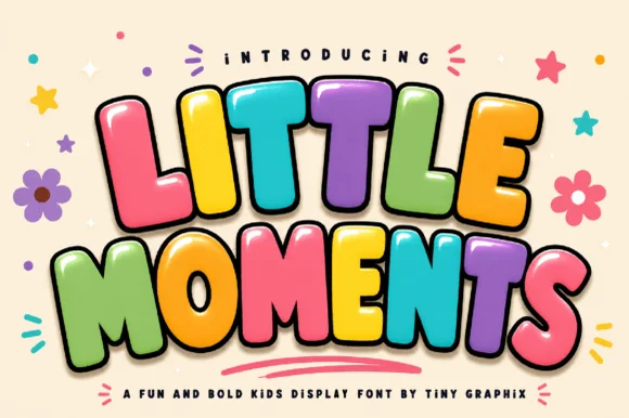
3D comic-extruded chunky kids' bubble display
Little Moments is a heavy, comic-book kids' bubble font with tilted overlapping capitals, plump rounded bellies, and glossy cartoon punch.
Ideas for this font
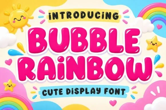
Ultra-plump kawaii bubble display with shine highlights
Bubble Rainbow is a super-plump, jellybean-round bubble display font accented with cute curved shine highlights inside each letter.
Ideas for this font
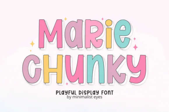
Tall bouncy pastel sticker cartoon sans
Marie Chunky is a tall, lively cartoon display font mixing uppercase and lowercase bubble shapes inside crisp outline borders!
Ideas for this font
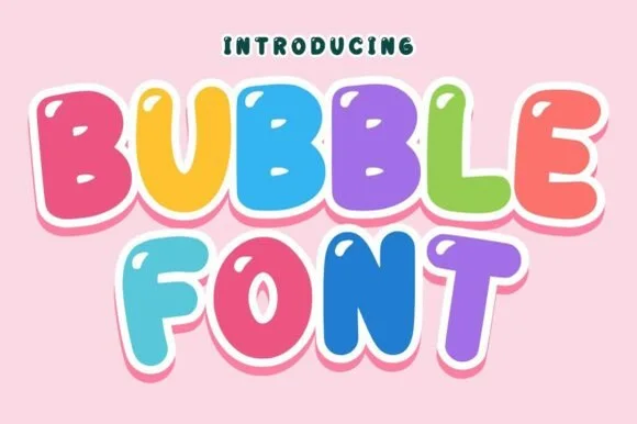
Bouncy comic-tilted rainbow cartoon bubble sans
Bubble (by Infinity art Studio) is a lively, tilted-baseline cartoon bubble font with open rounded counters and energetic kid-merchandise bounce.
Ideas for this font
Allow optional Google Analytics to measure visits and catalogue actions. Your search words and notes are not included. Privacy & storage