Neutral Sans Workhorse

Spooky Patch + Corven
Lets Spooky Patch own the focal silhouette while handling secondary copy, sizing and subheads cleanly.
Inspect Corven specimenDisclosure: MakerFileHub may earn a commission from qualifying purchases via paid links on this page. How our links work.
Patchwork Halloween colour display
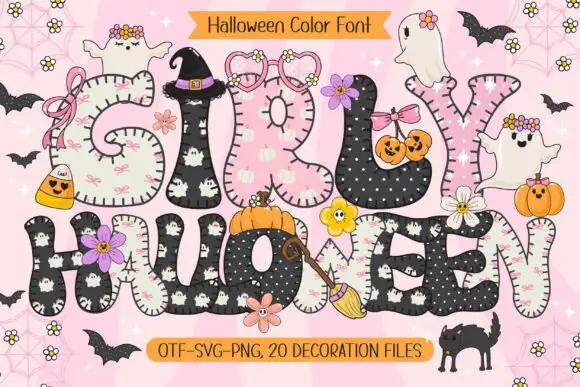
Spooky Patch is a colour display on a stitched cream ground: tall soft letters divided into warm checks, dots, plaid and dark patches, outlined in white with visible stitching, with ghosts, pumpkins, bats and webs scattered around and two ribbons that name the format list and the count of decoration files.
Paid link
Get this fontProject & layout blueprintsAt-a-glance maker compatibility
Sturdy stroke walls and open counters weed cleanly on adhesive vinyl, HTV apparel film, and cut cardstock.
Visual anatomy & craft review
The plate is a craft scene, and the letters are patchwork: each stem is divided into panels of different fabrics with a stitch line along the seams, so the word reads as a sewn banner rather than as type. That construction sets a large size floor, because the seams and the small motifs close first, and the plate sets the words large enough that each fabric patch is distinguishable. The ghosts and pumpkins around the sheet are supplied decoration files rather than glyphs, which the ribbons state plainly. The cream stitched ground is staging that keeps the warm palette readable. It suits a card, a tag and a shirt, and the pattern needs a print check at the intended size.
Decorative, patchwork, halloween, cosy
Two-font hierarchy recipes
Tested contrast partners — pairing Spooky Patch with grounded secondary typography.
Spooky Patch + Corven
Lets Spooky Patch own the focal silhouette while handling secondary copy, sizing and subheads cleanly.
Inspect Corven specimen
Spooky Patch + The Bilstein Editorial
Grounds bold display lettering with classic typographic authority on posters, badges and apparel.
Inspect The Bilstein Editorial specimenPractical applications
Concrete hierarchy, scale and production guidance tailored to Spooky Patch’s stroke geometry.
A patchwork display keeps the season friendly, and the sewn texture reads as a home-made banner rather than a printed graphic.
Hierarchy & layout recipe
A6 card: the greeting at 30 pt, the details in a 10 pt sans, and the date at 9 pt. Keep 15 mm margins, print four colours on a cream card and leave 12 mm at the foot for the address.
Pre-production check
Check the 30 pt greeting at home-print resolution, where a seam can close; keep the smallest patch above 1.5 mm. Confirm the 10 pt details keep a 4.5:1 contrast and that the card folds flat.
A patchwork tag names a bag, and the warm palette suits a daytime party rather than a dark one. The warm palette keeps it friendly.
Hierarchy & layout recipe
Print 45 by 70 mm tags: the name at 11 pt, the year at 7.5 pt, and four colours on a cream card. Keep 5 mm inside the die and punch the hole clear of a seam.
Pre-production check
Check the 11 pt name on a tag, where the seams crowd the die; simplify there. Confirm the year reads at arm's length and that the tags tie cleanly.
A patchwork display prints as event kit, and the warm tones read on a light shirt where a dark graphic would look severe.
Hierarchy & layout recipe
Print a 240 mm chest graphic: the fair at 50 mm cap height, the year at 24 mm, and four inks on a light shirt. Keep the smallest patch at 4 mm and place the graphic 80 mm below the collar.
Pre-production check
Check the screen at actual mesh, where a 4 mm patch can fill; simplify the pattern. Wash-test one shirt and confirm the seams stay visible after five cycles.
Technical & licence verification
Confirm included OTF/TTF/WOFF formats, full glyph tables and licence coverage on the live store page before batch production.
Closest visual alternatives
Matched across letterform anatomy, stroke behaviour and craft applications.
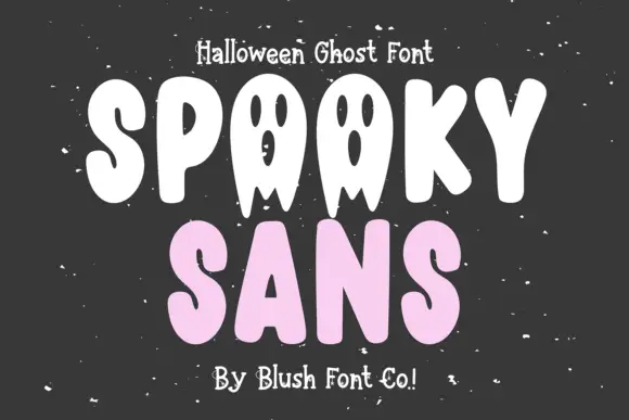
Rounded ghost-figure display
Spooky Sans is a playful display on a charcoal ground: heavy rounded capitals in white and pale pink, with the O drawn as a ghost figure with eyes and a pointed lower edge, small pale dots scattered around and a plain credit line at the foot.
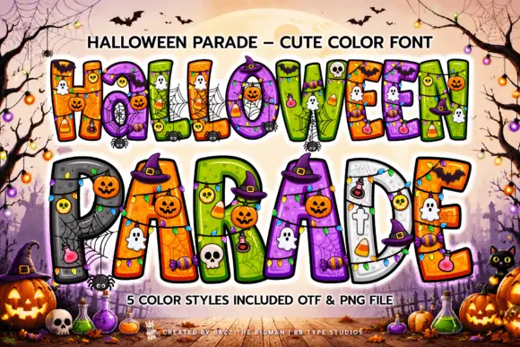
Thick outlined Halloween blocks with saturated patchwork interiors
Halloween Parade draws fat display letters in five colour styles and fills them with seasonal characters: jack-o-lanterns, ghosts, skulls, bats, spiders and webs inside the counters.
Ideas for this font
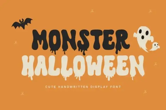
Cute dripping seasonal display
Monster Halloween is a cute dripping display in black and cream on orange: fat rounded letters with long drips hanging from the baseline, uneven heights and a bouncing baseline, with a bat and a ghost drawn in the same weight, so the plate reads as a friendly seasonal card.
Ideas for this font
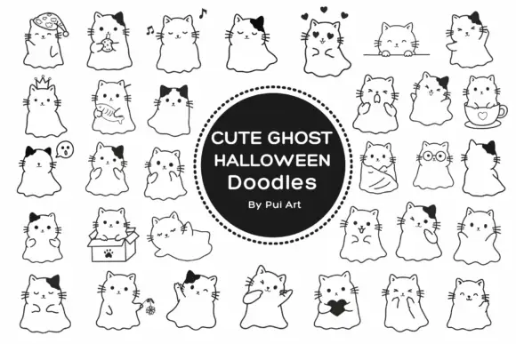
Cat-eared ghost doodles with thin outlines and small expressive accessories
Cute Ghost Halloween is a dingbat set of small cat ghosts — a cat's head on a sheet with a wavy hem — in about thirty variations, each holding something different: a candy, a candle, a heart, a cat in a box.
Ideas for this font
Same independent foundry
Allow optional Google Analytics to measure visits and catalogue actions. Your search words and notes are not included. Privacy & storage