Neutral Sans Workhorse

Spooky Halloween + Inkora
Lets Spooky Halloween own the focal silhouette while handling secondary copy, sizing and subheads cleanly.
Inspect Inkora specimenDisclosure: MakerFileHub may earn a commission from qualifying purchases via paid links on this page. How our links work.
Dripping pastel display with script
Spooky Halloween is a layered display in pastel pink, peach and sage on white: fat caps melting into long drips, a monoline script running across the middle of the block, and a tracked caption beneath, so the plate reads as a seasonal lockup rather than a single font.
Paid link
Get this fontProject & layout blueprintsAt-a-glance maker compatibility
Cut solid base, outline, and shadow layers in separate vinyl colors and align on registration marks.
Visual anatomy & craft review
The composition uses two voices: the dripping caps carry the seasonal weight, and the monoline script crosses them at mid-height, which is a common way to combine a display and a script on a party design. The caps are fat and rounded with drips that hang at irregular lengths, and the drips are part of the skeleton, so the word keeps its rhythm. The pastel palette is what keeps a drippy face light rather than gruesome, and the script is drawn in one weight so it reads clearly against the busy block behind it. Because the drips extend below the baseline, the pair needs vertical room, and the plate leaves the white empty around the lockup apart from a small caption.
Dripping, pastel, seasonal, layered
Two-font hierarchy recipes
Tested contrast partners — pairing Spooky Halloween with grounded secondary typography.
Spooky Halloween + Inkora
Lets Spooky Halloween own the focal silhouette while handling secondary copy, sizing and subheads cleanly.
Inspect Inkora specimen
Spooky Halloween + Askinо
Grounds bold display lettering with classic typographic authority on posters, badges and apparel.
Inspect Askinо specimenPractical applications
Concrete hierarchy, scale and production guidance tailored to Spooky Halloween’s stroke geometry.
A pastel dripping face keeps a seasonal card playful, and the script overlay lets one card carry both the greeting and the child's name.
Hierarchy & layout recipe
A6 card: the greeting at 28 pt, the name in the script at 16 pt, and the details in a 9 pt sans. Keep 14 mm margins, leave 10 mm below the drips, and print three colours on a white card.
Pre-production check
Check the 28 pt greeting, where the script can collide with the counters; raise it to the gap between the bowls. Confirm the 9 pt details keep a 4.5:1 contrast and that the drips clear the trim.
A dripping label reads as a seasonal special, and the pastel palette keeps a small bakery's range looking cheerful rather than frightening.
Hierarchy & layout recipe
Print a 60 mm round label: the product at 14 pt, the weight in a 6 pt sans, and 4 mm inside the die. Keep three colours and print on a white stock so the drips stay open.
Pre-production check
Check the 14 pt product, where a drip can reach the die edge; keep 4 mm clear. Confirm the 6 pt weight reads on the shelf and that the label survives a chilled cabinet.
A pastel seasonal face suits a school fair where the tone has to be friendly, and the flat colours photocopy acceptably in one colour.
Hierarchy & layout recipe
A4 print: the headline at 44 mm cap height, the times in a 10 mm sans, and the stalls in 9 mm. Keep 20 mm margins and print two colours on a light stock.
Pre-production check
Check the A4 at two metres, where the drips can read as noise; keep them coarse. Confirm the 9 mm stalls read at arm's length and that the headline fits the sheet.
Technical & licence verification
Confirm included OTF/TTF/WOFF formats, full glyph tables and licence coverage on the live store page before batch production.
Closest visual alternatives
Matched across letterform anatomy, stroke behaviour and craft applications.
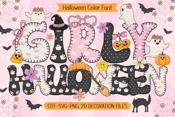
Rounded patchwork letters with pink motifs and small Halloween figures
Girly Halloween sets fat colour capitals in two treatments — cream with tiny black ghosts, and black with white dots — and dresses every letter with a bow, a flower, a pumpkin or a friendly ghost.
Ideas for this font
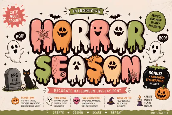
Bubble horror letters with faces and webs
Horror Season mixes puffy capitals with melting lower edges and face-shaped counters, where webs, cracks and small creature details appear inside selected letter bodies and the title is multicoloured with a heavy outline.
Ideas for this font
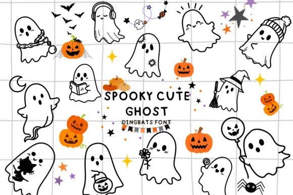
Ghost dingbat set
Spooky Cute Ghost is a dingbat sheet on a grid ground: many outlined ghosts in black line, each with a different prop or pose — headphones, a book, a witch hat, a balloon, a pumpkin bucket — mixed with small stars, bats and jack-o'-lanterns, and a lined title at the centre.
Ideas for this font
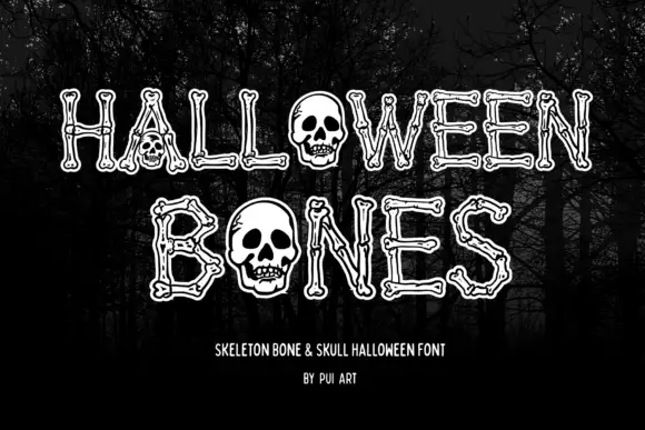
Narrow outlined capitals constructed from bone shapes with skulls replacing O forms
Halloween Bones sets pale outlined capitals against a dark forest, where long bone-like strokes end in small rounded joints and carry thin inner contours, and large skulls replace the O forms while the trees supply the scene behind the word.
Ideas for this font
Same independent foundry
Allow optional Google Analytics to measure visits and catalogue actions. Your search words and notes are not included. Privacy & storage