Neutral Sans Workhorse

Simple Chalk + Limited Coffee
Lets Simple Chalk own the focal silhouette while handling secondary copy, sizing and subheads cleanly.
Inspect Limited Coffee specimenDisclosure: MakerFileHub may earn a commission from qualifying purchases via paid links on this page. How our links work.
Chalk-hatched outlined display
Simple Chalk is an outlined upright display on a dark ground: capitals with fine outlines and rough diagonal chalk-like hatching inside, uneven edges and open counters, set in two stacked words between a small introducing line with sparkles above and a plain studio credit below.
Paid link
Get this fontProject & layout blueprintsAt-a-glance maker compatibility
Fine grain and micro-texture excel in 300 DPI print, sublimation, and screen print rather than small vinyl weeding.
Visual anatomy & craft review
The plate is a chalkboard mock-up, and the construction suits it: the letters are outlined rather than filled, and the interior is a rough diagonal hatch, so the word reads as chalk drawn on a board rather than as a printed face with a texture applied. The uneven edges and the open counters keep it legible at a moderate size, and the hatching sets the size floor because the stripes close first. The introducing line and the studio credit are product copy, and the dark ground is staging. It suits a menu board, a card and a poster for a cafe, a school or a handmade subject, and it is one of the clearer chalk-style faces at small sizes.
Decorative, chalk, outlined, hand-drawn
Two-font hierarchy recipes
Tested contrast partners — pairing Simple Chalk with grounded secondary typography.
Simple Chalk + Limited Coffee
Lets Simple Chalk own the focal silhouette while handling secondary copy, sizing and subheads cleanly.
Inspect Limited Coffee specimen
Simple Chalk + Medvilea Editorial
Grounds bold display lettering with classic typographic authority on posters, badges and apparel.
Inspect Medvilea Editorial specimenPractical applications
Concrete hierarchy, scale and production guidance tailored to Simple Chalk’s stroke geometry.
A chalk display reads as a board rather than a print, and the outlined letters stay legible where a solid chalk face would look heavy.
Hierarchy & layout recipe
A3 board: the heading at 60 mm cap height, the items in a 14 mm sans, and the prices at 10 mm. Keep 26 mm margins and keep the hatch above 1.5 mm at the board size.
Pre-production check
Check the board at 60 mm, where the hatch closes; keep it above 1.5 mm. Confirm the 10 mm prices read at two metres and that the items stay within the frame.
A chalk display names a workshop, and the outlined forms read on a dark poster where a fine hand would disappear. It reads on a dark poster.
Hierarchy & layout recipe
A2 poster: the workshop at 100 mm cap height, the details in a 20 mm sans, and the venue at 11 mm. Keep 28 mm margins, print one colour on a dark stock and keep the hatch above 2.5 mm.
Pre-production check
Check the A2 at five metres, where the hatch turns to grey; keep the strokes above 2.5 mm. Confirm the 11 mm venue reads at two metres and that the sparkles clear the type.
A chalk card reads as a classroom note, and the outlined letters suit a message that is meant to look hand-written. It reads as a classroom note.
Hierarchy & layout recipe
A6 card: the greeting at 26 pt, the message in a 10 pt sans, and the date at 9 pt. Keep 15 mm margins, print one colour on a dark card and keep the hatch above 1 mm.
Pre-production check
Check the 26 pt greeting at home-print resolution, where the hatch fills; keep the stripes above 1 mm. Confirm the message keeps a 4.5:1 contrast and that the card folds flat.
Technical & licence verification
Confirm included OTF/TTF/WOFF formats, full glyph tables and licence coverage on the live store page before batch production.
Closest visual alternatives
Matched across letterform anatomy, stroke behaviour and craft applications.
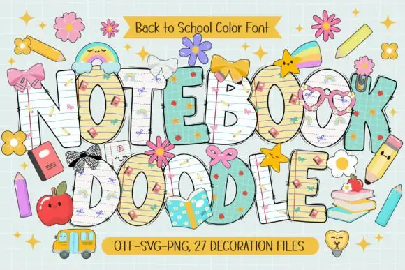
School-paper doodle colour display
Notebook Doodle is a colour display on a pale study scene: fat capitals filled with ruled paper, graph paper and star patterns, outlined in dark ink, decorated with bows, flower clips, pencils and stickers, with two ribbons that name the format list and the count of decoration files.
Ideas for this font
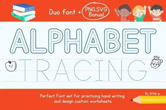
Outlined capitals with dashed centre paths shown beside a fine dotted tracing row
Alphabet Tracing shows two distinct uppercase rows on a ruled sheet, where outlined rounded letters with dashed centre paths sit above much finer dotted letters aligned to guide lines, the A and R keep visible counters and the long straight strokes make the two path treatments easy to compare.
Ideas for this font
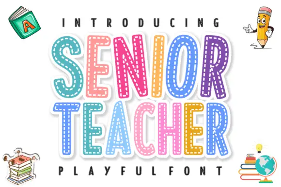
Layered stitched capitals in colour
Senior Teacher is a layered decorative display: fat capitals with a thick white outline and a dashed stitched line inside each letter, each one in a different bright colour, with drawn school objects around them.
Ideas for this font
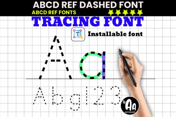
Dashed upright letter paths shown in large A and d with smaller letters and numerals
ABCD Ref Dashed and Dotted are tracing faces: the same letterforms drawn as a dashed outline for tracing and as a dotted form for dot-to-dot practice, meant to sit on ruled paper for handwriting drills.
Ideas for this font
Same independent foundry
Allow optional Google Analytics to measure visits and catalogue actions. Your search words and notes are not included. Privacy & storage