Editorial Serif Anchor

Shipping + Raffined
Anchors Shipping's fluid strokes with crisp Roman proportions on wedding suites, headers and packaging.
Inspect Raffined specimenDisclosure: MakerFileHub may earn a commission from qualifying purchases via paid links on this page. How our links work.
Thin oversized looping script
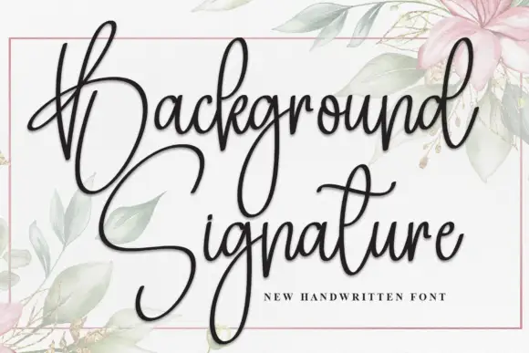
Shipping is a thin oversized looping script in black on white: a capital S drawn as a single enormous loop, tall light letters, and long tails that run out to both edges, framed by small drawn flowers.
Paid link
Get this fontProject & layout blueprintsAt-a-glance maker compatibility
Weld or Unite overlapping script joins into one continuous vector path before sending to the blade.
Visual anatomy & craft review
Shipping fills the card as one word, and the construction is deliberately oversized at the start: the capital S is drawn as a single continuous loop that takes a third of the word's width, then the lower case falls into narrow light letters with tall ascenders and a level baseline. The stroke is a thin monoline, the joins are slack and the final g drops into a long tail that swings back under the word, so the whole line reads as one gesture. Small drawn flowers and confetti in coral, teal and gold sit in the corners as a frame, and there is no caption. The face is a thin display script for cards, packaging and editorial openers: the oversized capital needs room at the start of the line, and the light stroke means it should be printed at a large size on a smooth stock.
An oversized thin script with a huge capital
Two-font hierarchy recipes
Tested contrast partners — pairing Shipping with grounded secondary typography.
Shipping + Raffined
Anchors Shipping's fluid strokes with crisp Roman proportions on wedding suites, headers and packaging.
Inspect Raffined specimen
Shipping + Hermano
Keeps small-scale dates, URLs, nutrition facts and care instructions crisp and legible below script titles.
Inspect Hermano specimenPractical applications
Concrete hierarchy, scale and production guidance tailored to Shipping’s stroke geometry.
The oversized capital gives a couple's names a strong opening gesture, and the thin stroke keeps a formal card from becoming heavy.
Hierarchy & layout recipe
Print a 130 by 180 mm invitation: set the names at 28 pt on one row, keep 20 mm of clear ground beneath before the venue at 9 pt, and hold 18 mm of margin so the capital and the tail stay inside.
Pre-production check
The huge capital loop can run into the trim on a narrow card; print one invitation at the finished size and check both ends before the suite.
One thin word with an oversized capital is a whole card front, and the light line keeps a short note looking considered rather than crowded.
Hierarchy & layout recipe
Print a 105 by 148 mm card: set the greeting at 40 pt on one row, keep 16 mm of clear ground beneath before the message at 10 pt, and hold 13 mm of margin on all sides.
Pre-production check
Thin monoline strokes break on textured card; print one card on the intended stock and check the capital before the batch.
The word suits a parcel, and the thin script on a light label reads as handwriting from the sender rather than as a shipping document.
Hierarchy & layout recipe
Print a 60 by 40 mm label: set the word at 14 pt on one row, keep 5 mm of clear ground beneath before the address at 5 pt, and hold 4 mm from the tail to the die line.
Pre-production check
A thin script at fourteen points on a kraft label nearly disappears; print one on the real stock and judge the contrast before the order.
Technical & licence verification
Confirm included OTF/TTF/WOFF formats, full glyph tables and licence coverage on the live store page before batch production.
Closest visual alternatives
Matched across letterform anatomy, stroke behaviour and craft applications.
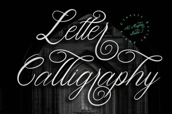
Hairline outline calligraphy with large swirls
Letter Calligraphy is a hairline calligraphy in white on a dark church interior: a single-weight line script with enormous loops, swirls that leave the letters and cross the words, and a long descender that curls under the block.

Tall fine script with large heart outlines
Autography sets a narrow handwritten word framed by a large heart at the right and a smaller heart above the opening letters, where the capital A carries a long thin diagonal and a looping lower stroke, a broad cross stroke runs across the upper middle and the final y descends deeply beside the large heart.
Ideas for this font
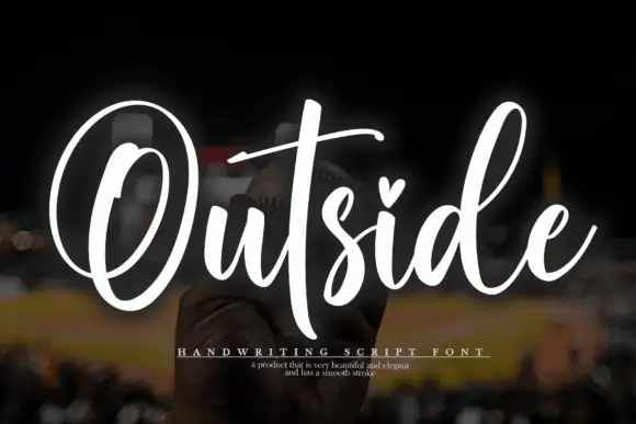
Tall script with an oversized O loop
Outside is a tall script in white over a dark photograph: a very large open capital O drawn as a single loop, a narrow connected body and a heart set into the counter of the i.
Ideas for this font
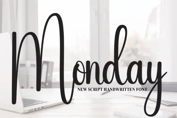
Tall script with an oversized narrow M
Monday is a tall script in black over a photograph of a desk: a very tall narrow capital M drawn as two long strokes with a shallow valley between, a compact connected body and a y whose descender curls below the word.
Ideas for this font
Same independent foundry
Allow optional Google Analytics to measure visits and catalogue actions. Your search words and notes are not included. Privacy & storage