Editorial Serif Anchor

Mount Climb + Vanielst Elegant Serif Display Stylistic
Anchors Mount Climb's fluid strokes with crisp Roman proportions on wedding suites, headers and packaging.
Inspect Vanielst Elegant Serif Display Stylistic specimenDisclosure: MakerFileHub may earn a commission from qualifying purchases via paid links on this page. How our links work.
Bold connected climbing-title script
Mount Climb is a bold connected script in white over a mountain photograph: fat even strokes, a pronounced climb from left to right, and a short rule beneath the words with a tracked caption.
Paid link
Get this fontProject & layout blueprintsAt-a-glance maker compatibility
Weld or Unite overlapping script joins into one continuous vector path before sending to the blade.
Visual anatomy & craft review
Mount Climb is written on one line, and the lettering is a bold monoline script: the M opens with a wide shoulder, the o and the u are broad and round, the n and the t climb, the C of Climb is a deep crescent and the b and the l carry short loops, and the whole line rises steadily from the first letter to the last. The stroke is an even heavy monoline, the joins are tight and the terminals are rounded, so the phrase reads as one confident gesture. The ground is a mountain landscape at sunset with a hiker in the foreground, a round badge sits above the words, and a thin rule with a tracked caption closes the composition. The face is a bold script for brand marks, signage and apparel: the climbing baseline is the character, and it needs a wide measure and a dark ground.
A bold script that climbs over a landscape
Two-font hierarchy recipes
Tested contrast partners — pairing Mount Climb with grounded secondary typography.
Mount Climb + Vanielst Elegant Serif Display Stylistic
Anchors Mount Climb's fluid strokes with crisp Roman proportions on wedding suites, headers and packaging.
Inspect Vanielst Elegant Serif Display Stylistic specimen
Mount Climb + Modern Heritage
Keeps small-scale dates, URLs, nutrition facts and care instructions crisp and legible below script titles.
Inspect Modern Heritage specimenPractical applications
Concrete hierarchy, scale and production guidance tailored to Mount Climb’s stroke geometry.
A bold climbing script reads against a landscape, and the rising baseline gives a plain board movement that a level line would not.
Hierarchy & layout recipe
Print a 600 by 400 mm board: set the greeting at 110 pt on one row, keep 26 mm of clear ground beneath before the names at 24 pt, and hold 24 mm of border on all sides.
Pre-production check
A climbing baseline on a rectangular board needs optical centring; print one at the final size and check the balance before the set.
A climbing script says movement before the product is seen, which is what an outdoor brand is selling, and the white on dark photographs well.
Hierarchy & layout recipe
Print a 70 by 50 mm label: set the brand at 16 pt on one row, keep 6 mm of clear ground beneath before the line at 5 pt, and hold 4 mm of margin on all sides.
Pre-production check
The climb can throw the mark off-centre on a small label; print one at the real size and check the optical balance before the order.
A climbing script over a landscape is a cover in two elements, and the bold monoline holds its weight against a busy photograph.
Hierarchy & layout recipe
Print a 230 by 300 mm cover: set the cover title at 90 pt on one row, keep 28 mm of clear ground beneath before the cover lines at 12 pt, and hold 22 mm of margin on all sides.
Pre-production check
White lettering over a bright sky loses contrast; print one cover on the actual stock and check the word before the run.
Technical & licence verification
Confirm included OTF/TTF/WOFF formats, full glyph tables and licence coverage on the live store page before batch production.
Closest visual alternatives
Matched across letterform anatomy, stroke behaviour and craft applications.
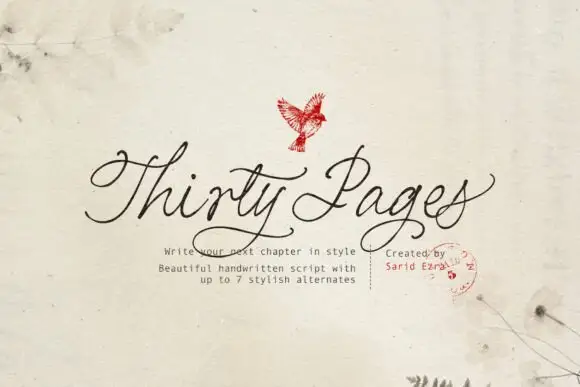
Clean connected handwritten script with alternates
Thirty Pages is a clean connected handwriting script in near-black on cream felt: tall ascenders, small open bowls and a light even stroke, sold with seven stylistic alternates for the capitals.
Ideas for this font
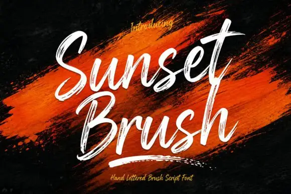
Rough brush script with a dry edge
Sunset Brush is a rough brush script in white over an orange paint smear: heavy strokes with dry, split ends, tall narrow loops and a forward slant that keeps a twelve-letter phrase moving.
Ideas for this font
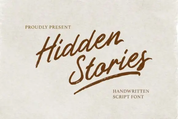
Angled brush script with dry-brushed edges and an underline swash
Hidden Stories is a dry brush script that leans hard to the right, its strokes ragged at the edges and broken where the brush lifted, with a single long underline swash finishing the second word.
Ideas for this font
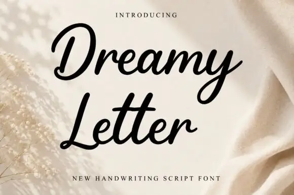
Smooth bold joined script with heavy even strokes and tight counters
Dreamy Letter is a smooth bold joined script in one even weight, with fat rounded strokes, tight counters and letters that connect without thinning, so a phrase reads as a continuous ribbon of ink.
Same independent foundry
Allow optional Google Analytics to measure visits and catalogue actions. Your search words and notes are not included. Privacy & storage