Modern Grotesque Body

Moner + Headline
Creates crisp high-hierarchy contrast beneath Moner headlines across menus, websites and labels.
Inspect Headline specimenDisclosure: MakerFileHub may earn a commission from qualifying purchases via paid links on this page. How our links work.
Fine serif with sweeping extensions
Moner is a fine serif in cream on a warm ochre gradient: tall caps with hairlines, long sweeping extensions that leave the M and the R and travel across the word, and an O whose bowl is crossed by a curve, with four small corner notes.
Paid link
Get this fontProject & layout blueprintsAt-a-glance maker compatibility
Crisp hairline serifs shine on stationery, foil stamping, and packaging; add slight offset for small decals.
Visual anatomy & craft review
The word fills the plate and the drawing is a fine display serif whose extensions are the structure: the M opens with a sweep that runs across the following letters, the R closes with another, and the O carries a curve through its bowl, so the word reads as one drawn object rather than five letters. That construction is a display decision, and the specimen sets it large enough that each sweep is legible as a shape. The four corner notes are tiny tracked caps and they name the designer, the studio and the style, which keeps the sheet reading like a foundry specimen. Because the stems are hairlines, the face works at display sizes on smooth stock or on screen, and the warm gradient behind it is a gentle contrast test that the cream passes.
Serif, fine, elegant, display
Two-font hierarchy recipes
Tested contrast partners — pairing Moner with grounded secondary typography.
Moner + Headline
Creates crisp high-hierarchy contrast beneath Moner headlines across menus, websites and labels.
Inspect Headline specimen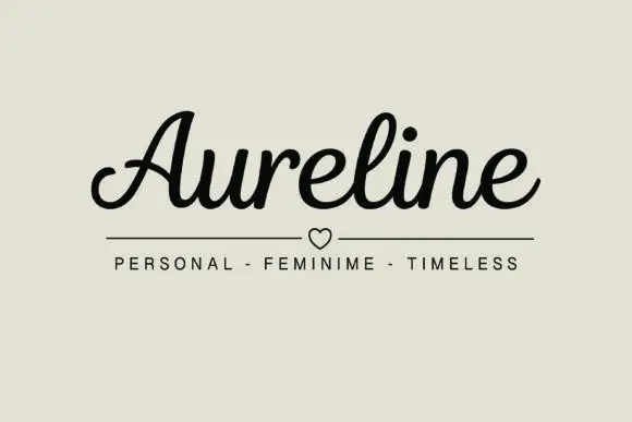
Moner + Aureline
Adds a warm human signature touch for 1-to-3-word callouts without competing against structured serif capitals.
Inspect Aureline specimenPractical applications
Concrete hierarchy, scale and production guidance tailored to Moner’s stroke geometry.
A fine serif with sweeping extensions gives a masthead movement, and the hairlines keep the cover from looking heavy above a photograph.
Hierarchy & layout recipe
Set the masthead at 105 mm cap height across 205 mm, the cover lines in an 8 pt serif, and the issue at 7 pt. Print one ink on a coated stock and keep the masthead over a quiet area.
Pre-production check
Check the masthead at 105 mm, where a sweep can break at the join; keep it above 0.3 mm. Confirm the 7 pt issue survives lamination and that the masthead holds at thumbnail size.
A fine serif gives a practice a mark with movement, and the sweeping extension lets a short name fill a sign without extra letterspacing.
Hierarchy & layout recipe
Set the mark at 20 pt on a card, 95 mm on a wall and 13 pt in a footer, keeping the sweeps only above 24 pt. Keep one colour and reserve clear space equal to the sweep depth.
Pre-production check
Check the 13 pt footer, where a sweep can collide with the line below; drop it at that size. Confirm the wall mark reads at eight metres and that the hairlines survive cutting.
A fine serif with an autumn palette reads as a seasonal invitation, and the drawn sweeps give one gesture without a second ornament.
Hierarchy & layout recipe
A5 invitation: the names at 26 pt, the request in a 9.5 pt serif, and the date at 8.5 pt caps. Keep 26 mm margins so the sweeps have room and foil one colour on a warm card.
Pre-production check
Check the 26 pt names in foil, where a hairline can break; keep it above 0.3 mm. Confirm the 9.5 pt request reads at arm's length and that the sweeps clear the trim by 12 mm.
Technical & licence verification
Confirm included OTF/TTF/WOFF formats, full glyph tables and licence coverage on the live store page before batch production.
Closest visual alternatives
Matched across letterform anatomy, stroke behaviour and craft applications.
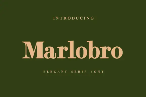
Substantial mixed-case serif
Marlobro is a substantial serif in a warm peach on deep olive: heavy stems with ball shoulders, fine baseline serifs, a large x-height and a rounded a and o, set in title case on one line with a tracked caps line above and beneath.
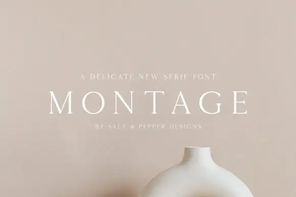
Delicate high-contrast serif
Montage is a delicate serif in white on a soft beige field: very fine hairlines, wide letterspacing, thin bracketed serifs and a high waist, set in caps on one line with a tracked line above and an attribution beneath, on a still life of a ceramic vessel.
Ideas for this font

Fine serif title with large upper and lower loops
Amilea shows pale yellow high-contrast letters with fine tapered serifs and broad rounded lowercase over a dark portrait, where a thin loop curves below the capital A and a tall upper flourish crosses the central ascender before sweeping right.
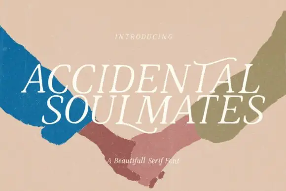
Slanted light capitals with fine serifs and selective curling extensions
Accidental Soulmates is a slanted light serif in which the capitals lean together, the serifs stay fine and two long extensions curl above the first row and sweep below the second, so a two-line title reads as a romantic editorial head.
Ideas for this font
Same independent foundry
Allow optional Google Analytics to measure visits and catalogue actions. Your search words and notes are not included. Privacy & storage