High-Contrast Display Serif

Modern Halloween + Auretha
Pairs sculptural editorial warmth with Modern Halloween's clean modern geometry.
Inspect Auretha specimenDisclosure: MakerFileHub may earn a commission from qualifying purchases via paid links on this page. How our links work.
Very tall condensed display sans
Modern Halloween is a very tall condensed sans in rust red on a pale lined sheet: dense capitals with narrow inner spaces, flat terminals and small four-point stars scattered around the block, set in two lines with a small tracked line above and beneath.
Paid link
Get this fontProject & layout blueprintsAt-a-glance maker compatibility
Sturdy stroke walls and open counters weed cleanly on adhesive vinyl, HTV apparel film, and cut cardstock.
Visual anatomy & craft review
The two words rise almost to the edges of the sheet and the drawing is an extremely condensed capital face: the stems are dense, the inner spaces are slivers, and the terminals are flat, so the block reads as a wall of lettering rather than as a line of text. That construction sets both a size floor and a use case, because the slivers close below a certain size and the words depend on height rather than width. The pale sheet with faint lines is staging that keeps the red crisp, and the small stars are a supplied ornament that lightens a severe face. The tracked lines above and beneath are product copy. Because the letters are this narrow, the face fills a vertical poster or a narrow cover and reads at distance on a sign.
Sans serif, condensed, tall, dramatic
Two-font hierarchy recipes
Tested contrast partners — pairing Modern Halloween with grounded secondary typography.
Modern Halloween + Auretha
Pairs sculptural editorial warmth with Modern Halloween's clean modern geometry.
Inspect Auretha specimen
Modern Halloween + Easy Handwriting
Introduces organic movement on pull-quotes, signatures and gift tags.
Inspect Easy Handwriting specimenPractical applications
Concrete hierarchy, scale and production guidance tailored to Modern Halloween’s stroke geometry.
A very tall condensed face fills a poster top to bottom in two words, and the slivers read as tension rather than as damage at display size.
Hierarchy & layout recipe
A1 poster: the night at 240 mm cap height, the date in a 24 mm sans, and the venue at 12 mm. Keep 30 mm margins and print two colours on a light stock so the red stays saturated.
Pre-production check
Check the A1 at five metres, where a sliver can close; keep every inner space above 3 mm. Confirm the 12 mm venue reads at two metres and that the date clears the block on both sides.
A condensed vertical title fills a narrow cover, and the dense stems hold against a light sheet where a fine face would look weak.
Hierarchy & layout recipe
Set the title at 150 mm cap height across 130 mm, the editor in a 12 pt serif, and the imprint at 8 pt. Print one ink on a dark stock with the title reversed out and keep 20 mm margins.
Pre-production check
Check the title at 150 mm, where a reversed sliver can fill on uncoated stock; specify a coated sheet. Confirm the 8 pt imprint survives and that the title clears the trim by 20 mm.
A condensed face fits a long attraction name on a narrow board, and the flat terminals read under a light box at night. It reads at night.
Hierarchy & layout recipe
Fabricate a 900 by 320 mm sign: the attraction at 120 mm cap height, the hours in a 22 mm sans, and a 4 mm rule. Keep 22 mm margins and specify an even backlight behind the panel.
Pre-production check
Check the sign at 120 mm, where a sliver can fill with light; keep it above 6 mm. Confirm the 22 mm hours read at three metres and that the rule clears the fixings at each end.
Technical & licence verification
Confirm included OTF/TTF/WOFF formats, full glyph tables and licence coverage on the live store page before batch production.
Closest visual alternatives
Matched across letterform anatomy, stroke behaviour and craft applications.
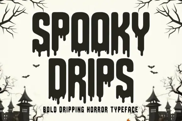
Bold dripping horror display
Spooky Drips is a bold dripping display in near-black on a bone ground: very heavy condensed letters with long viscous drips running from the baseline and the counters, flat terminals and a squared top, framed by bare branches and a row of haunted houses along the foot.
Ideas for this font
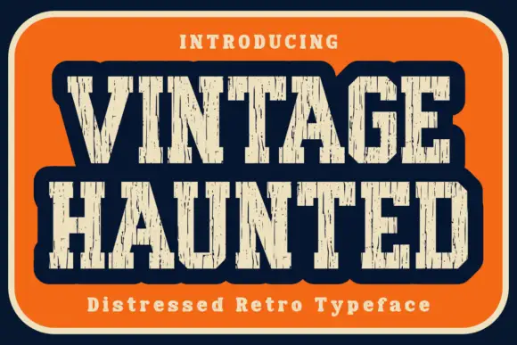
Distressed retro slab
Vintage Haunted is a distressed retro slab in cream on an orange panel with a navy ground: condensed caps with heavy vertical slabs, a rounded outer contour and long vertical gaps cut through the stems, with a tracked line above and a caption beneath.
Ideas for this font
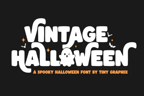
Rounded Halloween blocks with sweeping ends
Vintage Halloween is a rounded display capital set in white on black: fat letters with sweeping tails, an open ghost figure drawn in place of one letter and small bats and sparks scattered around the block.
Ideas for this font
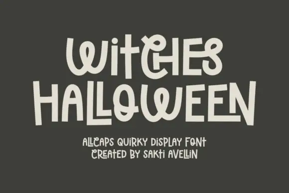
Quirky hand-drawn mixed-width display
Witches Halloween is a quirky hand-drawn display in cream on charcoal: letters of wildly different widths, some built from stacked strokes, a flipped E, a heart-like O, and a bounce that moves each character on the line, so the pair reads as hand lettering by a confident amateur rather than as a drawn alphabet.
Ideas for this font
Same independent foundry
Allow optional Google Analytics to measure visits and catalogue actions. Your search words and notes are not included. Privacy & storage