Editorial Serif Anchor

Magnolia Handwriting + Alerigue
Anchors Magnolia Handwriting's fluid strokes with crisp Roman proportions on wedding suites, headers and packaging.
Inspect Alerigue specimenDisclosure: MakerFileHub may earn a commission from qualifying purchases via paid links on this page. How our links work.
Tall high-contrast separated lettering
Magnolia Handwriting is a tall separated hand in black on ruled paper: very narrow letters with a high x-height, a light monoline stroke, short ascenders and a clean even spacing that reads at text size and at display size.
Paid link
Get this fontProject & layout blueprintsAt-a-glance maker compatibility
Weld or Unite overlapping script joins into one continuous vector path before sending to the blade.
Visual anatomy & craft review
The two words are stacked on ruled lines, and the face is a separated hand: the M is a narrow pair of peaks, the a and the g close into small loops, the n and the o are compact, the H and the d are the same height as the capitals and nothing connects, so a word reads as a row of careful letters rather than a written line. The stroke is monoline and even, the tall proportions give the face its look and the spacing is generous enough that a paragraph stays legible at ten points, which is why a sample sheet shows it at both sizes. Two tracked capitals frame the specimen above and below. Magnolia Handwriting is a hand for editorial captions, labels, planners and cards, and it works wherever a printed hand has to be read at length rather than admired at a distance.
A tall neat hand on ruled paper
Two-font hierarchy recipes
Tested contrast partners — pairing Magnolia Handwriting with grounded secondary typography.
Magnolia Handwriting + Alerigue
Anchors Magnolia Handwriting's fluid strokes with crisp Roman proportions on wedding suites, headers and packaging.
Inspect Alerigue specimen
Magnolia Handwriting + Mansory
Keeps small-scale dates, URLs, nutrition facts and care instructions crisp and legible below script titles.
Inspect Mansory specimenPractical applications
Concrete hierarchy, scale and production guidance tailored to Magnolia Handwriting’s stroke geometry.
A separated hand keeps captions legible at nine points, and the tall letters give a short caption the presence of a label rather than a footnote.
Hierarchy & layout recipe
Print a 210 by 297 mm page: set the caption at 9.5 pt on an 13 pt leading, keep 6 mm of clear ground above the caption block, and hold 18 mm of margin from the text column.
Pre-production check
A monoline at nine points can fill in on newsprint; print one page on the actual stock and check the letters before the issue.
A tall clean hand reads easily for a young reader and looks less institutional than a sans, which is worth a lot on a worksheet a child has to want to fill in.
Hierarchy & layout recipe
Print an A4 worksheet: set the heading at 24 pt on one line, set the instructions at 11 pt with 6 mm of leading, and hold 18 mm of margin on all four sides.
Pre-production check
A hand face in a long instruction block can look busy; print one worksheet at the finished size and check the readability before the run.
A tidy hand suits a shop that sells printed matter, and the narrow letters fit a long shop name on a narrow shelf label.
Hierarchy & layout recipe
Print a 60 by 40 mm shelf label: set the shop name at 12 pt on one line, keep 4 mm of clear ground beneath before the section at 8 pt, and hold 4 mm of margin on all four sides.
Pre-production check
At twelve points a separated hand needs air; print one label on the real stock and check the spacing before the order.
Technical & licence verification
Confirm included OTF/TTF/WOFF formats, full glyph tables and licence coverage on the live store page before batch production.
Closest visual alternatives
Matched across letterform anatomy, stroke behaviour and craft applications.
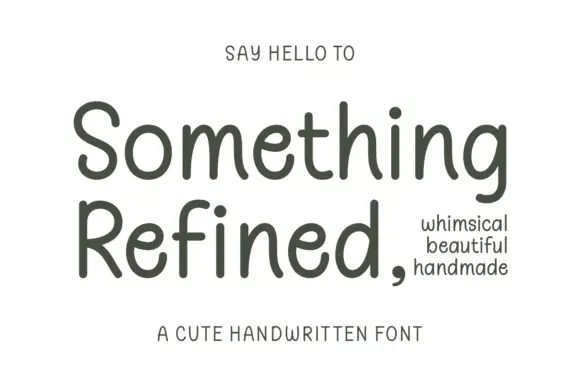
Gentle rounded handwritten print
Something Refined is a gentle rounded handwritten print in charcoal on cream: tall ascenders, open round bowls and a slight forward tilt, calm enough to set a short paragraph.
Ideas for this font
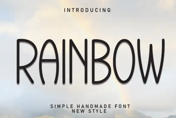
Tall handmade rounded caps
Rainbow is a tall handmade sans in black on a sky photograph: narrow capitals with rounded terminals, slightly uneven stems, a bowed W and an open R, so the word reads as lettering cut by hand rather than as a geometric grotesque.
Ideas for this font
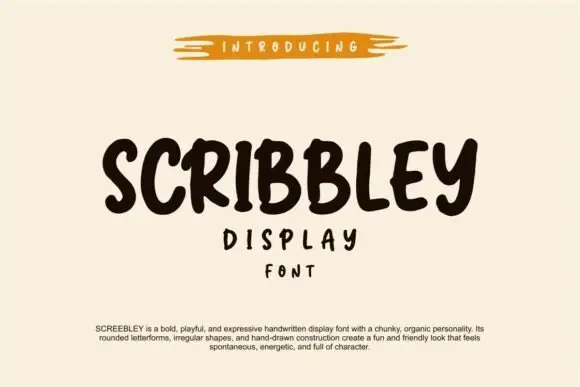
Chunky organic handwriting display
Scribbley is a chunky organic handwriting display in dark brown on cream: thick rounded letters with a wobbling outline, uneven heights, an open e and a looped y, set as one word with two small supporting lines beneath and a paragraph of tracked copy at the foot.
Ideas for this font
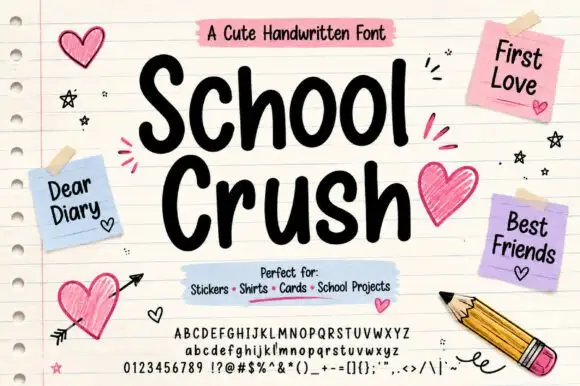
Heavy rounded marker print on a notebook page
School Crush is a heavy rounded marker print in black on a lined notebook page, with drawn hearts, sticky notes and a pencil turning the specimen into a school desk.
Ideas for this font
Same independent foundry
Allow optional Google Analytics to measure visits and catalogue actions. Your search words and notes are not included. Privacy & storage