Editorial Serif Anchor

Lucky Moment + Bulgary
Anchors Lucky Moment's fluid strokes with crisp Roman proportions on wedding suites, headers and packaging.
Inspect Bulgary specimenDisclosure: MakerFileHub may earn a commission from qualifying purchases via paid links on this page. How our links work.
Light handwriting script
Lucky Moment is a light handwriting script in black on a soft white background: narrow monoline letters, a low x-height, short ascenders and a gentle forward slant that keeps two words on one calm line.
Paid link
Get this fontProject & layout blueprintsAt-a-glance maker compatibility
Weld or Unite overlapping script joins into one continuous vector path before sending to the blade.
Visual anatomy & craft review
The two words run as one line, and the face is a light hand: the L opens with a small loop, the u and the c are narrow, the k throws a short leg, the M of Moment opens with two soft peaks, the m and the e connect with fine joins and the final t crosses with a short bar, while the letters stay connected only loosely and the line stays flat. The stroke is a fine monoline with a slight swell, the slant is light and the ascenders are short, so a twelve-letter phrase sits quietly on a card rather than filling it. The ground is a soft white with a blurred leaf shadow and a pale stone at the lower right, which sets a stationery tone, and three tracked lines name the style and the studio. Lucky Moment is a script for stationery, cards and packaging with a quiet voice.
A quiet hand on a soft white ground
Two-font hierarchy recipes
Tested contrast partners — pairing Lucky Moment with grounded secondary typography.
Lucky Moment + Bulgary
Anchors Lucky Moment's fluid strokes with crisp Roman proportions on wedding suites, headers and packaging.
Inspect Bulgary specimen
Lucky Moment + Helina
Keeps small-scale dates, URLs, nutrition facts and care instructions crisp and legible below script titles.
Inspect Helina specimenPractical applications
Concrete hierarchy, scale and production guidance tailored to Lucky Moment’s stroke geometry.
A quiet hand gives two names the tone of a written card, and the flat line keeps a long pair of names on one row without shrinking.
Hierarchy & layout recipe
Print a 130 by 180 mm invitation: set the names at 25 pt on one line, keep 20 mm of clear ground beneath before the venue at 9 pt, and hold 18 mm of margin on all four sides of the card.
Pre-production check
A fine monoline join can break on textured card; print one invitation on the intended stock and check a connector before the suite.
A light hand reads as a personal note on the back of a card, and the narrow letters fit a long studio name on a single line.
Hierarchy & layout recipe
Print an 85 by 55 mm card: set the studio name at 17 pt on one line, keep 6 mm of clear ground beneath before the contact block at 6.5 pt, and hold 5 mm of margin on both sides of the card.
Pre-production check
A monoline at seventeen points can look grey on uncoated card; proof one and check the weight before the order.
The same hand as the invitation ties a favour to the suite, and the light stroke prints cleanly on a small smooth label.
Hierarchy & layout recipe
Print a 50 mm round label: set the word at 12 pt on one line, keep 6 mm of clear ground to the die line, and leave 7 mm beneath for the date at 4.5 pt.
Pre-production check
A light stroke at twelve points can vanish on a pale label; print one on the real stock and check the letters before the order.
Technical & licence verification
Confirm included OTF/TTF/WOFF formats, full glyph tables and licence coverage on the live store page before batch production.
Closest visual alternatives
Matched across letterform anatomy, stroke behaviour and craft applications.
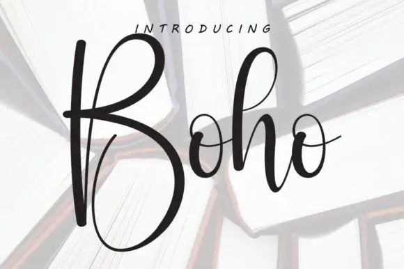
Tall high-contrast script with an oversized B
Boho opens with an oversized narrow B that drops a deep lower bowl, the h lifts a tall loop and the two small o forms join through fine crossing connectors, so a single short name reads as a tall written line.
Ideas for this font
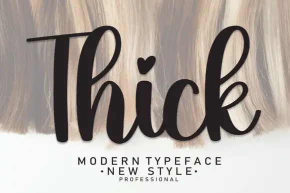
Heavy upright script with a heart dot
Thick is a heavy upright script in black over a pale textured ground: very fat even strokes, a tall narrow capital T drawn with a long bar, a heart in place of the dot on the i and a heavy leg on the k.
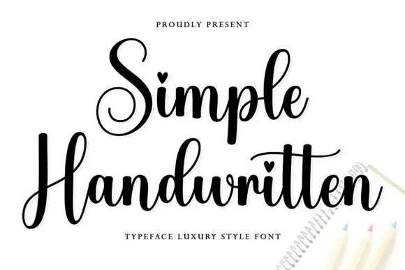
Curled script with heart dots
Simple Handwritten is a curled script in black on white: two spiral capitals that open the words, a fat even stroke, hearts used in place of the dots on the i, and a light slant.
Ideas for this font
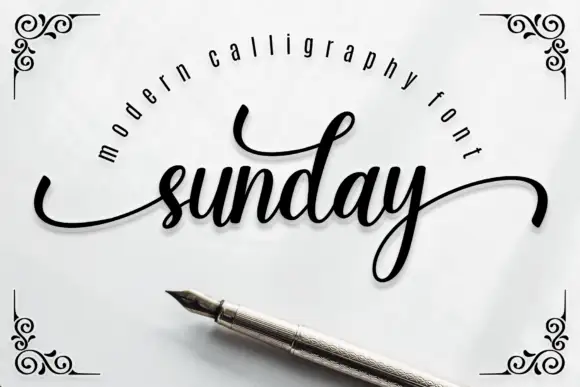
Heavy slanted script with sweeping swashes
Sunday is a heavy slanted script in black on pale grey: fat downstrokes, fine joins, a sweeping entry swash and a long exit that curls under the whole word, framed by drawn corner scrolls.
Ideas for this font
Same independent foundry
Allow optional Google Analytics to measure visits and catalogue actions. Your search words and notes are not included. Privacy & storage