Editorial Serif Anchor

Handwritten + Things
Anchors Handwritten's fluid strokes with crisp Roman proportions on wedding suites, headers and packaging.
Inspect Things specimenDisclosure: MakerFileHub may earn a commission from qualifying purchases via paid links on this page. How our links work.
Heavy monoline script with closed loops
Handwritten is a heavy monoline script with round closed loops and blunt terminals, so a single word reads as a thick, friendly band rather than as a delicate signature.
Paid link
Get this fontProject & layout blueprintsAt-a-glance maker compatibility
Weld or Unite overlapping script joins into one continuous vector path before sending to the blade.
Visual anatomy & craft review
The h lifts a thick stem that ends flat rather than tapering, and the a, n, d, w, r, i, t, t, e and n that follow keep the same weight with almost no variation, which is what separates this from a calligraphic script. Loops are drawn round and closed: the double t sits under a low crossbar, the e has a small tight counter, and the d and h stems rise a full x-height above the middle of the word. The joins are short and buried, so the letters touch rather than lean on each other, and the baseline stays level with only a slight lift at the end. The pastel wash behind the word, the tracked label above and the two-line credit below are cover treatment, and the wash is a soft gradient rather than part of the strokes.
Chunky · Rounded · Friendly
Two-font hierarchy recipes
Tested contrast partners — pairing Handwritten with grounded secondary typography.
Handwritten + Things
Anchors Handwritten's fluid strokes with crisp Roman proportions on wedding suites, headers and packaging.
Inspect Things specimen
Handwritten + Cenura
Keeps small-scale dates, URLs, nutrition facts and care instructions crisp and legible below script titles.
Inspect Cenura specimenPractical applications
Concrete hierarchy, scale and production guidance tailored to Handwritten’s stroke geometry.
A heavy monoline word stays readable at the size of a small shop window and looks hand-painted without the cost of a signwriter, which suits a business whose whole identity is friendly rather than formal.
Hierarchy & layout recipe
Set the shop name at 60 mm cap height on the glazing, keep the opening hours in a plain sans at 15 mm on the door panel, and hold 40 mm of clear glass around the word so nothing crowds the thick strokes.
Pre-production check
Vinyl on glass needs a solid stroke; check the tight e counter at full size, because a heavy script can close up once it is welded for cutting.
Thick rounded lettering reads at arm's length on a plant table and looks written by the grower, which matters when the stock is sold by people who know the plants by name.
Hierarchy & layout recipe
Set the variety at 20 mm on a 80 by 40 mm card, keep the price in a plain figure face at 10 mm in the corner, and hold the word to two lines so the card still reads when it is propped in a tray.
Pre-production check
Damp soil and condensation will lift a paper card; laminate or print on a synthetic stock and check that the heavy strokes do not bleed at the edges.
A friendly monoline script makes a receipt-sized thank-you feel written rather than generated, and the even weight prints cleanly on the cheap thermal or laser stock a shop already uses.
Hierarchy & layout recipe
Set the line at 14 pt at the foot of the receipt, keep the shop details above it in a plain sans at 8 pt, and leave 6 mm below the line so the cut never clips the last letter.
Pre-production check
Thermal printers build up heavy strokes; proof one receipt on the actual machine, since a thick script can print as a solid smear at 14 pt.
Technical & licence verification
Confirm included OTF/TTF/WOFF formats, full glyph tables and licence coverage on the live store page before batch production.
Closest visual alternatives
Matched across letterform anatomy, stroke behaviour and craft applications.
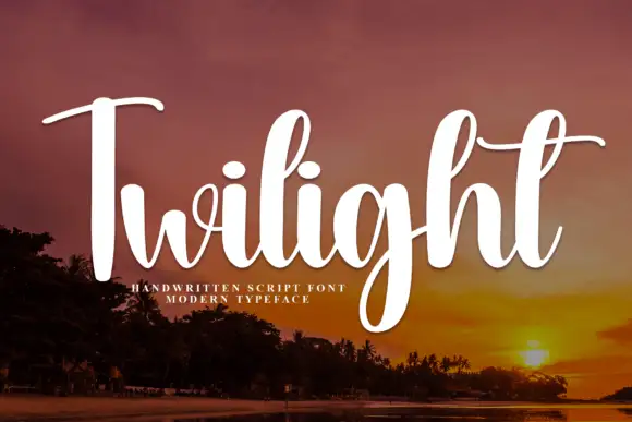
Slanted brush script with fine hairlines
Twilight is a slanted brush script in white over a dusk landscape: tall narrow letters with a soft swell, fine hairline joins, and a capital T whose crossbar runs out into a long thin entry stroke.
Ideas for this font
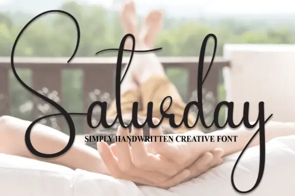
Oversized-loop handwriting script
Saturday is a casual handwriting script in black over a bright photograph: a huge open capital S with a loop that travels above and below the word, a light connected body and a long descending tail on the y.
Ideas for this font
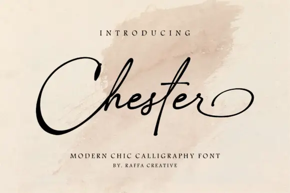
Fine script with a broad capital loop and a wide oval exit
Chester is a fine script whose capital opens into a broad oval loop while the lowercase stays narrow and light, and whose last letter exits in a wide flat oval that closes the word.
Ideas for this font
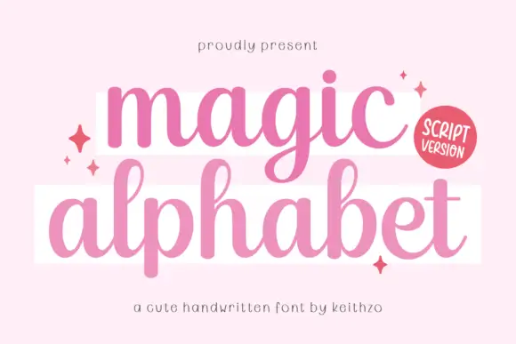
Rounded connected low-loop script
Magic Alphabet is a rounded connected script in pink on pale pink: low loops, fat even strokes, a marked bounce and drawn sparkles scattered around two white bands that carry the words.
Same independent foundry
Allow optional Google Analytics to measure visits and catalogue actions. Your search words and notes are not included. Privacy & storage