Editorial Serif Anchor

Grandelle + Stanza
Anchors Grandelle's fluid strokes with crisp Roman proportions on wedding suites, headers and packaging.
Inspect Stanza specimenDisclosure: MakerFileHub may earn a commission from qualifying purchases via paid links on this page. How our links work.
Heavy low-contrast signature script
Grandelle is a heavy signature script with low contrast and round bowls, so the word reads as a thick continuous stroke that swells and turns rather than as a nib-written line.
Paid link
Get this fontProject & layout blueprintsAt-a-glance maker compatibility
Weld or Unite overlapping script joins into one continuous vector path before sending to the blade.
Visual anatomy & craft review
The capital G is the widest letter: a large round bowl with a short entry stroke that comes in from below and a crossbar that cuts back across the bowl. The r, a, n, d, e, l, l and e that follow are drawn at the same heavy weight with almost no thinning between downstroke and join, and the double l closes into two tall loops that keep the middle of the word from flattening. The word finishes with a flat swash that leaves the last e and runs out to the right, which is what gives the signature its momentum. The small serif Introducing line above and the caption beneath are a second and third face, and the blush paper texture behind the word is the ground rather than part of the lettering.
Bold · Signature · Round
Two-font hierarchy recipes
Tested contrast partners — pairing Grandelle with grounded secondary typography.
Grandelle + Stanza
Anchors Grandelle's fluid strokes with crisp Roman proportions on wedding suites, headers and packaging.
Inspect Stanza specimen
Grandelle + Headline
Keeps small-scale dates, URLs, nutrition facts and care instructions crisp and legible below script titles.
Inspect Headline specimenPractical applications
Concrete hierarchy, scale and production guidance tailored to Grandelle’s stroke geometry.
Heavy low-contrast strokes survive the small, low-resolution reproduction of a cup, a sticker and a social avatar where a contrasted script would lose its hairlines entirely.
Hierarchy & layout recipe
Set the name at 20 pt on a cup, 22 mm on a 50 mm sticker and 400 px wide on an avatar, and check that the closing swash still reads as a deliberate stroke at each of the three sizes.
Pre-production check
The final swash is the part that clips; keep it inside the safe area on every format rather than trimming it per item.
A heavy script gives a food cover the warmth of a hand-written label while staying solid enough to compete with a photograph behind it, which a thin script cannot do.
Hierarchy & layout recipe
Set the cover line at 100 pt across the upper third, place it over a quiet area of the image or on a light panel, and keep the coverlines in a plain sans at 10 pt to one side.
Pre-production check
Heavy script over a busy image needs a panel or a shadow; test the cover line against the final photograph before the issue is signed off.
The signature weight reads as celebration without confetti, and one word set bold carries a table sign at a size that stays readable from across a room.
Hierarchy & layout recipe
Set the name at 120 mm wide on an A2 foamboard, keep the details in a small serif at 15 mm below, and hold 50 mm of border so the swash has space and the board does not look cropped.
Pre-production check
Foamboard and a heavy script both read as solid from a distance; check the sign under the venue's lighting, since shadows flatten the strokes.
Technical & licence verification
Confirm included OTF/TTF/WOFF formats, full glyph tables and licence coverage on the live store page before batch production.
Closest visual alternatives
Matched across letterform anatomy, stroke behaviour and craft applications.
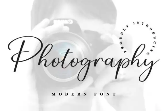
Fine connected script with a very open P
Photography is a fine slanted script in black on a pale photograph: a thin connected hand with a broad open P, hairline joins, a consistent slant and a curled tail on the y, framed by a circular line of tracked capitals.
Ideas for this font
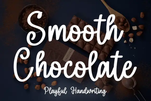
Rounded brush handwriting on a dark ground
Smooth Chocolate is a rounded brush handwriting in white over a dark photograph of chocolate: fat soft strokes with rounded ends, large open bowls, tall loops and a light bounce that keeps a long phrase moving.
Ideas for this font
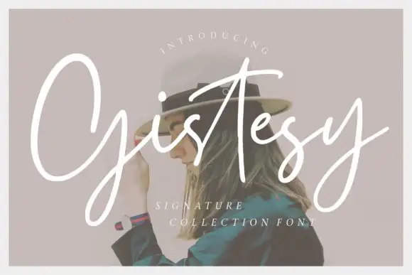
Loose signature script with tall capitals and an open, uneven rhythm
Gistesy is a loose signature script in which the capital rises very tall, the following letters drop small and the rhythm stays uneven enough to read as a real signature.
Ideas for this font
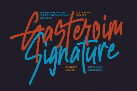
Tall energetic brush signature with long slanted ascenders
Gasteroim Signature is a tall brushed signature whose ascenders run three times the x-height and lean hard right, with quick flicks and broken joins that make the word look written fast rather than composed.
Ideas for this font
Same independent foundry
Allow optional Google Analytics to measure visits and catalogue actions. Your search words and notes are not included. Privacy & storage