Editorial Serif Anchor

Gasteroim Signature + Lumera Editorial
Anchors Gasteroim Signature's fluid strokes with crisp Roman proportions on wedding suites, headers and packaging.
Inspect Lumera Editorial specimenDisclosure: MakerFileHub may earn a commission from qualifying purchases via paid links on this page. How our links work.
Tall energetic brush signature with long slanted ascenders
Gasteroim Signature is a tall brushed signature whose ascenders run three times the x-height and lean hard right, with quick flicks and broken joins that make the word look written fast rather than composed.
Paid link
Get this fontProject & layout blueprintsAt-a-glance maker compatibility
Weld or Unite overlapping script joins into one continuous vector path before sending to the blade.
Visual anatomy & craft review
The capital G begins as a loose loop that opens above the cap line and then drops one long diagonal all the way to the baseline, where the stroke hooks back up into the rest of the word. Every ascender after it repeats that height with a slight backward lean, so the word reads as a row of tall blades with a low body of x-height shapes at their feet. Strokes swell like a loaded brush on the downstrokes and break into thin dry flicks at the top of the loops, and several joins are deliberately interrupted so the letters stand apart instead of connecting. The r and the m keep their counters loose and open, and the n finishes the word with a sharp exit that does not taper. The dark ground, the orange and blue colour split and the small tracked labels are presentation; the signature is the two words.
Tall · Energetic · Brushed
Two-font hierarchy recipes
Tested contrast partners — pairing Gasteroim Signature with grounded secondary typography.
Gasteroim Signature + Lumera Editorial
Anchors Gasteroim Signature's fluid strokes with crisp Roman proportions on wedding suites, headers and packaging.
Inspect Lumera Editorial specimen
Gasteroim Signature + Kohilo
Keeps small-scale dates, URLs, nutrition facts and care instructions crisp and legible below script titles.
Inspect Kohilo specimenPractical applications
Concrete hierarchy, scale and production guidance tailored to Gasteroim Signature’s stroke geometry.
A fast brushed signature is the kind of mark a client recognises from a studio door, and the tall narrow ascenders keep a long surname compressed enough to fit a shop window without being squashed.
Hierarchy & layout recipe
Set the signature at 24 cm on the window vinyl, keep the artist's pronouns and styles in a condensed sans at 2 cm at the base, and hold 12 cm clear on the right so the final exit does not reach the glass edge.
Pre-production check
Window vinyl applied to curved glass stretches the lean; cut a paper template first and check that the tall ascenders stay parallel once the film is wrapped.
Sharp brushed strokes with broken joins look candid beside studio photography, and the tall ascenders let a cover line run short and high instead of filling the whole top band with text.
Hierarchy & layout recipe
Set the cover line at 64 pt on an A4 cover, place it in the upper third left of the masthead, and keep the coverlines in a light sans at 11 pt in the lower right so the two voices never overlap.
Pre-production check
Coated stock reflects light and a 0.4 mm flick vanishes; view the proof at print size under a lamp and thicken the breaks if the signature reads as one blurred shape.
A brushed signature signals a relaxed celebration rather than a formal one, and the broken joins keep the couple's names from becoming an unreadable ribbon at the size of a welcome board.
Hierarchy & layout recipe
Set both names at 12 cm on a 600 by 800 mm board, keep the date in a small caps serif at 3 cm beneath, and leave the bottom quarter of the board empty for the venue's directions.
Pre-production check
A painted board with a loaded brush will flood the breaks; give the signwriter the vector file and ask them to keep the dry flicks thinner than the stems rather than evening them out.
Technical & licence verification
Confirm included OTF/TTF/WOFF formats, full glyph tables and licence coverage on the live store page before batch production.
Closest visual alternatives
Matched across letterform anatomy, stroke behaviour and craft applications.
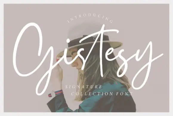
Loose signature script with tall capitals and an open, uneven rhythm
Gistesy is a loose signature script in which the capital rises very tall, the following letters drop small and the rhythm stays uneven enough to read as a real signature.
Ideas for this font
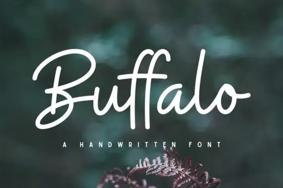
Broad monoline signature script with open capitals
Buffalo is a monoline signature script that holds one even stroke from the first capital to the last exit, with a wide-open capital B and a double f whose two ascenders stand straight up out of the x-height band.
Ideas for this font
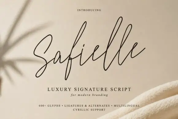
Very fine rising signature loops
Safielle is a very fine signature script in black on sand: hairline monoline strokes, tall narrow loops that rise well above the x-height and a lifted final stroke that ends the word with an open rise.
Ideas for this font

Fine extended signature script
Lovely sets a fine signature script in a single dark weight over a pale city photograph, where a wide entry curve opens low at the left, the letters rise into tall slender loops through the middle and a large descending y plus an extended closing sweep make the lower right part of the footprint.
Same independent foundry
Allow optional Google Analytics to measure visits and catalogue actions. Your search words and notes are not included. Privacy & storage