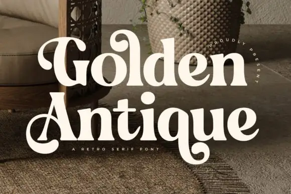
Editorial Serif Anchor

Autumn Silent + Wolles Elegant Modern Serif
Anchors Autumn Silent's fluid strokes with crisp Roman proportions on wedding suites, headers and packaging.
Inspect Wolles Elegant Modern Serif specimenDisclosure: MakerFileHub may earn a commission from qualifying purchases via paid links on this page. How our links work.
Fine widely spread signature script with high swashes and open spacing
Autumn Silent is a fine signature script in which the letters are spaced well apart, the swashes rise high above the line and the stroke stays light, so two words read as a signed caption rather than as a design element.
Paid link
Get this fontProject & layout blueprintsAt-a-glance maker compatibility
Weld or Unite overlapping script joins into one continuous vector path before sending to the blade.
Visual anatomy & craft review
The capital A opens as a tall sweeping stem that rises above the x-height, and the letters after it spread: the u closes a small bowl, the t crosses with a long bar, the double m keeps four open arches, the n holds a wide shoulder and the e loops back through its counter. The spacing is the character — the letters do not touch, which keeps the line airy at 30 pt and lets the swashes on the second word read as separate gestures. Weight is light and even, so the face wants a smooth stock and 18 pt minimum. The swash on the final letter rises and crosses back over the word, which is how the composition closes. The white ground, the watercolour leaf, the brown ink and the three caption lines are presentation; the script is the two words.
Spread · Fine · Signature
Two-font hierarchy recipes
Tested contrast partners — pairing Autumn Silent with grounded secondary typography.
Autumn Silent + Wolles Elegant Modern Serif
Anchors Autumn Silent's fluid strokes with crisp Roman proportions on wedding suites, headers and packaging.
Inspect Wolles Elegant Modern Serif specimen
Autumn Silent + Inkora
Keeps small-scale dates, URLs, nutrition facts and care instructions crisp and legible below script titles.
Inspect Inkora specimenPractical applications
Concrete hierarchy, scale and production guidance tailored to Autumn Silent’s stroke geometry.
The open spacing keeps a seasonal greeting airy, and the high swashes fill a card at 28 pt without a second element on the page.
Hierarchy & layout recipe
Print a 148 by 105 mm card: set the greeting at 28 pt across the centre, set the message in a 9 pt serif beneath, and keep 16 mm of margin so the closing swash stays inside the trim on both sides.
Pre-production check
A light swash over a printed message reads as a rule; check the proof and keep the message clearly below the swash rather than beside it.
The spread letters give a studio mark air at 16 pt, and the fine stroke reproduces in one colour on a card or a stamped box.
Hierarchy & layout recipe
Stamp a 60 by 45 mm box panel: set the studio name at 16 pt equivalent height, keep the town in a 5 pt sans beneath, and leave 8 mm of clear panel so the stamp edge does not ink the swash.
Pre-production check
A fine script under-inks on a rubber stamp; check a test impression and ink twice lightly rather than pressing harder.
The airy script heads a menu at 24 pt without competing with the dish list, and the even stroke keeps it legible on an uncoated card.
Hierarchy & layout recipe
Print an A5 menu: set the header at 24 pt, set the courses in a 9.5 pt serif at 14 pt leading, and hold 12 mm under the closing swash before the first course so the two never touch.
Pre-production check
Uncoated stock softens a light stroke; check the proof and keep the header on the smoother side of the card.
Technical & licence verification
Confirm included OTF/TTF/WOFF formats, full glyph tables and licence coverage on the live store page before batch production.
Closest visual alternatives
Matched across letterform anatomy, stroke behaviour and craft applications.
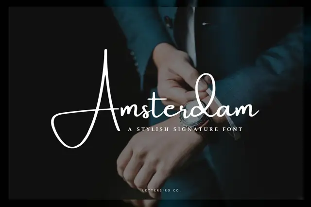
Very thin signature script with a large open capital
Amsterdam is a very thin signature script whose capital opens into a wide oval before the rest of the word runs, and the whole name is set so lightly that it reads as a pen mark on the photograph behind it.
Ideas for this font
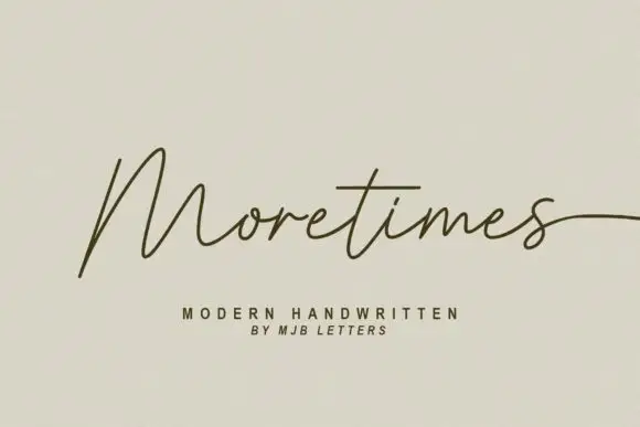
Light modern handwriting with long exits
Moretimes is a light modern handwriting script in olive brown on cream: hairline monoline strokes, an M built from open peaks, and a final s that runs out to the edge of the frame.
Ideas for this font
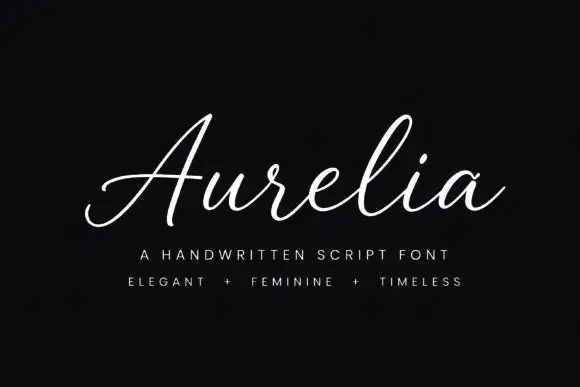
Light connected signature script with an open slant and a flat baseline
Aurelia is a light connected signature script drawn at one even weight, with an open slant, wide letter spacing and a flat baseline that holds across a whole word.
Ideas for this font
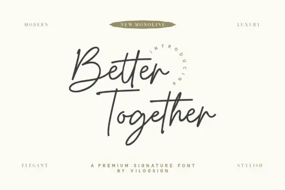
Fine crossed signature script
Better Together is a fine connected signature script with an open looped B, an even monoline weight and long horizontal strokes that cross beneath both words.
Same independent foundry
Allow optional Google Analytics to measure visits and catalogue actions. Your search words and notes are not included. Privacy & storage