High-Contrast Display Serif

Gc Allio + The Simple Editorial
Pairs sculptural editorial warmth with Gc Allio's clean modern geometry.
Inspect The Simple Editorial specimenDisclosure: MakerFileHub may earn a commission from qualifying purchases via paid links on this page. How our links work.
Substantial rounded lowercase with flat l tops and curved baseline feet
Allio is a bold neo-grotesque set in lowercase, its bowls round, its apertures closed and its strokes even, so one short word holds a whole cover without a second element.
Paid link
Get this fontProject & layout blueprintsAt-a-glance maker compatibility
Sturdy stroke walls and open counters weed cleanly on adhesive vinyl, HTV apparel film, and cut cardstock.
Visual anatomy & craft review
The name sits low and wide on an off-white page with a soft red blur behind it, the double l close together and the o almost a perfect circle. Terminals cut horizontally, the counters stay generous, and the weight sits heavy enough to read as branding rather than as body text. Four corner notes list the classification, the release year and the language support, which is the way a specimen cover usually declares itself. Nothing about the face is decorative, so its quality shows in the spacing between the round letters and in how evenly the bold strokes sit on a curve, and that is what a small identity buys.
Substantial rounded lowercase with flat l tops and curved baseline feet
Two-font hierarchy recipes
Tested contrast partners — pairing Gc Allio with grounded secondary typography.
Gc Allio + The Simple Editorial
Pairs sculptural editorial warmth with Gc Allio's clean modern geometry.
Inspect The Simple Editorial specimen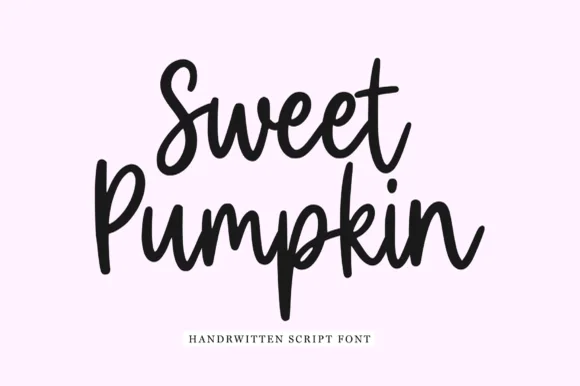
Gc Allio + Sweet Pumpkin
Introduces organic movement on pull-quotes, signatures and gift tags.
Inspect Sweet Pumpkin specimenPractical applications
Concrete hierarchy, scale and production guidance tailored to Gc Allio’s stroke geometry.
The even bold strokes hold at small sizes on invoices and cards, and the round lowercase gives a one-word studio name a calm, confident mark.
Hierarchy & layout recipe
Print a 55 by 90 mm business card: set the studio name at 15 pt on one row, keep 7 mm of clear ground beneath before the contact line at 6 pt, and keep 6 mm of margin so no bowl is clipped.
Pre-production check
Closed apertures fill at 9 pt in offset; check the printed card before ordering a box. Ask the printer for a sample at the finished size.
The heavy grotesque holds a heading under a photograph without competing with it, and the even weight keeps a short opener line clean.
Hierarchy & layout recipe
Print a 210 by 280 mm page: set the heading at 54 pt across two lines, keep 18 mm of clear ground beneath before the standfirst at 10 pt, and keep 16 mm of margin from the text block edge.
Pre-production check
Bold coverage can fill the counters at small sizes; check the printed page before setting captions.
The plain letterforms suit an institution that wants to look current, and the bold weight stays legible on a cover read at arm's length.
Hierarchy & layout recipe
Print an A4 cover: set the course name at 38 pt across two rows, keep 16 mm of clear ground beneath before the year at 12 pt, and keep 18 mm of margin from the trim on all sides.
Pre-production check
Two lines of bold set tight can crowd; check the pair at final size before the cover proof.
Technical & licence verification
Confirm included OTF/TTF/WOFF formats, full glyph tables and licence coverage on the live store page before batch production.
Closest visual alternatives
Matched across letterform anatomy, stroke behaviour and craft applications.
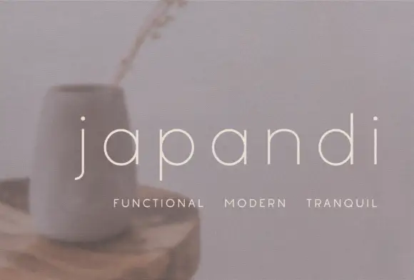
Widely spaced thin lowercase with circular bowls and a hooked j descender
Japandi draws its lowercase in a hairline geometric line, keeps the bowls almost circular and sets the words far apart on a soft photographic ground so the type feels like a room rather than a label.
Ideas for this font

Contrast display sans with single-storey g
Swaraga is a contrast display sans in off-white over a close photograph of a monstera leaf: mixed case with broad bowls, thin joins, a descending single-storey g and a tall ascender, set in two lines with a small line at the upper left and a studio badge at the upper right.
Ideas for this font
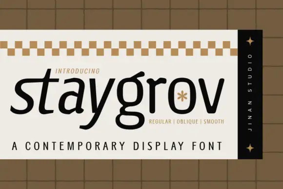
Sloping contemporary display sans
Staygrov is a sloping lowercase display in black on cream: letters with a forward lean, a broad double-storey g, a long t crossbar and a small asterisk set into the o, framed by a checkered band at the head, a vertical dark strip at the side and two tracked lines beneath.
Ideas for this font
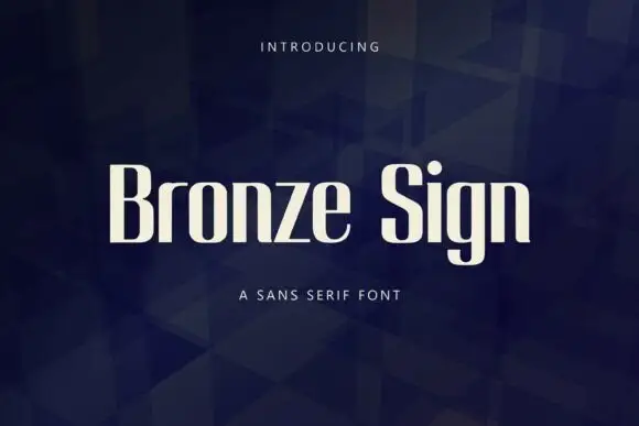
Narrow upright sans letters with softened rectangular bowls
Bronze Sign is a condensed sans display face: tall narrow caps and lowercase with a closed aperture, tight spacing and a flat, even stroke that reads like a sign painter's block letter.
Ideas for this font
Same independent foundry
Allow optional Google Analytics to measure visits and catalogue actions. Your search words and notes are not included. Privacy & storage