Neutral Sans Workhorse

Folk Floral Dingbats + Furion
Lets Folk Floral Dingbats own the focal silhouette while handling secondary copy, sizing and subheads cleanly.
Inspect Furion specimenDisclosure: MakerFileHub may earn a commission from qualifying purchases via paid links on this page. How our links work.
Solid black folk-floral drops, petal fans and stylised leaf sprays
Folk Floral Dingbats is a set of solid black folk ornaments — leaf sprigs, fan flowers, scalloped stems, seeded bursts, tulip shapes — drawn as filled silhouettes with cut-out details.
Paid link
Get this fontProject & layout blueprintsAt-a-glance maker compatibility
Sturdy stroke walls and open counters weed cleanly on adhesive vinyl, HTV apparel film, and cut cardstock.
Visual anatomy & craft review
The card arranges about forty shapes in a ring around a black circle that carries the set name, and every shape is a solid silhouette rather than an outline: a fan of leaves, a stem with paired buds, a burst of radiating petals, a scalloped flower head with a cut centre. The shapes come from the vocabulary of painted folk furniture and paper cutting, and because they are filled they read at a small size and can be cut from vinyl without a second pass. A credit line sits under the title. The set is meant for pattern building — a border, a scatter or a repeat — and its silhouette construction means a whole wall of them can be printed in one ink with no registration worries at all.
Solid black folk-floral drops, petal fans and stylised leaf sprays
Two-font hierarchy recipes
Tested contrast partners — pairing Folk Floral Dingbats with grounded secondary typography.
Folk Floral Dingbats + Furion
Lets Folk Floral Dingbats own the focal silhouette while handling secondary copy, sizing and subheads cleanly.
Inspect Furion specimen
Folk Floral Dingbats + Augler
Grounds bold display lettering with classic typographic authority on posters, badges and apparel.
Inspect Augler specimenPractical applications
Concrete hierarchy, scale and production guidance tailored to Folk Floral Dingbats’s stroke geometry.
The silhouettes give a plain label the look of painted folk decoration, and one solid ink prints on a small run without registration risk.
Hierarchy & layout recipe
Print a 55 by 45 mm label: set the studio name at 13 pt with three shapes between 8 and 12 mm around it, keep 5 mm of clear ground around the type, and hold 4 mm from the nearest shape to the die line.
Pre-production check
Solid shapes crowd a small label fast; print one label with three shapes and check the balance before the order.
A repeat built from typed shapes ties an invitation, a menu and a program together, and the silhouettes hold on cheap card where a detailed drawing would fail.
Hierarchy & layout recipe
Print a 130 by 180 mm invitation: tile twelve shapes at 9 mm along the lower edge, keep 8 mm of clear ground above the pattern before the details at 9 pt, and hold 12 mm of margin from the pattern to the trim.
Pre-production check
A dense repeat can look like wallpaper; print one invitation and check the density before the full suite.
One solid ornament per section gives a craft title a consistent mark, and a silhouette reads on a busy page where a line drawing would disappear.
Hierarchy & layout recipe
Print a 230 by 300 mm spread: place one shape at 14 mm beside each section head at 28 pt, keep 7 mm of clear ground between the shape and the lettering, and hold 18 mm of margin at the outer edge.
Pre-production check
Solid black shapes print heavier than expected; print one spread and compare the mark against the text weight first.
Technical & licence verification
Confirm included OTF/TTF/WOFF formats, full glyph tables and licence coverage on the live store page before batch production.
Closest visual alternatives
Matched across letterform anatomy, stroke behaviour and craft applications.
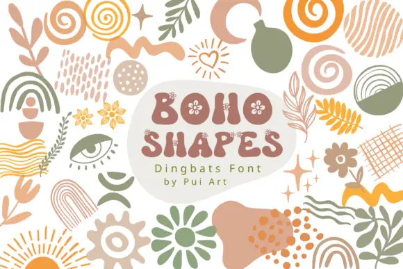
Organic dingbat motifs with leaves, spirals, arches and irregular texture marks
Boho Shapes is a typable collection of abstract ornaments — arches, spirals, sunbursts, squiggles, dotted blobs, leaves, eyes, stars — drawn as flat shapes in a warm terracotta, sage and mustard palette.
Ideas for this font
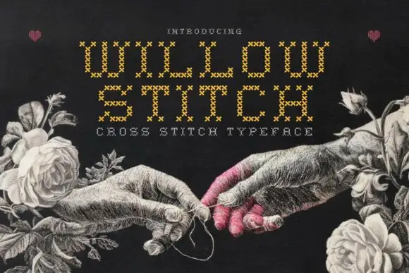
Cross-stitch constructed display
Willow Stitch is a cross-stitch display in gold on a dark ground: narrow angular capitals assembled from small stitched X marks, so each stroke is a column of crosses, set in two lines above a tracked line, with a drawn etching of two hands and roses around the words.
Ideas for this font
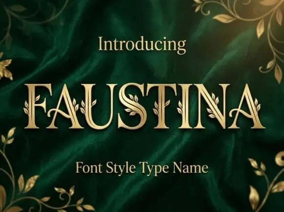
Fine serif capitals with small leaf sprigs attached along stems and curves
Faustina sets gold serif capitals on green velvet and grows gold vines across the strokes, so leaves and buds climb out of the letters instead of sitting beside them.
Ideas for this font
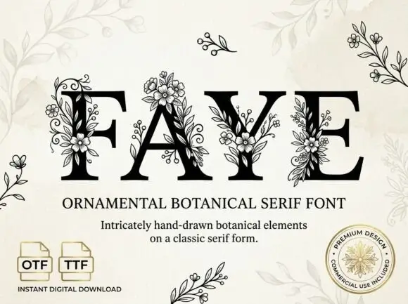
Large contrast serif capitals crossed by fine outlined flower and leaf clusters
Faye places black capitals on pale cream, where large fine-lined flowers overlap the F stem and the A apex, leafy sprigs and small buds cross the Y and E, and narrow curled tendrils climb between the letters while standalone sprigs sit around the page.
Ideas for this font
Same independent foundry
Allow optional Google Analytics to measure visits and catalogue actions. Your search words and notes are not included. Privacy & storage