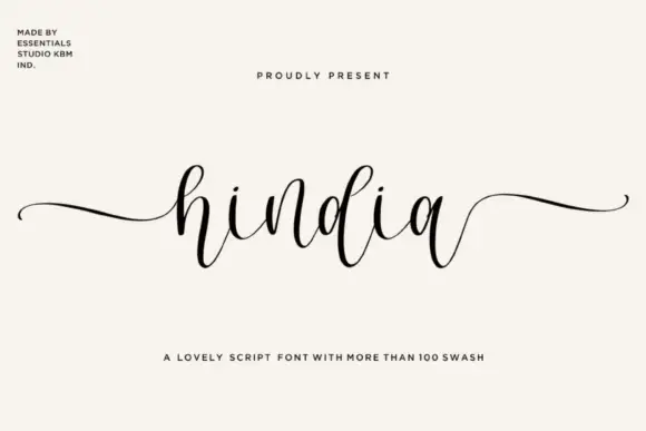
Editorial Serif Anchor

Essentials Handwriting + Majestic Letters
Anchors Essentials Handwriting's fluid strokes with crisp Roman proportions on wedding suites, headers and packaging.
Inspect Majestic Letters specimenDisclosure: MakerFileHub may earn a commission from qualifying purchases via paid links on this page. How our links work.
Fine informal signature lettering
Essentials Handwriting is a fine informal signature script set in two lines, with short joins, small caps-height letters and a quick, unposed rhythm.
Paid link
Get this fontProject & layout blueprintsAt-a-glance maker compatibility
Weld or Unite overlapping script joins into one continuous vector path before sending to the blade.
Visual anatomy & craft review
The two lines are written at the same x-height, which makes the stack read as one signature rather than a headline and a subline, and the small differences in letter angle keep it from looking assembled. Weight is thin and even, joins are short, and the capitals are only a little taller than the lowercase, so the face depends on the pen angle rather than on contrast. The small script badge beside the second line and the tracked caption below are separate label elements, and the pink floral line art in the corners is decoration.
Signature · Fine · Informal
Two-font hierarchy recipes
Tested contrast partners — pairing Essentials Handwriting with grounded secondary typography.
Essentials Handwriting + Majestic Letters
Anchors Essentials Handwriting's fluid strokes with crisp Roman proportions on wedding suites, headers and packaging.
Inspect Majestic Letters specimen
Essentials Handwriting + Swaraga
Keeps small-scale dates, URLs, nutrition facts and care instructions crisp and legible below script titles.
Inspect Swaraga specimenPractical applications
Concrete hierarchy, scale and production guidance tailored to Essentials Handwriting’s stroke geometry.
A fine signature reads as a watermark over photographs without dominating the image, which is what a photographer needs on proofs.
Hierarchy & layout recipe
Set the signature at 18 pt in white or 60 percent black, place it in the lower corner with a 6 mm margin, and keep it clear of faces and busy background detail.
Pre-production check
Fine strokes disappear over light skies; test the overlay on the brightest and the darkest frame in the set.
An informal signature suits the return address on an envelope, where a formal calligraphic hand would feel stiff and out of place on the flap.
Hierarchy & layout recipe
Keep the line at 11 pt on the back flap, set the street address in a plain sans at 9 pt beneath it, and leave 6 mm of clear space above the flap fold line.
Pre-production check
Addresses need punctuation and numerals, so check how the face draws a comma and the figure one before committing.
A quick fine signature ends a column with a personal mark that a printed byline simply cannot reproduce anywhere on the page.
Hierarchy & layout recipe
Set the sign-off at 15 pt at the end of the piece, keep it on a line of its own, and leave 10 mm of clear space before the footer rule and any footnote.
Pre-production check
Keep the signature short; a long name set at 15 pt will wrap and break the informal rhythm.
Technical & licence verification
Confirm included OTF/TTF/WOFF formats, full glyph tables and licence coverage on the live store page before batch production.
Closest visual alternatives
Matched across letterform anatomy, stroke behaviour and craft applications.
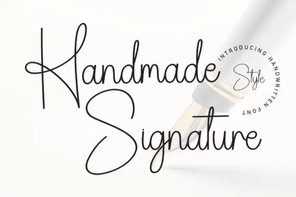
Monoline handwriting with crossing loops and an italic cut
Handmade Signature is a monoline handwriting face in which the capitals cross their own stems, the ascenders loop tall and an italic cut leans the same shapes, so a name reads as a signature drawn with a fine pen.
Ideas for this font
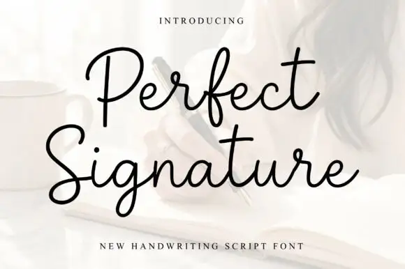
Open fine signature script
Perfect is an open handwriting script in black over a soft photograph: fine even strokes, wide loops on the ascenders and a level baseline, with a long exit stroke that runs out beneath the second line.
Ideas for this font
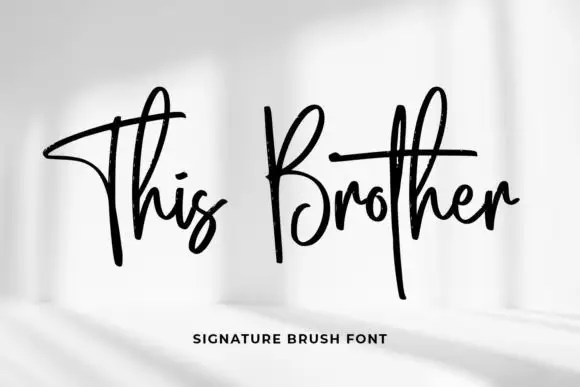
Tall crossed brush signature
This Brother is a signature brush script in black on a pale photograph: tall narrow letters, a long crossed stroke on the T and the B, and a fast forward lean.
Ideas for this font
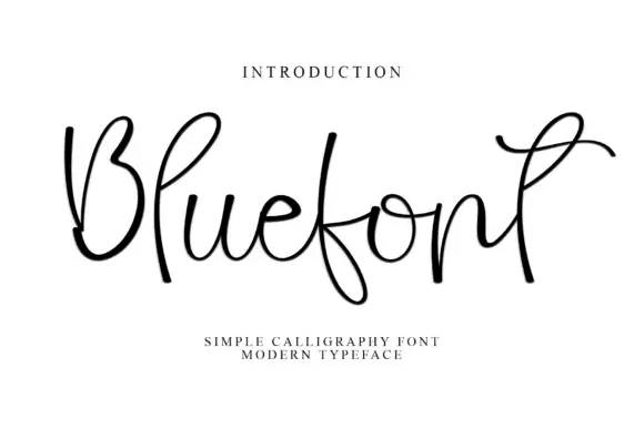
Open looping monoline script with exaggerated ascenders
Blue is an open monoline script whose ascenders and descenders run two or three times the x-height, with wide untouching loops and thin joins that make the word read as a loose ribbon rather than a solid line of text.
Ideas for this font
Same independent foundry
Allow optional Google Analytics to measure visits and catalogue actions. Your search words and notes are not included. Privacy & storage