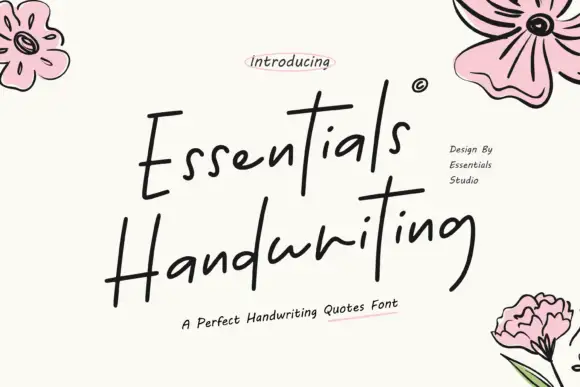
Editorial Serif Anchor

Hindia + Worldstar
Anchors Hindia's fluid strokes with crisp Roman proportions on wedding suites, headers and packaging.
Inspect Worldstar specimenDisclosure: MakerFileHub may earn a commission from qualifying purchases via paid links on this page. How our links work.
Fine script with long side swashes
Hindia sets small connected lowercase between two long tapering horizontal swashes, so the whole word sits inside its own flourish rather than above it.
Paid link
Get this fontProject & layout blueprintsAt-a-glance maker compatibility
Weld or Unite overlapping script joins into one continuous vector path before sending to the blade.
Visual anatomy & craft review
The specimen is a pale sheet with the script in the centre and two sweeping strokes leaving the first and last letters at the same height, which is what makes the composition feel symmetrical. Lowercase letters stay small and close together, the joins are thin enough to look drawn with a fine pen, and the swashes taper to points at both ends. Because the swashes carry the width, the word itself can stay short without the lockup looking lost on the page. A tracked line of small capitals sits beneath and belongs to a separate label face; the pale paper texture is the background, not part of the strokes.
Fine · Swept · Delicate
Two-font hierarchy recipes
Tested contrast partners — pairing Hindia with grounded secondary typography.
Hindia + Worldstar
Anchors Hindia's fluid strokes with crisp Roman proportions on wedding suites, headers and packaging.
Inspect Worldstar specimen
Hindia + Noar
Keeps small-scale dates, URLs, nutrition facts and care instructions crisp and legible below script titles.
Inspect Noar specimenPractical applications
Concrete hierarchy, scale and production guidance tailored to Hindia’s stroke geometry.
Two long swashes give a narrow menu header the width it needs without stretching the letters, which keeps the fine stroke intact.
Hierarchy & layout recipe
Set the word at 26 pt on a 100 mm wide menu card, allow each swash to run to within 8 mm of the margin, and keep the dishes at 9 pt below the swash line.
Pre-production check
The swash tips are the finest points in the face; on textured card they break up before the letters do.
A symmetrical swash lockup reads as balanced on a narrow band, which is exactly where most candle labelling has to work.
Hierarchy & layout recipe
Keep the script at 11 pt on a 55 mm band, centre it on the swash span rather than on the word itself, and leave 4 mm above the swashes for the scent name.
Pre-production check
Centring on the word rather than the swashes makes the label look off-centre; align to the swash span.
A single word between two swashes is a ready-made divider that does not need a second rule, an ornament or any extra spacing device.
Hierarchy & layout recipe
Place the divider at 30 pt between two text blocks, keep 10 mm of white space above and below the swashes, and avoid using it more than once per spread.
Pre-production check
Two swash dividers on facing pages create a visual rhyme that readers take for an error, so use it once and let it land.
Technical & licence verification
Confirm included OTF/TTF/WOFF formats, full glyph tables and licence coverage on the live store page before batch production.
Closest visual alternatives
Matched across letterform anatomy, stroke behaviour and craft applications.

Very slanted calligraphy with broad lower sweeps and fine hairlines
Silken Luxe is a formal calligraphy script with a steep slant, broad lower sweeps and hairlines that thin almost to nothing, drawn so two words build an ornamental diagonal across the plate.
Ideas for this font
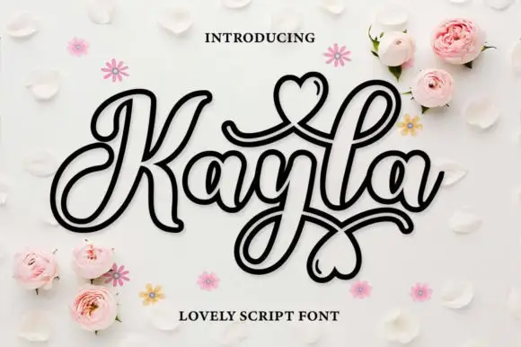
Outlined decorative script with hearts drawn inside the loops
Kayla is an outlined decorative script in which every stroke is drawn as a double line and the loops close into hearts, so a name reads as a paper cut-out rather than as a written word.
Ideas for this font
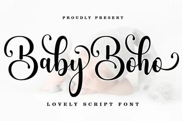
Casual calligraphy script with large repeated capitals and a long descending loop
Baby Boho is a casual modern calligraphy script in which the capitals sit large, the downstrokes stay broad, the entry curls thin away and the final o lifts a rising tail, so a name reads as written quickly but carefully.
Ideas for this font
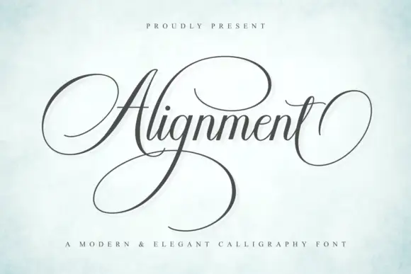
Formal calligraphic script with a large calligraphic capital
Alignment is a formal calligraphy script whose capital occupies three times the x-height and whose oval flourish sweeps out from the first letter and back under the last, so the word is framed top and bottom by one continuous gesture.
Ideas for this font
Same independent foundry
Allow optional Google Analytics to measure visits and catalogue actions. Your search words and notes are not included. Privacy & storage