Modern Grotesque Body

Cigaret + Taught
Creates crisp high-hierarchy contrast beneath Cigaret headlines across menus, websites and labels.
Inspect Taught specimenDisclosure: MakerFileHub may earn a commission from qualifying purchases via paid links on this page. How our links work.
Fine high-fashion serif with a wide C and a low ribbon-like g loop
Cigaret is a fine high-fashion serif in which the C opens wide, the bowls round off against slender diagonals, the g drops into a low ribbon loop and the final t rises above the row, so a short name reads as a boutique label.
Paid link
Get this fontProject & layout blueprintsAt-a-glance maker compatibility
Crisp hairline serifs shine on stationery, foil stamping, and packaging; add slight offset for small decals.
Visual anatomy & craft review
The C sweeps a wide open curve, the o and e hold rounded bowls with fine joins, the g returns a low ribbon that curls back under the baseline, and the t lifts its crossbar above the lowercase row. The low ribbon loop is the character: it keeps a word sitting tight, which is why the sample sets one name over a warmly lit portrait. Expressive ligatures and monogram frames ship with the family, so a maker can build a two-letter mark without drawing one. Because the joins are fine, the face wants coated stock from 10 pt and gains from a hot-foil finish on signage. The portrait, the orange highlights and the small caps credit are presentation.
Fashion · Fine · Ligatures
Two-font hierarchy recipes
Tested contrast partners — pairing Cigaret with grounded secondary typography.
Cigaret + Taught
Creates crisp high-hierarchy contrast beneath Cigaret headlines across menus, websites and labels.
Inspect Taught specimen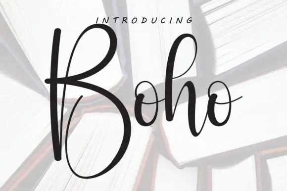
Cigaret + Boho
Adds a warm human signature touch for 1-to-3-word callouts without competing against structured serif capitals.
Inspect Boho specimenPractical applications
Concrete hierarchy, scale and production guidance tailored to Cigaret’s stroke geometry.
The shipped monogram frames turn two letters into a mark, and the fine serif keeps a product name elegant at 14 pt on a small carton.
Hierarchy & layout recipe
Print a 45 by 90 mm carton: set the product name at 14 pt, place the monogram frame 12 mm above it, and set the volume in a 6 pt caps at the foot so the panel keeps two levels.
Pre-production check
A foil monogram under 10 mm loses its counter; check the plate and keep the frame at 12 mm or wider.
The open fine forms suit a reflective title, and the wide C holds a two-word heading at 60 pt over a photographic ground.
Hierarchy & layout recipe
Print an A4 cover: set the heading at 60 pt across the calmest band of the portrait, keep 18 mm of clear space under the ribbon g, and set the byline in a 9 pt caps at the foot.
Pre-production check
Fine serifs printed over a lit face lose their hairlines; check the cover proof and either darken the band or move the heading.
The fashion serif suits a modern suite, and the fine contrast keeps a course heading distinct at 18 pt above the dish lines.
Hierarchy & layout recipe
Print a 105 by 210 mm menu: set the course headings at 18 pt, set the dishes at 10 pt in a neutral serif, and keep 14 mm between courses so the ribbon loops sit clear.
Pre-production check
A low g loop printed over a dish line reads as a stray mark; check the proof and keep 10 mm under every descender.
Technical & licence verification
Confirm included OTF/TTF/WOFF formats, full glyph tables and licence coverage on the live store page before batch production.
Closest visual alternatives
Matched across letterform anatomy, stroke behaviour and craft applications.
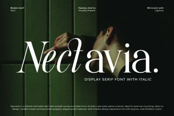
Minimalist display serif with italic
Nectavia is a refined minimalist serif in white over a dark green portrait: moderate contrast, smooth curves, a clean stem and sharp serifs, set in title case on one line with a small italic line beneath and three tracked notes across the top.
Ideas for this font
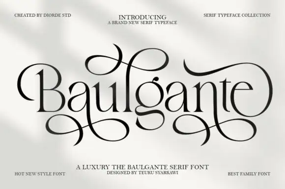
Tall high-contrast serif with looping figure-eight extensions in regular and slant
Baulgante is an elegant high-contrast serif in which the stems stay narrow, the bowls round broadly and repeated figure-eight extensions loop above and below the line, and the family ships in regular and slant so a suite can shift its axis.
Ideas for this font
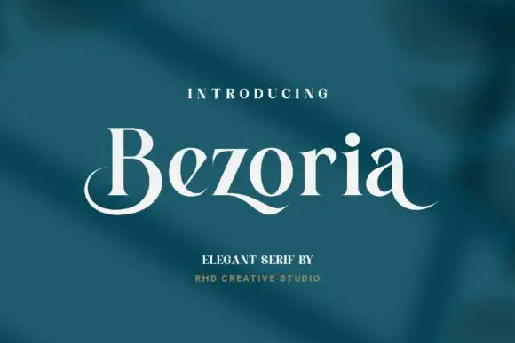
Elegant serif with calligraphic tails and a flowing lowercase
Bezoria is an elegant serif in which the lowercase carries calligraphic tails, the bowls flow into their stems and the serifs stay fine, so a single name reads as a piece of modern lettering rather than as a text face.
Ideas for this font
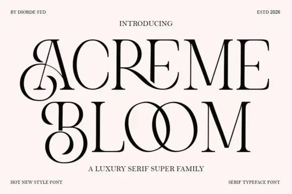
Luxury serif super family with ligatures and high contrast
Acreme Bloom is a luxury serif family in which neighbouring letters join into drawn ligatures, the stems keep a high contrast and the fit stays wide, so a two-word title reads as a couture wordmark rather than as a headline.
Ideas for this font
Same independent foundry
Allow optional Google Analytics to measure visits and catalogue actions. Your search words and notes are not included. Privacy & storage