High-Contrast Display Serif

Christmas Delight + Alerigue
Pairs sculptural editorial warmth with Christmas Delight's clean modern geometry.
Inspect Alerigue specimenDisclosure: MakerFileHub may earn a commission from qualifying purchases via paid links on this page. How our links work.
Tall playful capitals paired with a softer flowing lowercase script
Christmas Delight is a two-face set: a tall hand-drawn caps face with uneven strokes in red, and a loose monoline script in green that curls under the first line.
Paid link
Get this fontProject & layout blueprintsAt-a-glance maker compatibility
Weld or Unite overlapping script joins into one continuous vector path before sending to the blade.
Visual anatomy & craft review
CHRISTMAS runs across the top in a narrow hand-drawn caps face, and delight follows underneath in a script whose loops drop below the baseline and whose t finishes in a long tail. Both faces are drawn with the same wobble, so the pair looks like one hand at two speeds, and four-pointed sparkles sit in the spaces between the words. The red and green are warm rather than bright, and the ground is an off-white paper with a faint printed border, which keeps the card from looking like a novelty. Two lines of quiet type at the foot credit the designer. The pairing is the point: the caps carry information and the script carries the greeting, and both faces work on their own, which matters when one of them is used for a date and the other for a name. It is a seasonal set for cards, tags and menus.
Tall playful capitals paired with a softer flowing lowercase script
Two-font hierarchy recipes
Tested contrast partners — pairing Christmas Delight with grounded secondary typography.
Christmas Delight + Alerigue
Pairs sculptural editorial warmth with Christmas Delight's clean modern geometry.
Inspect Alerigue specimen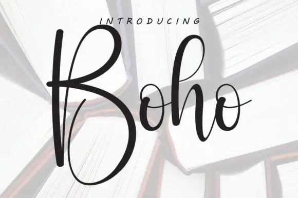
Christmas Delight + Boho
Introduces organic movement on pull-quotes, signatures and gift tags.
Inspect Boho specimenPractical applications
Concrete hierarchy, scale and production guidance tailored to Christmas Delight’s stroke geometry.
The pair gives a card a headline and a handwritten line without a second design element, and both faces stay readable at the size of a folded card.
Hierarchy & layout recipe
Print a 120 by 170 mm card: set the greeting in the caps at 30 pt and the family name in the script at 34 pt beneath it, keep 14 mm of clear ground above the written message, and hold 12 mm from the lowest loop to the card edge.
Pre-production check
Script loops tangle with the line above; print one card at the finished size and check the clearance before the batch.
The script fits a short thank-you on a small tag, and the caps give the year a separate place so nothing has to be abbreviated.
Hierarchy & layout recipe
Print a 45 by 70 mm tag: set the greeting in the script at 18 pt with the year in the caps at 12 pt above it, keep 6 mm of clear ground beneath before the name line, and hold 5 mm from the tail to the punch hole.
Pre-production check
Small tags lose the hairline joins of the script; print one tag at the finished size and check the thickest and thinnest strokes.
The handwritten pair suits a jar filled in a home kitchen, and the caps face keeps the flavour readable while the script carries the season.
Hierarchy & layout recipe
Print a 55 by 45 mm jar label: set the flavour in the caps at 15 pt with the season in the script at 14 pt, keep 5 mm of clear ground between the two lines, and hold 4 mm from the script tail to the label edge.
Pre-production check
Jars are handled wet; print one label on the real stock, chill it and check that the thin script still reads.
Technical & licence verification
Confirm included OTF/TTF/WOFF formats, full glyph tables and licence coverage on the live store page before batch production.
Closest visual alternatives
Matched across letterform anatomy, stroke behaviour and craft applications.
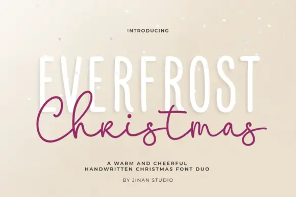
Tall narrow caps paired with a wide looping Christmas script
Everfrost Christmas Duo is a seasonal pair in which tall narrow capitals set the plain line and a wide looping script crosses their lower half, so a greeting reads as a composed holiday card rather than a single face.
Ideas for this font
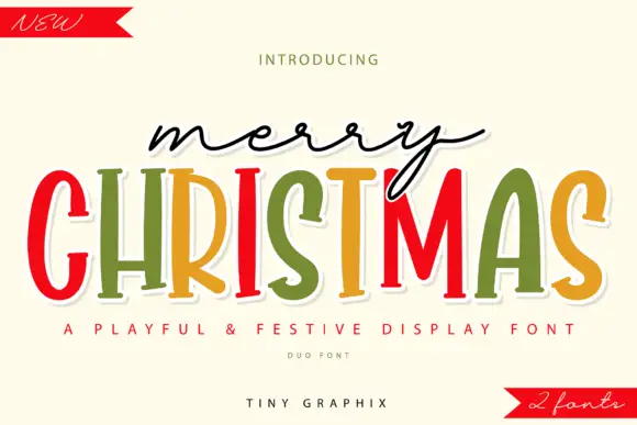
Thin connected script above narrow festive serifs
Merry Christmas Duo is a festive pair on cream: a thin connected script in black, and a narrow colourful serif with outlined edges beneath, finished with two red ribbon banners.
Ideas for this font
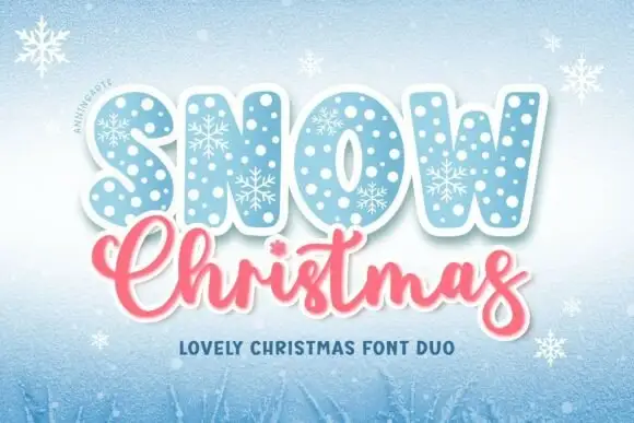
Festive duo of patterned caps and script
Snow Christmas Duo is a two-face set shown on a pale blue winter ground: a fat capital face filled with polka dots and snowflakes in ice blue, and beneath it a connected pink script with a swash on the final letter, with a small line naming the pair and snowflakes drifting across the sheet.
Ideas for this font
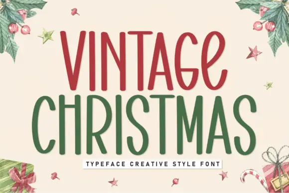
Tall condensed festive display
Vintage Christmas is a tall condensed display in red and green on cream: narrow rounded letters with a hand-drawn edge, uneven stems, small loops on the C and the S, and generous counters, presented inside a watercolour wreath of holly and gifts, so the pair reads as a hand-painted seasonal sign.
Ideas for this font
Same independent foundry
Allow optional Google Analytics to measure visits and catalogue actions. Your search words and notes are not included. Privacy & storage