Neutral Sans Workhorse

Catsumi + Bareum
Lets Catsumi own the focal silhouette while handling secondary copy, sizing and subheads cleanly.
Inspect Bareum specimenDisclosure: MakerFileHub may earn a commission from qualifying purchases via paid links on this page. How our links work.
Fine contrast capitals with a sweeping S and a suspended curved M centre
Catsumi is a wide high-contrast titling face in which the thin strokes almost vanish at the joins, leaving the heavy stems and the flat thin serifs to carry the word on their own.
Paid link
Get this fontProject & layout blueprintsAt-a-glance maker compatibility
Sturdy stroke walls and open counters weed cleanly on adhesive vinyl, HTV apparel film, and cut cardstock.
Visual anatomy & craft review
CATSUMI spans the full width of the frame in cream on a warm sand ground raked by long shadows from an unseen blind. The letters are wide and low, with hairline cross strokes, unbracketed thin serifs and a very large difference between thick and thin, so the C, the S and the U look like drawn ribbons rather than built letters. Inside the C a script band spells two words in a small hand, and that inset is the only soft element on the card, which makes the contrast of the main word feel deliberate. Three small caps lines at the head and foot name the studio, the style and the designer, and a hairline rule runs above the footer. The face is a titling cut with no lowercase in the preview, and it works on a cover or a bottle because the hairlines disappear at a distance and leave a row of elegant shapes.
Fine contrast capitals with a sweeping S and a suspended curved M centre
Two-font hierarchy recipes
Tested contrast partners — pairing Catsumi with grounded secondary typography.
Catsumi + Bareum
Lets Catsumi own the focal silhouette while handling secondary copy, sizing and subheads cleanly.
Inspect Bareum specimen
Catsumi + The Avenue Editorial
Grounds bold display lettering with classic typographic authority on posters, badges and apparel.
Inspect The Avenue Editorial specimenPractical applications
Concrete hierarchy, scale and production guidance tailored to Catsumi’s stroke geometry.
The hairline joins give a bottle a fashion tone without a printed ornament, and the wide capitals fill a short product name across the front of a label.
Hierarchy & layout recipe
Print a 60 by 110 mm label: set the product name at 30 pt on one row, keep 10 mm of clear ground beneath before the volume at 5 pt, and hold 8 mm from the outer stem to the label edge.
Pre-production check
Hairlines under a tenth of a millimetre drop out in flexo; print one label on the real foil and check the thin strokes first.
One wide word becomes the whole cover image, and the vanishing hairlines let a photograph show through between the heavy stems without the type losing its shape.
Hierarchy & layout recipe
Print a 230 by 300 mm cover: set the issue word at 150 pt across the full measure, keep 34 mm of clear ground beneath before the cover lines at 12 pt, and hold 18 mm from the last letter to the right trim.
Pre-production check
Wide letters over a bright photograph need a shadow or a solid panel; print one cover and check the legibility of the hairlines at a metre.
The clean hairline contrast suits a restrained invitation, and the wide caps hold a long pair of names in one line without reducing the size or adding a script.
Hierarchy & layout recipe
Print a 148 by 210 mm invitation: set the names at 32 pt across one row, keep 22 mm of clear ground beneath before the venue at 9 pt, and hold 18 mm of margin left and right of the widest stem.
Pre-production check
Thin serifs print unevenly on textured card; print one invitation on the actual board and inspect the ends of the stems.
Technical & licence verification
Confirm included OTF/TTF/WOFF formats, full glyph tables and licence coverage on the live store page before batch production.
Closest visual alternatives
Matched across letterform anatomy, stroke behaviour and craft applications.
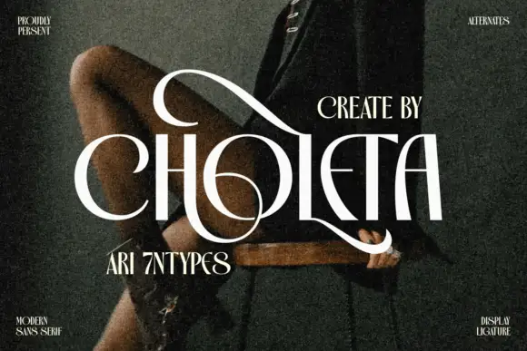
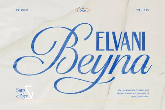
Contrasting capitals woven through a large upper loop and low circular sweep
Choleta builds tall white capitals and then lets thin strokes cross through them, so the counters open into slashes and the whole line reads as one sculpted ligature rather than six separate letters.
Ideas for this font
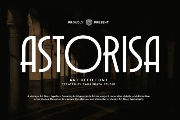
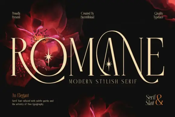
Deco-like capitals combining very narrow uprights with an oversized circular O
Astorisa draws its capitals tall and narrow in the art deco manner, lifts the crossbars high, squares the curves into octagonal facets and closes the counters with a thin inner line.
Ideas for this font
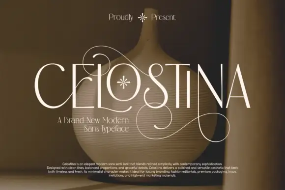
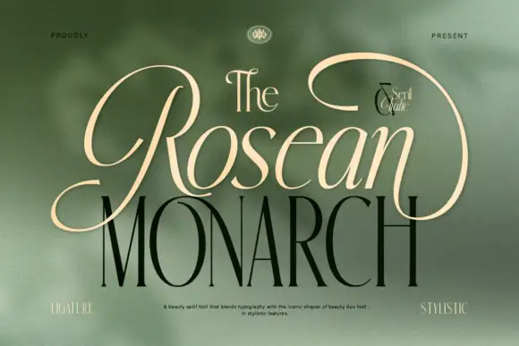
Fine narrow capitals with large looped flourishes crossing above and below the baseline
Celostina is a high-contrast serif with hairline serifs, a very wide E and a single joined flourish that travels from the first letter to the last along the baseline.
Ideas for this font
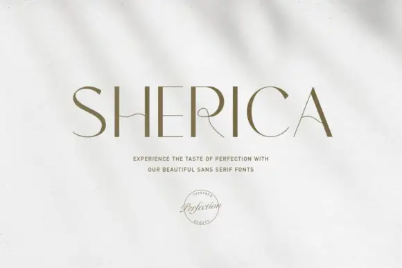
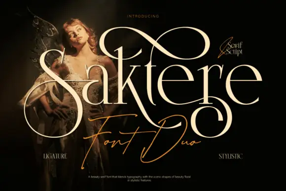
Fine contrast display with drawn details
Sherica is a fine contrast display in olive on a pale textured ground: wide capitals with thick verticals, hairline horizontals, a waved bar on the H and a curling interior on the R, set as one word above two lines of small caps and a circular seal.
Ideas for this font
Same independent foundry
Allow optional Google Analytics to measure visits and catalogue actions. Your search words and notes are not included. Privacy & storage