High-Contrast Display Serif

Bolula + Svara
Pairs sculptural editorial warmth with Bolula's clean modern geometry.
Inspect Svara specimenDisclosure: MakerFileHub may earn a commission from qualifying purchases via paid links on this page. How our links work.
Thin rounded-square capitals with an arched A and long curved L feet
Bolula is a thin capital sans in which the strokes stay near even, the O and B bowls round off into rectangles, the A opens as a tall arch over a low crossbar and the L curves into a long horizontal foot while the U holds a deep rounded cup.
Paid link
Get this fontProject & layout blueprintsAt-a-glance maker compatibility
Sturdy stroke walls and open counters weed cleanly on adhesive vinyl, HTV apparel film, and cut cardstock.
Visual anatomy & craft review
The A carries a low crossbar under a pointed arch, the L sweeps out into a long foot, the U closes a deep cup and the O keeps rounded corners rather than a true circle. The arched A is the character: it is the one letter that departs from the squared skeleton, which is why the sample sets a single name on dusty pink. Because the strokes are thin and the arms long, set the word at 26 pt before the joins thin out, and check the trailing foot against any edge. The small subtitle below the name is another short line, not proof of a lowercase set.
Thin · Rounded-square · Arched
Two-font hierarchy recipes
Tested contrast partners — pairing Bolula with grounded secondary typography.
Bolula + Svara
Pairs sculptural editorial warmth with Bolula's clean modern geometry.
Inspect Svara specimen
Bolula + Simple Alphabet
Introduces organic movement on pull-quotes, signatures and gift tags.
Inspect Simple Alphabet specimenPractical applications
Concrete hierarchy, scale and production guidance tailored to Bolula’s stroke geometry.
The thin squared caps give a bottle a quiet mark, and the arched A stays open at 20 pt on a 45 mm wide label. The label should stay narrow so the long foot keeps its travel.
Hierarchy & layout recipe
Print a 45 by 70 mm label: set the word at 20 pt in capitals, keep 8 mm of clear space beneath the long L foot, and set the volume in a 5 pt caps at the foot with 4 mm of clear ground.
Pre-production check
Thin strokes printed on an uncoated label spread at 16 pt; check the proof and keep the word at 19 pt or above.
The thin capitals suit a restrained cover, and the long L foot gives a one-word title a line to rest on at 62 pt. The foot gives the title a baseline without needing a rule.
Hierarchy & layout recipe
Print an A4 cover: set the title at 62 pt in capitals across the lower third, keep 22 mm of clear ground beneath the foot, and set the contributor list at 9 pt in a serif above with 14 mm of space.
Pre-production check
A long foot printed into a cover line crowds it; check the proof and keep 18 mm between the arm and any text. Keep the title off any dark image area.
The thin uniform caps keep a contemporary suite calm, and the wide bowls hold two names on one row at 22 pt on heavy card stock. The arch is the only curve in the row, so it draws the eye.
Hierarchy & layout recipe
Print a 130 by 180 mm card: set the names at 22 pt in capitals, keep 16 mm of clear ground beneath for the trailing foot, and set the venue at 9 pt in a light serif with 12 mm of clear space below.
Pre-production check
Hairlines printed at 26 pt on textured card break at the joins; check the proof and keep the names on a smooth stock.
Technical & licence verification
Confirm included OTF/TTF/WOFF formats, full glyph tables and licence coverage on the live store page before batch production.
Closest visual alternatives
Matched across letterform anatomy, stroke behaviour and craft applications.

Open rounded mixed case with a tall t and broad circular bowls
Cultivo shows a large black title-case name across the lower part of a pale beige cover, where light to moderate nearly even strokes form an open C, a broad u and near-circular bowls, the t finishes with a rounded lower turn and the v opens a clean diagonal.
Ideas for this font
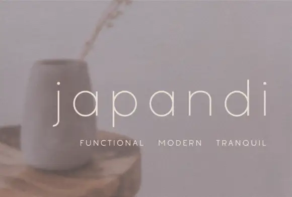
Widely spaced thin lowercase with circular bowls and a hooked j descender
Japandi draws its lowercase in a hairline geometric line, keeps the bowls almost circular and sets the words far apart on a soft photographic ground so the type feels like a room rather than a label.
Ideas for this font
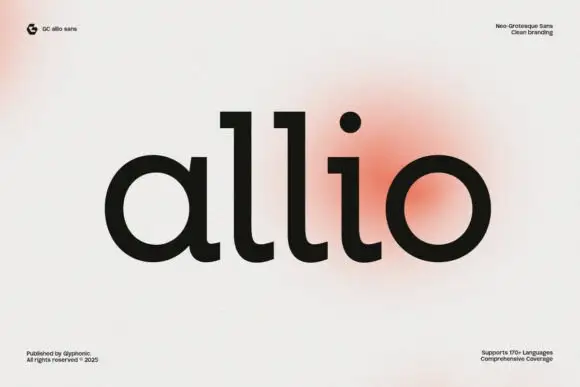
Substantial rounded lowercase with flat l tops and curved baseline feet
Allio is a bold neo-grotesque set in lowercase, its bowls round, its apertures closed and its strokes even, so one short word holds a whole cover without a second element.
Ideas for this font

Contrast display sans with single-storey g
Swaraga is a contrast display sans in off-white over a close photograph of a monstera leaf: mixed case with broad bowls, thin joins, a descending single-storey g and a tall ascender, set in two lines with a small line at the upper left and a studio badge at the upper right.
Ideas for this font
Allow optional Google Analytics to measure visits and catalogue actions. Your search words and notes are not included. Privacy & storage